PMO Metrics: Top 12 That Predict Project Delivery Outcomes
Sruti Satish
A scorecard that predicts beats the one that reports
And, the PMO metrics that hold up in 2026 are the ones that warn you before a project slips: cost and schedule variance, forecast-at-completion, milestone adherence, demand-vs-capacity, and a handful of people signals.
This list is built from what PMO leads and portfolio-dashboard builders actually track. These metrics keep resurfacing when practitioners compare real portfolio health dashboards.
We kept the twelve that act as leading indicators of a delivery outcome and grouped them the way a PMO actually reports: delivery and financials, schedule and risk, resource and capacity, and the people-and-process signals most scorecards ignore.
What are PMO metrics?
PMO metrics are the quantifiable measures a PMO uses to track and demonstrate the performance, value, and health of its projects, programs, and, portfolios.
The metrics should be able to answer three questions:
Are we delivering projects well (on time, on budget, at quality)?
Are those projects producing real business value (benefits realized, ROI, strategic alignment)?
And is the PMO functioning effectively as a governance and delivery engine (maturity, standard adoption, resource utilization)?
Why track them?
Because a PMO that can’t prove its value gets treated as overhead and cut. Tracking metrics is how the PMO justifies its existence and earns influence. The specific reasons:
Prove value and secure buy-in. Without hard numbers, a PMO looks like bureaucracy. Metrics give evidence of impact that make the business case for the PMO and its budget to the C-suite.
Enable better decisions. Real-time data on cost, schedule, resources, and risk lets leaders decide what to fund, pause, or kill — and reallocate people where they matter most, instead of guessing.
Catch problems early. Leading indicators (SPI trends, resource forecasts, risk signals) let you intervene before a project slips, rather than reporting the damage after it’s done.
Create visibility and accountability. Shared dashboards give everyone a single source of truth, so status isn’t buried in spreadsheets or wishful reporting.
Drive improvement over time. Tracking maturity, delivery rates, and rework shows whether the PMO is actually getting better, and where processes need fixing.
Connect projects to strategy. Alignment metrics ensure the portfolio is delivering the organization’s goals, not just keeping busy. And, this is exactly the shift that moves a PMO from a reporting hub to a strategic partner.
The underlying logic: you can’t manage, defend, or improve what you don’t measure. For a PMO specifically, measurement is also the main way it demonstrates it’s worth having.
Through data - driven decision - making, leaders can more accurately assess the performance of the PMO and provide feedback and support accordingly.
Clausiuspress
How PMO metrics have to be rethought for 2026 and beyond
Most PMO scorecards over-index on lagging status: how many projects are green, how many milestones closed. Useful for a board update, useless for prevention. A 2026 scorecard is built around three tests. Every metric below passes at least one.
Leading, not lagging. It shows divergence from plan while there’s still time to act — cost variance climbing, demand crossing capacity — rather than confirming an outcome after the fact.
Actionable, not descriptive. It points to a decision: reallocate, rebaseline, escalate. PMI’s 2025 Pulse of the Profession research, Boosting Business Acumen, found only 18% of project professionals score high on business acumen and reframes success as value delivered beyond scope, budget, and schedule. This is exactly what an actionable metric protects.
Trustworthy, not stale. It’s only as good as the underlying data. Metrics built on data PMs don’t maintain will mislead a steering committee, so data freshness is itself a metric here.
These twelve were filtered against those three tests. Metrics that only described history were left off. For the wider tooling context, see our guide to enterprise PMO software.
There’s a question on how should the PMOs set their metrics, though. Because there are different PMO types with different goals. Let’s take a quick look at them.
What are the 5 types of PMOs? And do the metrics differ by each type?
Two ways to classify:
a) by governance style: how much control the office has over delivery
b) by organisational scope: where it sits and how far its influence reaches.
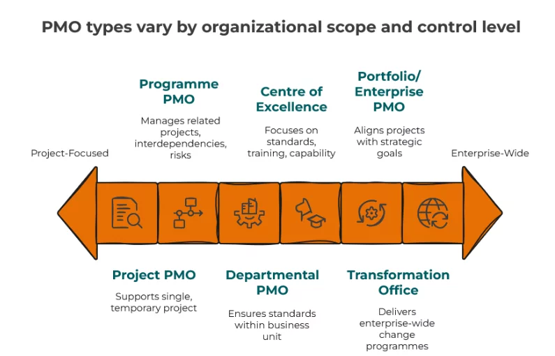
There’s no single official list of five; most people asking the question want a practical shortlist that blends both axes. The image below shows the five drawn from the PMI PMBOK governance models and the scope-based structures catalogued by bodies like House of PMO.
Supportive PMO. An advisory hub. It supplies templates, best practices, training, and lessons learned, but exercises low control. Project managers stay largely autonomous; the PMO supports rather than enforces.
Controlling PMO. Support plus governance. It sets frameworks and requires compliance with moderate control. PMs still run their projects, but within the PMO’s guardrails.
Directive PMO. The office owns delivery. Project managers often report into the PMO, which allocates resources and is accountable for outcomes. High control. Its mature form — sometimes called a “challenging PMO” — actively questions assumptions and will recommend cancelling work that doesn’t stack up.
Enterprise / Portfolio PMO (EPMO). Operates at the strategic level, aligning every project and programme to organisational goals, prioritising investment, and tracking benefits across the portfolio.
Centre of Excellence (CoE). Capability-focused. It builds methods, standards, training, and maturity rather than directly controlling delivery.
Most real PMOs blend these and evolve — often starting supportive in a low-maturity culture, adding controlling elements as governance needs grow, and taking directive control of strategic programmes over time.
Yes — the metrics don’t change, but the emphasis does
The twelve PMO metrics that predict delivery stay the same across every type.
What shifts is which ones a PMO can act on and should be judged by. A supportive PMO can’t be held to a cost performance index it has no authority to enforce; a directive PMO owns the entire leading set because it owns the outcome.
Let’s quickly look at all the twelve metrics, the group they belong to and what each predicts
The top 12 PMO metrics at a glance
#
Metric
Group
Why it predicts delivery
1
Baseline vs Actual (planned vs actual)
Delivery & Financial
Early divergence from plan shows before a milestone turns red
2
Forecast & Variance at Completion (EAC / BAC / VAC)
Delivery & Financial
Projects the final overrun while there’s still budget to protect
3
Schedule & Cost Performance Index (SPI / CPI)
Delivery & Financial
Normalized efficiency flags pace and burn problems early
4
Budget Burn vs Timeline
Delivery & Financial
Spend outrunning progress is the earliest overrun signal
5
Milestone Adherence (on track vs delayed)
Schedule & Risk
Slipping milestones lead slipping delivery dates
6
Portfolio RAG / Health
Schedule & Risk
Consistent status rules show where to intervene first
7
Risks & Issues Trend
Schedule & Risk
Rising or aging high-impact risks precede failures
8
Resource Utilization & Over/Under-Allocation
Resource & Capacity
Overload predicts burnout and slippage; idle time predicts waste
9
Demand vs Capacity Over Time
Resource & Capacity
Demand crossing capacity forecasts a future bottleneck
10
Team Turnover / Talent Retention
People & Process
Churn on a project is an early warning even when status is green
11
Data Freshness & Update Cadence
People & Process
Stale data makes every other metric unreliable
12
Work-Breakdown Level-of-Detail Accuracy
People & Process
Forecasts are only as accurate as the WBS beneath them
Delivery and financial performance
1. Baseline vs Actual
The foundation metric: planned versus actual at every level — baseline hours and cost against actual cost and effort. Without a baseline, “over budget” is an opinion. With one, divergence is visible the first time actuals pull away from plan, weeks before it shows up as a red status.
Enterprise PMOs need this at portfolio, project, and task level, because an on-track portfolio can hide a project bleeding hours.
KPI & target: cost/effort variance against baseline → within ±10%; flag any line item beyond it.
Baseline tells you where you planned to land; Estimate at Completion (EAC) tells you where you’ll actually land. Compared against Budget at Completion (BAC), the Variance at Completion (VAC) is the number a sponsor cares about most: are we going to blow the budget, and by how much? Tracked continuously, EAC turns an end-of-project surprise into a mid-project decision.
KPI & target: VAC as a share of BAC → not negative; escalate when projected overrun exceeds 5%.
3. Schedule & Cost Performance Index (SPI / CPI)
The two earned-value ratios that normalize performance across a portfolio of different sizes. SPI (schedule) and CPI (cost) below 1.0 mean you’re getting less schedule or cost value than planned. Because they’re ratios, a PMO director can compare a €200k project and a €5m program on the same axis and see which is drifting.
KPI & target: SPI ≥ 0.95 and CPI ≥ 0.95 on every active project; anything lower enters the review.
4. Budget Burn vs Timeline
The fastest overrun check there is: compare percentage of budget spent against percentage of work complete. Spend running ahead of progress is the earliest, clearest sign of trouble — and it’s visible long before EAC math confirms it. Use time-phased data (planned, forecast, actual over time) so the trend, not just the snapshot, drives the conversation.
KPI & target: (spend % − progress %) → within ±5 points; widening gap triggers a forecast review.
Schedule, scope, and risk
5. Milestone Adherence
The share of milestones hit on their baseline date. Milestones are the earliest schedule checkpoint that matters to a sponsor, and a pattern of “just slipped” milestones predicts a missed delivery date more reliably than a Gantt percentage. Keep active projects separate from closed ones so the operational view isn’t diluted by history.
KPI & target: milestones on track → ≥ 90%; two consecutive slips on a project escalates it.
6. Portfolio RAG / Health
The executive at-a-glance: Green / Amber / Red across the portfolio. RAG only predicts anything if the rule behind it is consistent and defined — a colour set by gut feel is noise. Done right, it’s the first screen a steering committee reads and the fastest way to decide where attention goes.
KPI & target: a documented RAG rule applied uniformly; track the count and trend of Amber/Red, not just the current tally.
7. Risks & Issues Trend
Not a static risk register — the trend. New and high-impact risks over a rolling window, with the top risks on the highest-value projects surfaced first. A rising risk count, or risks aging without a mitigation, is a leading indicator of failure. The metric that matters is less “how many risks” and more “how fast do we act.”
KPI & target: high-impact risks open beyond a set threshold (e.g. 14 days) → trending to zero.
Resource and capacity
8. Resource Utilization & Over/Under-Allocation
Utilization only means something when it’s built on real capacity — available hours net of holidays and PTO, not a flat 40-hour assumption. Paired with over- and under-allocation in hours or FTE, it predicts two different failures: overload leading to burnout and slippage, and idle capacity leading to waste. For PMOs sharing teams across dozens of projects, this is the metric that prevents both.
The forward-looking companion to utilization: stacked demand by role over time with a capacity line on top. The moment demand crosses capacity is the conversation — and because it’s plotted over time, you see the bottleneck coming a quarter out, not the week it hits. This is where portfolio intake decisions should be made.
KPI & target: count of future periods or roles where demand exceeds capacity → surfaced and resolved before the crossing.
People, process, and data quality
10. Team Turnover / Talent Retention
Delivery success achieved on the back of high churn is a warning, not a win. Turnover associated with specific projects predicts future delivery risk even when the current status is green — institutional knowledge is walking out the door. Few PMO scorecards track it; the ones that do catch trouble a quarter earlier.
KPI & target: project-associated attrition → below team baseline; a spike flags the project for a health check.
11. Data Freshness & Update Cadence
The metric that makes the other eleven trustworthy. If PMs don’t keep project data current, every KPI above misleads. Track how recently each project’s data was updated and treat overdue updates as a first-class exception. The more updates are automated or enforced, the more the whole scorecard can be relied on.
KPI & target: projects updated within the reporting cadence (e.g. weekly) → ≥ 95%.
12. Work-Breakdown Level-of-Detail Accuracy
Most projects have real structure beneath them — a WBS of nested tasks with their own deadlines, not a single start and end date. Forecasts built at the project level miss the detail that actually drives dates. Tracking at WBS/task level is what makes EAC, SPI, and milestone forecasts accurate rather than aspirational.
KPI & target: share of active work planned to task/WBS level (not just project level) → high and rising; no “black-box” projects in the portfolio.
How NimbleWork supports these metrics
Every metric above is tool-agnostic. Where a platform earns its place is by making them leading and actionable instead of a monthly data-gathering exercise.
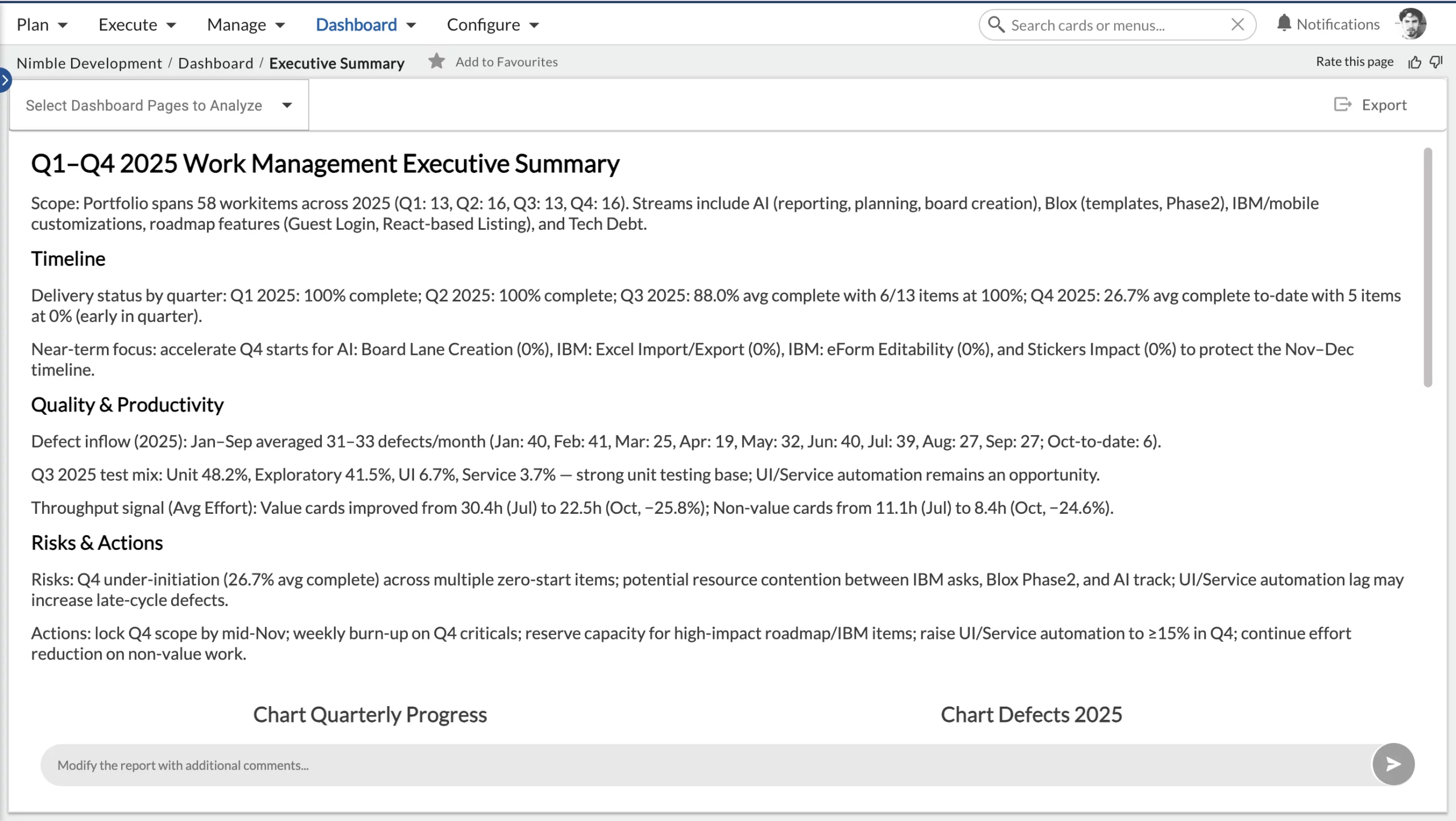
Delivery and financial performance.Earned Value Analysis computes SPI, CPI, EAC, BAC, and VAC natively, so metrics 2 and 3 don’t need a separate spreadsheet. Schedule Deviation, Effort Deviation, and the Effort Tracker track planned-vs-actual over time. And the Executive Summary rolls burn and variance into a simple portfolio narrative.
Schedule, scope, and risk.Project Health and Default Dashboard Pages give a consistent portfolio RAG without hand-building it. The Predicted Date Widget forecasts a milestone slip before the date arrives, and Nimble Buddy can act on a flagged risk in the flow of work. It can log time, block or unblock, and comment, so risk response time actually shrinks.
Resource and capacity. The Utilization View reports utilization on real capacity plus over/under-allocation, and Persona Demand vs Capacity plots demand against a capacity line over time — metrics 8 and 9, without a BI build.
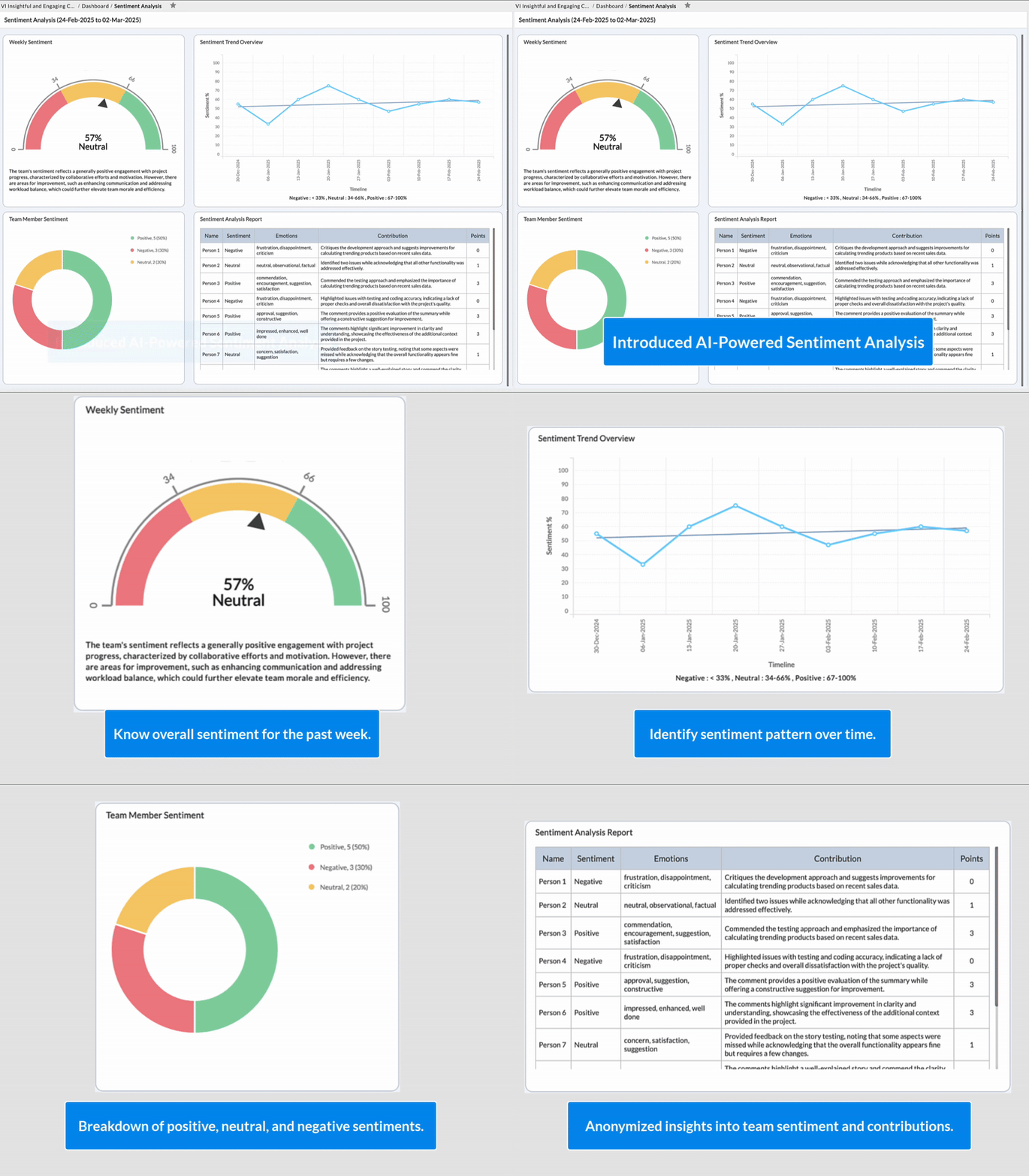
People, process, and data quality.Sentiment Analysis reads team morale continuously, an early signal of the churn that metric 10 tracks after the fact.
Business Rules and Nimble Buddy’s auto-fill enforce and automate updates and native task/WBS structure supports the level-of-detail forecasting. Across all of it, the Dashboard Builder and Intelligent Hub keep the reporting exec-ready without an IT bottleneck.
Checkout the PMO Metrics Maturity Self-Assessment
Want to see where your PMO stands? Assess your PMO against the framework and identify your priority improvement areas.
Measure what leads, not only what lags, and make sure the data underneath is trustworthy enough to act on. Keep the financial and schedule metrics your board expects, add the capacity and people signals that see trouble coming, and present them so a steering committee acts in one glance. Leading, actionable, trustworthy — that’s the test.
Want to see where your PMO stands? Download the PMO Metrics Maturity Self-Assessment to score your PMO against the framework and get your priority improvement areas.
Ready to operationalize it? Book a demo to see how NimbleWork tracks these metrics natively. Or start a free trial.
Common FAQs
What’s the difference between PMO metrics and KPIs?
A metric is any measurement you track; a KPI is a metric tied to a target and a decision. “CPI” is a metric — “CPI ≥ 0.95 on every active project” is a KPI. The twelve here are metrics; each carries one or two KPIs with targets. Track the metrics for coverage; commit to the KPIs for accountability.
Which PMO metrics matter most for predicting delivery?
The leading ones: budget burn vs timeline, SPI/CPI, milestone adherence, and demand vs capacity. Financial variance and RAG status still matter for the board, but they confirm what already happened. A balanced scorecard pairs both.
How do you avoid tracking too many KPIs?
Apply three tests to every candidate: is it leading, actionable, and trustworthy? A metric that fails all three is usually describing history. A dozen metrics that each drive a decision beat forty that fill a dashboard nobody acts on.
Why include data freshness as a metric?
Because every other metric depends on it. If PMs don’t keep project data current, your variance, forecast, and RAG numbers all mislead. Tracking update cadence, automating or enforcing it is what makes the rest of the scorecard trustworthy.