
Start with the video first to get a better grasp of the topic!
|
Skip Ahead to: |
Overview
The Analytics Builder is a collection of different types of charts. The charts are visually categorized into different categories such as relationship charts, comparison charts, composition charts, and distribution charts as per the business standards.
The Analytics builder visualization helps you select the right chart type as per your use case. It covers most of the charts available in the application so that you can see and pick up the chart which meets your requirement. For example, if you want to compare data over time, you can select comparison charts that are based on time. Similarly, if you want to plot data of two variables and see the distribution, you can select the two variation distribution charts.
The Analytics Builder is available in two views –
- Outcome view
- List View
Outcome View
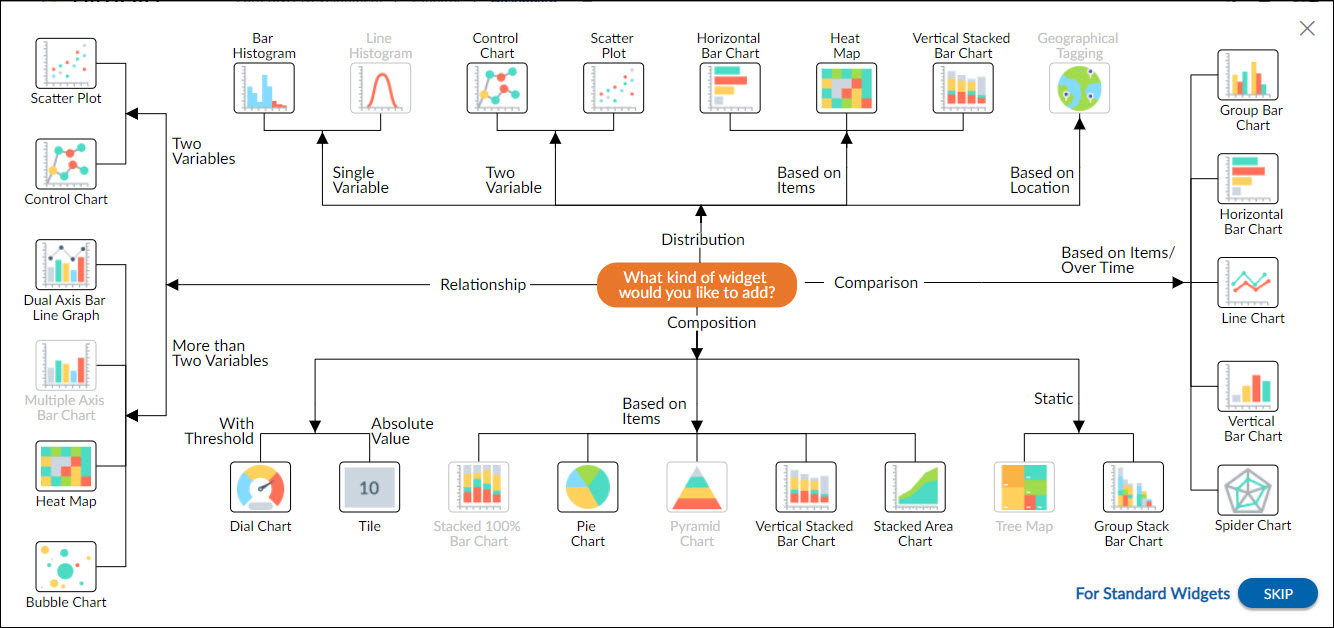
The charts in the Outcome view of the Analytics Builder are categorized in four categories as given below –
- Distribution
- Comparison
- Composition
- Relationship
Distribution
The distribution charts are used to show how data points’ values are distributed. This is particularly useful during the exploration process when we want to build an understanding of the properties of data features. The distribution charts are further divided into the following types –
- Single variable charts such as Bar Histograms
- Two variables charts such as Control Chart and Scatter Plot
- Distribution is based on item charts such as Horizontal Bar Chart, Heat Map, and Vertical Stacked Bar Charts
Comparison
The comparison charts are used to compare values between two or multiple distinct groups. The comparison charts help us view the change in the data over time as per the distribution of the data. The comparison charts are further divided into the given charts –
Comparison based on items/over time such as Group Bar Chart, Horizontal Bar Chart, Line Chart, Vertical Bar Chart, and Spider Charts.
Composition
Sometimes, we need to know not just a total, but the components that comprise that total. The composition charts are used to view a portion of data in the context of the whole. They are useful to see the part-to-whole composition of a value. The following charts come under the composition charts.
- Composition with threshold charts such as the Dial Chart
- Absolute value charts such as the Tile Chart
- Based on items charts such as Pie Chart, Vertical Stacked Bar Chart, Stacked Area Chart
- Static charts such as the Group Stack Bar Chart
Relationship
The relationship charts are used in data exploration to understand the relationship between data features. The chart types below can be used to plot two or more variables against each other to observe trends and patterns between them.
Two variables chart – as the name suggests these charts are used to show the relationship between two variables such as Scatter Plot, and Control Chart.
More than two variable charts- these charts are used to show relationships between more than two variables such as Dual axis bar line graph, Heat Map, and Bubble Chart.
To create other standard widgets of the application like agile analytics widgets, item status widgets, etc, or custom widgets, you can click the SKIP button.
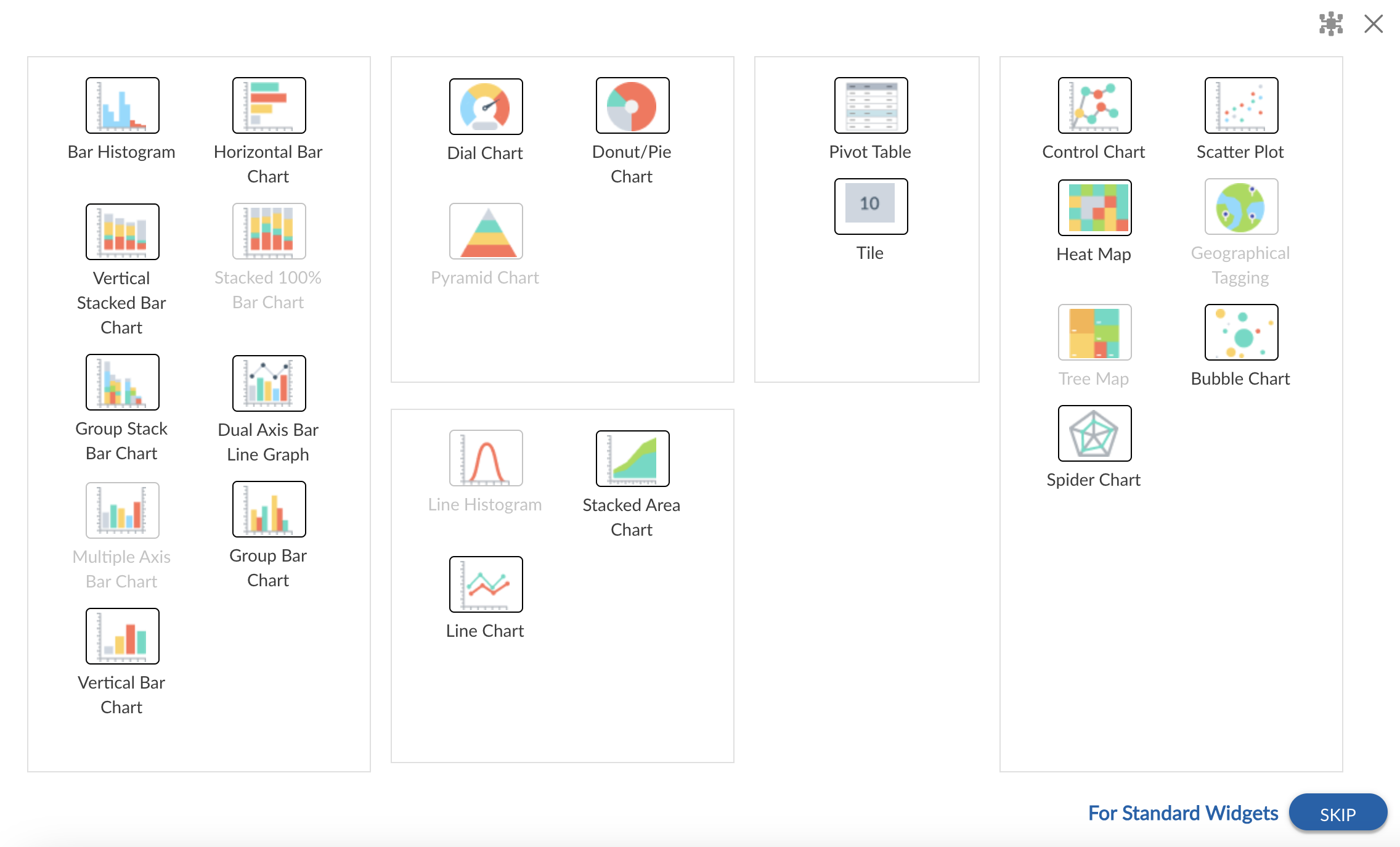
List View
The List view of the Analytics Builder shows all the widgets only once in their respective group. Click a widget to open it and specify the settings. Just like the Outcome view, you can click the SKIP button to see the standard widgets and plot them.
The list view of the Analytics Builder appears at the Organization level, Project level, and Process level analytics.
Note: For half of the users, the List view is enabled as the default view, while for the other half, the Outcome view is enabled as the default view. You can switch to the Outcome view using the Switch to Outcome view icon on the top-right corner of the board.
 |
Creating a Chart with Analytics Builder
You can create a new chart using the Analytics Builder. You can read about all chart types in detail here.
Perform the following steps to create a new chart with the help of Analytics Builder:
- Open the Analytics page and click the Add Widget icon. It will open the Analytics Builder.
- You will see a set of charts grouped together as per their business purposes. Select the type of chart that you want to add. It will open the setting page of the selected widget.
- Specify the settings on the page like widget name, data criteria, date range, and other applicable settings.
- Click the Save button.
Adding a Standard Widget with Analytics Builder
You can add the application’s standard widgets with the help of Analytics Builder. To know more about the standard widgets, read here.
Perform the following steps to add a standard widget.
- Open the Analytics page and click the Add Widget icon. The Analytics Builder appears.
- Click the SKIP button at the bottom of the page to open the Standard Widgets page.
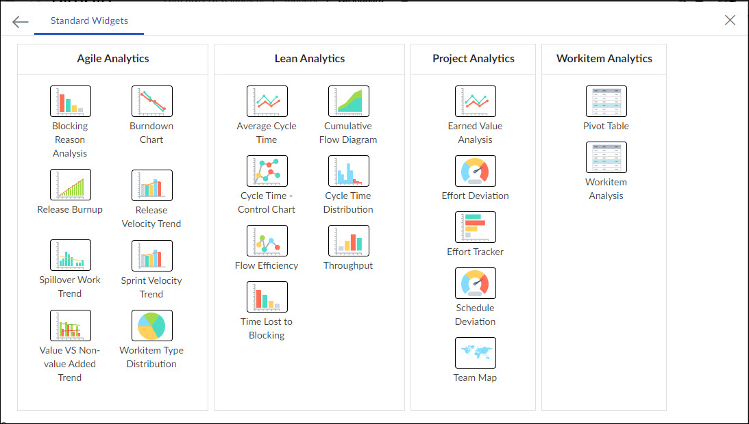
- Select the required widget from its category.
These group analytics are available as per the project template. For example, the group analytics for the Scrum template would be different from the group analytics of the Kanban template, and so on. Here is the list of group analytics falling under each template.
Scrum template:
1) Agile Analytics Group
2) Workitem Analytics Group
Kanban template:
1) Lean Analytics Group
2) Workitem Analytics Group
Scrumban template:
1) Agile Analytics Group
2) Workitem Analytics Group
3) Lean Analytics Group
Waterfall template:
1) Project Analytics Group
2) Workitem Analytics Group
Hybrid template:
1) Agile Analytics Group
2) Lean Analytics Group
3) Project Analytics Group
4) Workitem Analytics Group
While plotting an Analytics chart or widget, you can specify the parameters in the settings window. The Widget name appears as the title by default, which you can edit to rename. By default, the chart size is set to M(Medium). You can enter values to reset for best visibility, depending on the chart type.