
In this article, we will help you understand the different field types that you can configure in a form using Forms 2.0.
|
Skip Ahead to: |
Text/Number Fields
Single Line text
Used to enter one-line information in the textual form. It can store up to 100 characters in the field. By default character limit for the single-line text field is set as 250. To change the settings of the Single Line field, click it. The Reposition, Delete and Settings icons are enabled. Click the Settings icon to change the settings such as name, default value, etc.
It has the following settings:
Details
The Details section is used to store the details of the field such as default value, icon, etc.
| Fields | Description |
| Display Label | Enter the name that you want to give to the field. It will be visible to the users in the form, such as First Name, Last Name, etc. |
| Hide display label | Turn on this toggle to hide the display label of the text field so that the input field appears without any label on it. |
| Field Name | Enter a unique name that will be only used by the system to identify this field. It will not be visible to a user. |
| Field Icon | Select a field icon from the drop-down list if required. This property is optional. |
| Helper text | Enter a helper text that will be visible to the user inside the field so that the user can enter the relevant information. For example, you can enter helper text for a name such as – Enter a name without a title. There is a limit of 100 characters on this property so you will be able to set help text within the limit of 100 characters. |
| Default value | Enter a default value that you want to show in the form in case the user doesn’t enter any value for this field. This property is also optional. |
| Reposition field |
Use this option to move the field between different blocks within the same tab or to a different tab. |
Validations
The validation section is used to store the different validations or conditions that you want to apply to your field such as the number of characters, hide field, etc.
| Mandatory | Set the toggle on if you want to set your field as a mandatory field. |
| Hide Field | Set the toggle on if you want to hide the field. |
| Maximum Characters | Enter the maximum number of characters to be supported by this field type. By default, it is 250 characters. You can increase the number of supported characters up to 1000 characters. |
| Field Type | Set whether you want to set this field as read-only or editable. |
Rule
To know how to configure a rule for a single-line text, read here. Please note that the Single-line text field supports the Font color decorator and Validation rule.
Multi-Line Text
Used to enter multiple lines of textual information. Following are the properties of a multiline field.
- It accepts alphanumeric values.
- By default, it can have text of up to 1000 characters. However, you can increase this limit by 2048 characters.
It has the following fields in the settings page.
Details
| Fields | Description |
| Display Label | Enter the name that you want to give to the field. It will be visible to the users in the form, such as First Name, Last Name, etc. |
| Hide display label | Turn on this toggle to hide the display label of the field so that the input field appears without any label on it. |
| Field Name | Enter a unique name that will be only used by the system to identify this field. It will not be visible to a user. |
| Helper text | Enter a helper text that will be visible to the user inside the field so that the user can enter the relevant information. For example, you can enter helper text for a name such as – Enter a name without a title. |
| Reposition field |
Use this option to move the field between different blocks within the same tab or to a different tab. |
Validations
| Mandatory | Set the toggle on if you want to set your field as a mandatory field. |
| Hide Field | Set the toggle on if you want to hide this field. |
| Maximum Characters | You can set the maximum character limit for a multi-line field up to 2048 characters. |
| Field Type | Set whether you want to set this field as read-only or editable. |
Rules
To know how to configure a rule for a single-line text, read here.
Text Label
Used to add a label to a specific area of the form. For example, if you want to show the different sections in your form such as Personal Information, and Address, then you can add such labels in your form. These labels are added in the same segment /block of the form. It has the following fields in the Fields Setting.
Details
The Details section is used to store the details of the field such as default value, icon, etc.
| Fields | Description |
| Display Text | Enter the name that you want to give to the label. It will be visible to the users in the form. |
| Field Name | Enter a unique name that will be only used by the system to identify this field. It will not be visible to a user. |
| Reposition field |
Use this option to move the field between different blocks within the same tab or to a different tab. |
Style
| Fields | Description |
| Font Size | Enter the font size for your label. By default, the font size is 14. |
| Font Style | Select the font style for the label such as Bold, Italic, Regular, and Semibold. |
| Decoration | Select the decoration style for the label such as strikethrough, underline. |
Rich Text
Used to enter the rich text in a field such as images and text. It has the following fields in the Field Settings –
Details
| Fields | Description |
| Display Label | Enter the name that you want to give to the field. It will be visible to the users in the form, such as First Name, Last Name, etc. |
| Hide display label | Turn on this toggle to hide the display label of the field so that the input field appears without any label on it. |
| Field Name | Enter a unique name that will be only used by the system to identify this field. It will not be visible to a user. |
| Helper text | Enter a helper text that will be visible to the user inside the field so that the user can enter the relevant information. For example, you can enter helper text for a name such as – Enter a name without a title. |
| Reposition field |
Use this option to move the field between different blocks within the same tab or to a different tab. |
Validations
| Mandatory | Set the toggle on if you want to set your field as a mandatory field. |
| Hide Field | Set the toggle on if you want to hide this field. |
| Field Type | Set whether you want to set this field as read-only or editable. |
URL
This is used to enter the URL in a field. It has the following properties.
Details
| Fields | Description |
| Display Label | Enter the name that you want to give to the field. It will be visible to the users in the form, such as First Name, Last Name, etc. |
| Hide display label | Turn on this toggle to hide the display label of the field so that the input field appears without any label on it. |
| Field Name | Enter a unique name that will be only used by the system to identify this field. It will not be visible to a user. |
| Helper text | Enter a helper text that will be visible to the user inside the field so that the user can enter the relevant information. For example, you can enter helper text for a name such as – Enter a name without a title. |
| Default value | Enter a default value that you want to show in the form in case the user doesn’t enter any value for this field. This field is also optional. |
| Reposition field |
Use this option to move the field between different blocks within the same tab or to a different tab. |
Validations
| Mandatory | Set the toggle on if you want to set your field as a mandatory field. |
| Hide Field | Set the toggle on if you want to hide this field. |
| Field Type | Set whether you want to set this field as read-only or editable. |
| Maximum characters | It can support maximum characters up to 1000 characters. |
Rules
To know how to configure a rule for a single-line text, read here.
Numbers
Used to store the numeric values in a field. Users can perform calculations on a Number type of field. It has the following fields in the Field Settings –
Details
| Fields | Description |
| Display Label | >Enter the name that you want to give to the field. It will be visible to the users in the form, such as First Name, Last Name, etc. |
| Hide display label | Turn on this toggle to hide the display label of the field so that the input field appears without any label on it. |
| Field Name | Enter a unique name that will be only used by the system to identify this field. It will not be visible to a user. |
| Field Icon | Select a filed icon from the drop-down list if required. This field is optional. |
| Helper text | Enter a helper text that will be visible to the user inside the field so that the user can enter the relevant information. For example, you can enter helper text for a name such as – Enter a name without a title. |
| Number type | Select the number type such as Numbers, Currency, or percentage. |
| Number Format | Forms 2.0 supports several formats for displaying numbers. This number format depends upon factors such as numbers with plus or minus signs, the number of decimal values to be shown after the decimal, etc. |
| Default value | Enter the default numeric value to be used if the user doesn’t provide any value to this field. |
| Reposition field |
Use this option to move the field between different blocks within the same tab or to a different tab. |
Validations
| Mandatory | Turn the toggle on if you want to set your field as a mandatory field. |
| Hide Field | Set the toggle on if you want to hide this field. |
| Range in digits | |
| Minimum digits | Enter the minimum digit for the number to be entered. |
| Maximum digits | Maximum digits enter the maximum digit for the number to be entered. For example, if you want to receive numbers from 1000 to 1000000 in a numeric field, then the minimum digit would be 4 and the maximum digit would be 7. |
Note: Percent Progress field is also a number type field (percentage).
To know how to configure a rule for a single-line text, read here.
Date Fields
Date and Time field
The date and time field type is used to enter both date and time in a field. It has the following settings –
Details
| Fields | Description |
| Display Label | Enter the name that you want to give to the field. It will be visible to the users in the form, such as First Name, Last Name, etc. |
| Hide display label | Turn on this toggle to hide the display label of the field so that the input field appears without any label on it. |
| Field Name | Enter a unique name that will be only used by the system to identify this field. It will not be visible to a user. |
| Field Icon | Select a filed icon from the drop-down list if required. This field is optional. |
| Helper text | Enter a helper text that will be visible to the user inside the field so that the user can enter the relevant information. For example, you can enter helper text for a name such as – Enter a name without a title. |
| Date time format | Select the date and time format from the drop-down list as per your business requirements. The list shows the format of the date and time along with an example of the same on the right side. |
| Default the field value with the current date & time | Select the check box to set the current date and time as the default value in the field if the user doesn’t enter any value. |
| Reposition field |
Use this option to move the field between different blocks within the same tab or to a different tab. |
Validations
| Mandatory | Set the toggle on if you want to set your field as a mandatory field. |
| Hide Field | Set the toggle on if you want to hide this field. |
| Field Type | Set whether you want to set this field as read-only or editable. |
| Allowed dates | Select the type of dates that you want to allow for selection in the field. It has the following values –
|
Rules
The rule is useful if you want to set a condition for your field. For example, if a specific date and time value is entered then the color of the field changes to a predefined color to highlight the field.
There are two types of Rules –
Date Field
The date field type is used to enter a date in a field. It has the following settings –
Details
| Fields | Description |
| Display Label | Enter the name that you want to give to the field. It will be visible to the users in the form, such as First Name, Last Name, etc. |
| Hide display label | Turn on this toggle to hide the display label of the field so that the input field appears without any label on it. |
| Field Name | Enter a unique name that will be only used by the system to identify this field. It will not be visible to a user. |
| Field Icon | Select a filed icon from the drop-down list if required. This field is optional. |
| Helper text | Enter a helper text that will be visible to the user inside the field so that the user can enter the relevant information. |
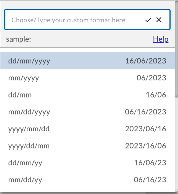
| Date format | Select the date format from the drop-down list as per your business requirements. The list shows the format of the date along with an example of the same on the right side. |
| Default the field value with the current date | Select the check box to set the current date as the default value in the field if the user doesn’t enter any value. |
| Reposition field |
Use this option to move the field between different blocks within the same tab or to a different tab. |
Validations
| Mandatory | Set the toggle on if you want to set your field as a mandatory field. |
| Hide Field | Set the toggle on if you want to hide this field. |
| Field Type | Set whether you want to set this field as read-only or editable. |
| Allowed dates | Select the type of dates that you want to allow for selection in the field. It has the following values – |
Rules
The rule is useful if you want to set a condition for your field. For example, if a specific date is entered then the color of the field changes to a predefined color to highlight the field.
There are two types of Rules –
Selection Fields
Radio Group
These are used when we want to allow users to select one option among all the available options. It has the following fields-
Details
| Fields | Description |
| Display Label | Enter the name that you want to give to the field. It will be visible to the users in the form, such as First Name, Last Name, etc. |
| Hide display label | Turn on this toggle to hide the display label of the field so that the input field appears without any label on it. |
| Field Name | Enter a unique name that will be only used by the system to identify this field. It will not be visible to a user. |
| Helper text | Enter a helper text that will be visible to the user inside the field so that the user can enter the relevant information. |
| Data type | Select the data type for the values in the Radio group such as Number, String, or Decimal. |
| Options alignment | Select the Options alignment as Horizontal or Vertical. |
| Define Options | By default, three options are given. Click on the given options to change their name. |
| Add new option | Click the Add new button to add more than 3 options. Click the button and enter the value. |
| Set default value | You can set a default value for your radio button using this option. Select one value from the drop-down list and click the Save button. |
| Reposition field |
Use this option to move the field between different blocks within the same tab or to a different tab. |
Validations
| Mandatory | Set the toggle on if you want to set your field as a mandatory field. |
| Hide Field | Set the toggle on if you want to hide this field. |
| Field Type | Set whether you want to set this field as read-only or editable. |
Decision Box
It is used when we want to allow the user to select or clear the check box to provide his preference. It has the following fields.
Details
| Fields | Description |
| Display Label | Enter the name that you want to give to the field. It will be visible to the users in the form, such as First Name, Last Name, etc. |
| Hide display label | Turn on this toggle to hide the display label of the decision box so that the input field appears without any label on it. |
| Field Name | Enter a unique name that will be only used by the system to identify this field. It will not be visible to a user. |
| Default selection | Select whether you want the check box to be selected or unselected by default. |
| Reposition field |
Use this option to move the field between different blocks within the same tab or to a different tab. |
Validations
| Mandatory | Set the toggle on if you want to set your field as a mandatory field. |
| Hide Field | Set the toggle on if you want to hide this field. |
| Field Type | Set whether you want to set this field as read-only or editable. |
Static Drop-down
It is used when we want to allow a user to select one option from the given drop-down list. It has the following fields –
Details
| Fields | Description |
| Display Label | Enter the name that you want to give to the field. It will be visible to the users in the form, such as First Name, Last Name, etc. |
| Hide display label | Turn on this toggle to hide the display label of the drop-down list so that only the field appears without any label on it. |
| Field Name | Enter a unique name that the system will only use to identify this field. It will not be visible to a user. |
| Helper text | Enter a helper text that will be visible to the user inside the field so that the user can enter the relevant information. |
| Dropdown type | It has two options – Single-select and Multi-select. Select the appropriate option to specify whether you want the user to select one value at a time or multiple values at a time. |
| Enable search select | Turn this toggle On to allow a user to search the values in the drop-down by entering the initials of the value. For example, in the list of Countries, entering the character “in” will list all the countries having the letters “in” in it such as India, Indonesia, etc. |
| Data type | Select the data type for the values in the drop-down such as Number, String, or Decimal. |
| Define Options | By default, three options are given. Click on the given options to change their name. |
| Add new option | Click the Add new button to add more than 3 options in the list. Click the button and enter the value. |
| Set default value | You can set a default value for your drop-down list using this option. Select one value from the drop-down list and click the Save button. |
| Reposition field |
Use this option to move the field between different blocks within the same tab or to a different tab. |
Validations
| Mandatory | Set the toggle on if you want to make your field mandatory. |
| Hide Field | Set the toggle on if you want to hide this field. |
| Field Type | Set whether you want to set this field as read-only or editable. |
Rules
The rule is useful if you want to set a condition for your field. For example, if a specific value is selected, the field’s color changes to a predefined color to highlight it.
There are two types of Rules –
Checkbox Group
It is used when we want to allow a user to select one checkbox among all the available checkboxes to provide their preferences. It has the following fields –
Details
| Display Label | Enter the name that you want to give to the field. It will be visible to the users in the form, such as First Name, Last Name, etc. |
| Hide display label | Turn on this toggle to hide the display label of the check box so that only the check boxes appear without any label on it. |
| Field Name | Enter a unique name that will be only used by the system to identify this field. It will not be visible to a user. |
| Helper text | Enter a helper text that will be visible to the user inside the field so that the user can enter the relevant information. |
| Data type | Select the data type for the values in the check boxes such as Number, String, or Decimal. |
| Options alignment | Select how you want the options to appear – Horizontally or Vertically. |
| Define Options | By default, three options are given. Click on the given options to change their name. |
| Add new option | Click the Add new button to add more than 3 options. Click the button and enter the value. |
| Set default value | You can set a default check box which will be selected if the user doesn’t provide their selection. Select one value from the drop-down list and click the Save button. |
| Reposition field |
Use this option to move the field between different blocks within the same tab or to a different tab. |
Validations
Advanced Fields
The advanced field types have advanced capabilities to define a field. To know more about the advanced field types, read here.