
Start with the video first to get a better grasp of the topic!
|
Skip Ahead to: |
Overview
The application’s user interface is designed to give you a rich user experience. It has a structured layout organized into key functional areas that make the navigation intuitive, quick, and easy.
Let’s take a quick tour to understand the user interface elements in the application and how to navigate within the tool. You will also get an overview of how the application organizes and displays information.
Terminologies for the Key UI Elements
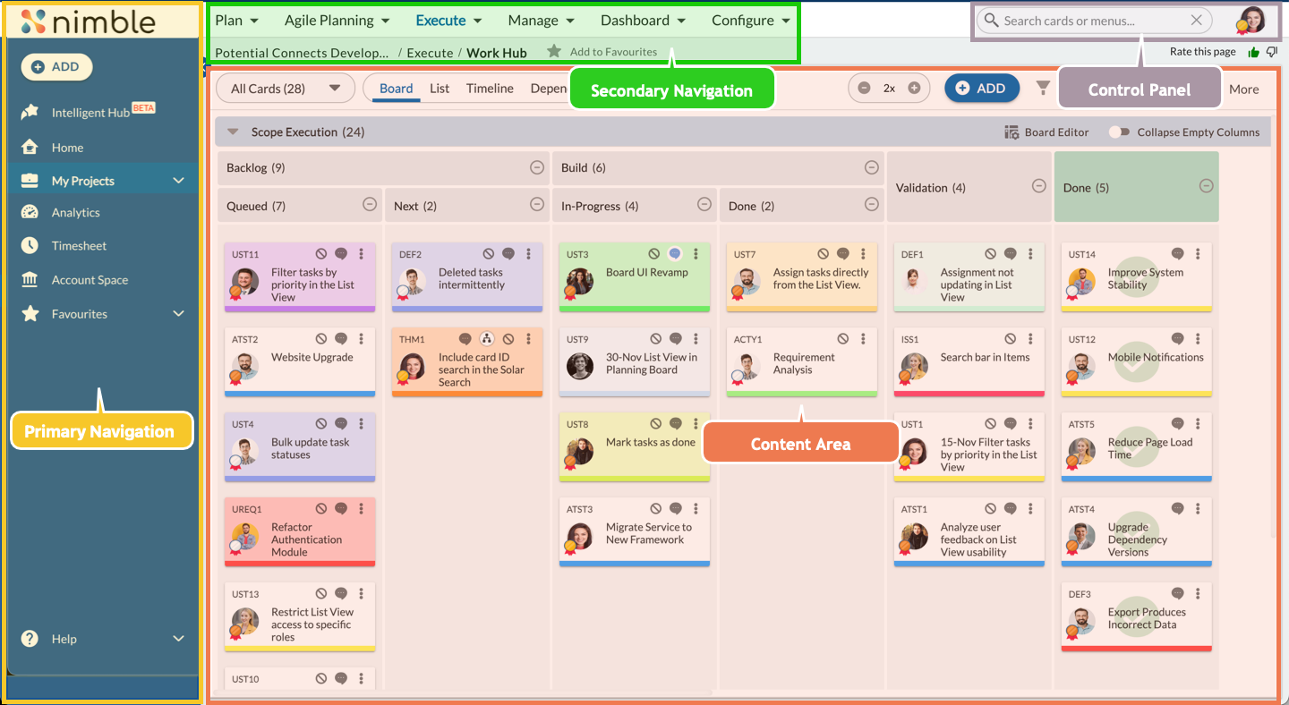
The key user interface elements are as follows:
- Control Panel
- Primary Navigation
- Secondary Navigation
- Content Area
- Nimble Buddy
The screenshot is a generic representation of the basic layout of the application’s user interface. The color scheme in the screenshot is the default theme. Your application color scheme will look different if you choose another theme. By clicking on the Nimble logo, you will be redirected to the Nimble Cafe page.
Control Panel
The Control Panel in the top-right corner consists of the following icons –
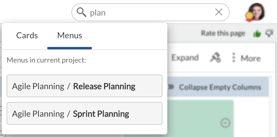
Search –
The search lets you find both workitems and menus using the search bar. When a keyword is entered, the system checks for matches within workitems across all projects in the Workitems section and menus within the current project in the Menus section. If searching for a menu while on a project page, the standard/custom menus for that project are shown. If searching outside a project page, such as from My Workspace or Administration pages, the results display menus available outside the project.
Searching for Workitems
The workitem search is global, meaning it searches across the entire application. Every field of a workitem, including custom fields, is checked for matches. You can also refine their search using conditions, attributes, and cards to filter results effectively. When you enter a keyword, the system scans all workitems and displays matches under the Workitems tab. Unlike menu searches, workitem searches support partial matches, making it easier to find relevant workitems even if the full name is unknown.
Searching for Menus
- Within the Project: When searching within a project, the system only looks for menus specific to that project. The keyword must match the menu name to appear in the Menus tab. Clicking a menu result takes the user directly to that menu.
- Outside the Project: If the search is performed outside a project, the system checks for menus available at a global level (e.g., menus in My Workspace or Administration). Menus from specific projects are not included in the results. Similar to project-specific menu searches, an exact match is required for a menu to appear.
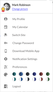
User Profile – The User Profile helps you perform multiple user-centric actions like updating your profile photo and calendar, user profile, changing passwords, downloading a mobile application, setting preferences, setting a theme, and so on.
Primary Navigation
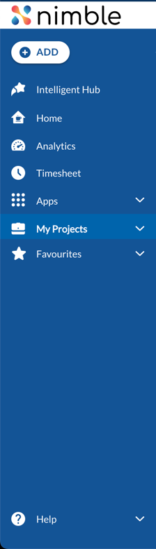 The Module Navigation in the left pane displays Module Groups based on the workspace you have selected. You can show or hide the menu navigation by clicking the main menu in the top-left corner just before the application logo. When you click on a Module Group, the menu displays related Modules. It has the following sections-
The Module Groups on the Module Navigation bar change as you select a different workspace. To open a module, click the required module from the menu.
ADD
Quickly add cards, add OKRs (Objectives, Key Results, and Sub Key Results), team members, and create projects in the application. Read more about the Workitem creation, Team Member, OKRs, and Project creation.
Intelligent Hub
The Intelligent Hub in Nimble is your personal AI-powered assistant that helps you understand and navigate Nimble’s features with ease. Learn more, here.
Home
On clicking Home, the Nimble Café page appears. Use this page to communicate with team or project members on a work item within the application. For more information, see Nimble Café.
Analytics
On the My Analytics page, you can plot the analytics that you want to monitor based on your role and access to data across projects. Read more about Analytics here.
Timesheet
The Timesheet menu in Nimble allows users to efficiently log and track work hours for better project management, billing, and productivity insights.
Apps
In this section, you will find options like Integrations, Portfolio Management, OKRs, and an option to view/update all your organization-related details.
Portfolio Management (PPM) – Help enterprises consolidate all program/project requests from different departments/functions, review them in a structured manner, and make decisions on those that would be funded for execution. It helps the decision-makers monitor the approved programs/projects during execution for ROI, so that subsequent funding decisions can be taken. To know more about PPM, read here.
OKRs – Objective and Key Results (OKRs) help to establish and clarify goals or objectives for an organization, department, project/team, or person. They not only clearly state what the goal is, but they also provide specific details that allow you to measure the success of the goal. Read more about OKR from here.
View/Update Org Details: The option ‘Account Space’ is labeled on the left panel. Configure the application to provide access to users, define personas, set application preferences, define organization settings, and other configurations. Learn more about the various menus and their usage from here.
All Projects
Displays the top 5 recently accessed projects. To view all the projects that you are assigned to, click View All.
1. When you log in for the first time, you will see the top 5 projects in alphabetical order. Once you access a project, it will take precedence and appear at the top of this list.
2. If you are not assigned to any project, the list will not display any projects.
Favourites
Favorites is an easy way to manage and organize all your frequently accessed pages. You can view all the pages that you have added as Favourites under this menu.
To add a page to your favourite list, navigate to the page that you want to mark as a favourite and click the star-shaped Add to Favourites icon next to the application breadcrumb.
To remove a page from your favourite list, click the Add to Favourites icon again.
Note: You can add a maximum of 20 pages under the Favourites list.
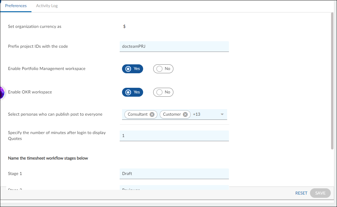
Quote
View motivational quotes in the primary navigation panel and stay motivated all day long. To view a Quote, make sure you set a time against the preference Specify the number of minutes after login to display Quotes in Application Preferences. For example, add time as 2 then after 2 minutes of login you will be able to view motivational quotes. Read more here.
Help
This Online Help is intended to guide you through the various features available in the application. The application provides various resources for getting familiar with the product and direct access to specific help pages.
The Help pull-down menu in the left Navigation contains various help links.
- Product Documentation: You will be directed to the Nimble Knowledge Base, where you can find comprehensive guides, articles, and resources to help you understand and effectively use various features of Nimble.
- Product Consultation: Schedule a consultation with our support team to explore specific features and receive personalized guidance on maximizing your use of Nimble.
- Product Support: Contact our support team to explore specific features and receive personalized guidance on maximizing your use of Nimble.
- Video Tutorials: Watch all the product and training videos to better understand Nimble features.
- What’s New in Nimble: Highlights of the latest features and updates in the Nimble application.
- About Nimble: Information about the product release.

Navigation
The Secondary Navigation indicates the path of the current page, i.e., how you navigated to reach the current page.
NOTE: The Nimble application does not support the browser’s forward/backward functionality to navigate between screens. To continue navigating, please utilize the product navigation options provided.
Content Area
The Content area displays the content based on the context, i.e., Timesheet, Module, and feature.
The information will be displayed in any one of the layouts for workitems:
- List View
- Detail View
There are other special layouts for Analytics, Calendar, and other pages. These are explained in their specific help pages.
List View
The List view displays a summarized list of all workitems in a grid layout, such as workitem IDs (hyperlinked), names, and related attributes. When you select a module, for example, an Action Item, the Action items created will be listed in this layout.
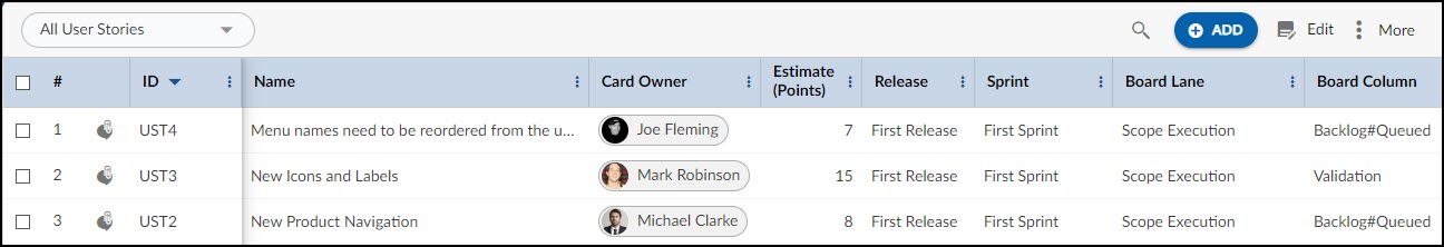
The grid layout facilitates listing and basic operations such as:
- Quick filtering/sorting on any column
- Multi-column / value filtering
- Column resizing, which persists across sessions
- Drag-and-drop the Column to reposition
- Simple Multi sorting
- Quick functional filters for applying and clearing at a single go
List View Options:
The List view toolbar appearing below the breadcrumb displays Feature icons specific to the module, for example, the ADD button, Edit icon, Search icon, and other options under the More Options icon such as Import/Export, Print, Copy, Delete, Column Settings, Multi Sort, and Multiline Add Item. These options are specific to their respective pages.
Detail View
The Detail view displays extensive information related to a single workitem that can be in a read-only mode or editable to capture data. Once the workitem is created it enables Working with ToDos, tracking revision history in the Activity Log, Comments & Attachments, and defining Linked Cards.
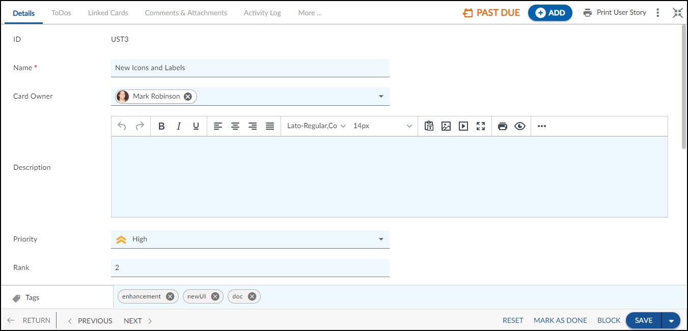
The workitem toolbar displays specific icons and buttons for performing special operations when you open the workitem in the Detail view.
Nimble Buddy
Nimble Buddy is based on the Generative AI model and is capable of helping you perform your day-to-day operations in a jiffy. It can help you view your priority cards, log time against a card, see the online help of a specific feature, or navigate to a specific area of the application. Learn more.
Page Navigation
The Page Navigation bar is applicable for Workitems lists as these span multiple pages. At the bottom left of the Page Navigation bar, you can select the various page scrolling options to quickly navigate through multiple lists. You can define the Page Setting value to view the maximum items in a single list. For help navigating across pages, see the Set up Page Scrolling topic.