Start with the video first to get a better grasp of the topic!
|
Skip Ahead to: Adding and Modifying a Form Field Modifying Form Field Settings for Projects |
Overview
Form fields can be used to gather input in the form of text, numerical values, URLs, pre-defined lists, etc. A ‘Details’ section which is a standard ‘Field type’ of section always exists for a Form, where you can add and modify existing fields.
Fields can be added only to a Field type of section. To add a Field type of section, see Adding and Modifying a Section.
To configure Form fields, you can perform the following functionalities:
- Modify the Form Field Settings for Projects
- Reposition the Form Fields
- Defining Form Field Print Settings
Navigation
Administration Level
In the left navigation panel, expand the Apps menu and select the Account Space. Hover over the top breadcrumb, expand the Administration module, and select Form Configuration.
Note: If you’ve onboarded after version 8.13, the Process Governance module will display as ‘Account Space’.
Project Level
In the left navigation panel, expand the All Projects menu and select any Project. Hover over the Project breadcrumb at the top, expand the Configure module, and select Forms.
Adding and Modifying a Form Field
You can add fields to the Details section, which is a standard Field type of section, and also to custom sections of a similar type. You cannot add fields to other standard sections- Linked Cards, Comments & Attachments, Workflow, and Activity Log.
The new fields will be available for new projects and templates only.
These fields can be used to capture data of different types such as text, numerical values, URLs, pre-defined lists, etc. Some of these field attributes such as label, display length, etc. can be modified later, except for the data type and control type which is a one-time setting. You can also control whether these fields can be changed at the project level or not.
To add a field to a section in a Form,
- Go to the section to which you want to add the field.
- The existing fields along with the data types and control types are displayed.
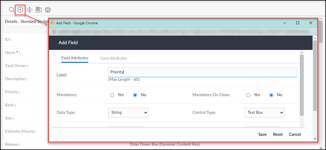
- Click the Add Field button.
- In the Add field window, enter appropriate values in the field attributes.
- Label: Type the name of the field that should be displayed in the section. It is a mandatory field and accepts alphanumeric characters with a maximum of 60 characters. Type a unique and easily identifiable name.
- Hide: Select Yes to hide the field or No to display the field for capturing the data.
- Mandatory: To set the field as mandatory, select Yes, or select No if you want it to be an optional field. Mandatory fields are underlined with a blue line.
- Mandatory on Close: If you set this option to Yes, only when an item is being closed, it will be validated that the mandatory field is not blank, meanwhile you can leave the field blank. For example, if the Reason Code field is set to Mandatory on Close in the Defect Form and you add a defect item, you can leave the field blank till the time you diagnose the reason for the defect. However, when you close the defect item you have to ensure that you select the Reason Code. Mandatory on Close fields is underlined with the grey line.
- Data Type: The data type you select from the list determines how the data should be accepted at the Form instance level, stored, and represented. For example, the data type suitable for accepting age is Number and for a Name is String. The Dynamic List data type allows you to accept values from a pre-defined list.
- Control Type: The control type is dependent on the data type you select. It determines the type of control for accepting the data from the user. For example, for accepting value for a Month, the preferred control type would be a drop-down list box. Similarly, to accept value for Description, the preferred Control Type would be a Multiline Text Box.
- Field Description: Enter the description for the field. Based on what you select in Data Type and Control Type together, a few additional field attributes appear. Select appropriately for applicable field attributes.
The description fields for Data Type and Control Type are: - Values: Enter the values that should appear in the Drop Down Box, Multi-Select List Box, Radio Button, and Search-Select Box. Click Add Value as you enter the values one by one. The values you enter appear in the Values box. To arrange the values, select the value and click the Up and the Down arrows. To sort the values in ascending order, click the Sort Asc button. To delete, select the value and click Delete Value. Subsequently, the values appear in the Default Value list above. Select the default value that the field should display.
- Enable Roll up: This field is applicable only for a field of hierarchical Form type and hence will display only for Forms such as a User Story, where it is possible to indent items under a Summary (Parent) item to form a Parent-Child relationship.
- Roll-up Method: Once you select Enable Roll-up, you need to select the Roll-up Method. It is used to roll up (calculate) the values for child items at the parent item based on the applicable Roll Methods, which are— Sum, Maximum, Minimum, and Average.
- Dynamic List Type: To add a data type of Dynamic List Type, you need to create two fields and establish a relationship between these two fields which will then be available in the Master List Relationship list. The Dynamic List Type consists of all existing Master Lists created at the organization level. You can create fields pointing to multiple dynamic list data types in the same Form, or different Forms pointing to the same Dynamic List Type.
The difference between the Dynamic List data type and the String or Number data type used with the Drop Down control type is that the Dynamic List field points to a Master List. The changes in Master List wherever used, reflect dynamically in all the dynamic list fields across various Forms. This attribute is useful for incorporating the constraint of entering values from a pre-defined list. In the case of the Drop Down control type, the values have to be manually edited for each field in the section of the Form. - Master List Relationship: This field is available by selecting the Dynamic List Type and displays existing Master List Relationships combined with the parent field in the list.
- Display Length: Enter the value (in character length) that will display the field extended to that length in the Form Detail view.
- Display Height: Enter the value appropriately which will display the field to that height in the Form Detail view.
- Input Length: Enter the value (maximum characters) that can be entered in the field at the instance level.
-
Click the Save button to save, or the Cancel button to discard and exit from the window. Click the Reset button to discard the entered values and select new values.
When modifying a Form field, you can make changes in the Label, Hide, and Mandatory settings at the organizational level, Display Length, Input Length, or Display Height if applicable, and the Project Field Settings.
If you want to move the field to another section, select the section in the Move Field To list.
Field Legend
The fields listed after adding are color-coded to indicate if they are default, custom fields, or hidden.
- White: Default Field (Updated by System)
- Yellow: Custom Field (field you created)
- Green: Hidden Fields (Fields which you selected to be hidden in the workitems)
- Light Blue: Project Field (field you created across work items for projects)
- Light Pink: MS Project Field (custom field added in MS Project, appears in Task Forms only)
Modifying Form Field Settings for Projects
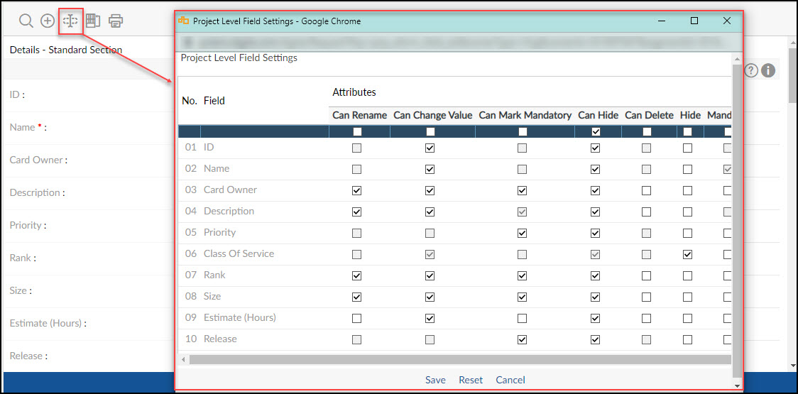
The settings for a Form field that will be applicable for projects are defined when adding a field. However, you can also modify the settings as and when required which will flow down into projects. These settings apply depending on the Forms at the project level for example, if the Form field is available in Forms. You can add fields and manage the field settings for a project in the Details section and custom sections of the Field type section. The field settings include attributes such as the ability to rename, mark as a mandatory field, hide, etc. at a project level. These attributes can be modified as necessary.
To modify the project-level field settings,
- Go to the Form field.
- Click the Field Settings icon to view or modify project-level field settings.
-
The Project Level Field Settings window displays the following attributes. Select or clear the checkboxes to provide or deny rights to rename, hide the field, and so on.
- Can Rename: If selected, the field can be renamed at the project level.
- Can Change Value: If selected, at the project level can change values that appear in the field.
- Can Mark Mandatory: If selected, gives an option at the project level to mark or unmark the field as mandatory and ‘Mandatory on Close’.
- Can Hide: If selected, gives an option at the project level to hide or unhide the field.
- Can Delete: If selected, the field can be deleted at the project level.
- Hide: If selected, hides the field to make it unavailable for viewing or entering values at the project level.
- Mandatory: If selected, marks the field as mandatory at the project level.
- Click the Save button
Repositioning Form Fields
You can change the sequence of the fields in which they will appear in a section at the Form instance level. The fields can be distributed in one or two columns.
To change the order of the fields:
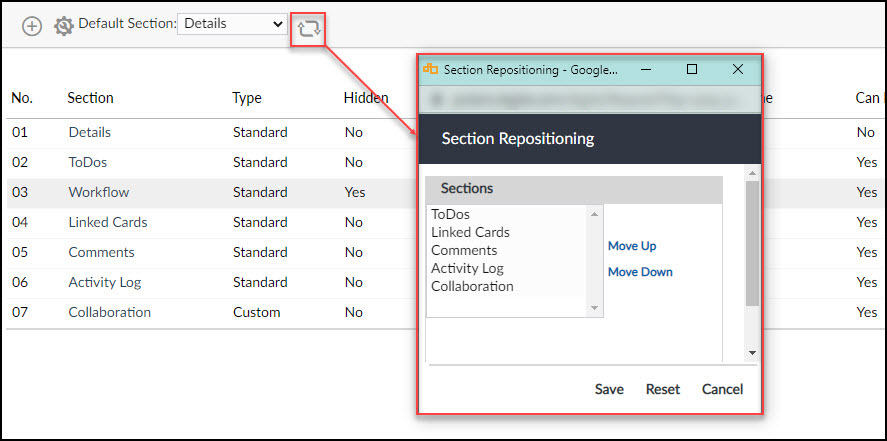
- Go to the Form section.
- Click the Field Repositioning icon.
- In the Field Repositioning window, select the name of the field from the column you want to reorder. Click the Move Up or Move Down button to reposition the selected field in the same column.
- Click the Save button.
If you have configured the Form for MS Word checkout/check-in, click the MS Word Field Repositioning icon on the toolbar. In the MS Word Field Repositioning window, select and arrange the fields in the order you want, as explained above.
Defining Form Field Print Settings
Form fields in a Field type section can be configured for printing. The Form fields are distributed equally in two columns— Left Side Fields and Right Side Fields. If there are an odd number of fields in the section, the odd field will be printed in the left column by default. You can rearrange the order of the fields as you want them to be printed.
The Form Print SettingS will be applied when the field-wise details have to be printed for a Form instance in the following different outputs:
- Rich Text Format (using the Save To File option)
- PDF (using the Save To File option)
- Output to Screen
The Form print setting configured or modified will reflect only for the new instances of the Templates/Projects created and flow down from the organizational level to the Template level/project level, and templates to projects.
From the item list at the instance level in the Print window, if you select List View in the ‘Output Option’, only a list of items will be printed based on the selected Table view without any field information as the Form Field Print setting will not be applicable.
Configuring Card Attributes for Agile Workitems
For an agile workitem, you can configure the fields as attributes on the card of the Work Hub.
By customizing the default layout of the cards on your board, you’re bringing just the correct level of information to your team’s attention.
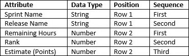
The card attributes can be customized across two rows. Each Row can contain a maximum of four attributes depending on their Data Type.
A field, having Data Type as String or Date will occupy 50% of a row, while a Number as Data Type will occupy 25% of the row. So, a maximum of two fields of String or Date and a maximum of four fields of Number type can be accommodated in a row.
By default, the card contains the following 6 attributes on it.
To customize the attributes as per your business needs, perform the following steps:
- Click a Field name that you wish to see on the card
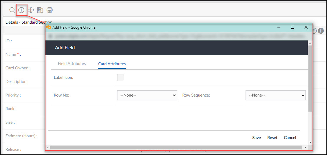
- Click the Add Field icon and the Card Attributes section.
Notes:- The ID, Name, and Card Owner fields will not have the Card Attributes section as their positions on the card are fixed.
- The fields having URL and Email as Data Type cannot be added to the card.
- The fields having Multiline Text Box, Multi-Select List Box, and Multiline Text Box with Rich Text Editing as Control Type cannot be added to the card.
- Select an appropriate Label Icon from the available icons.
- Select Row No so that it can be seen in the first or second row of the card.
- Select the Row Sequence as it should be seen in the selected Row.
- Click the Save button.