
Start with the video first to get a better grasp of the topic!
|
Skip Ahead to: |
Overview
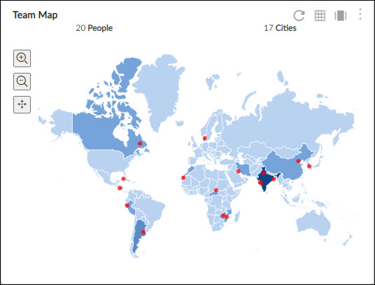
The Team Map widget helps you see the distribution of the team members who are working on a project on a map. It is useful for organizations where team members of a team are spread across multiple cities or countries.
It helps you know the number of team members and their location at a glance so that you can know how many team members are from a particular country or city.
Key Features
- The cities (having team members in them) are highlighted in red color dots.
- The blue shade of a country indicates the number of team members working in it. A higher number of team members in a country is represented by a darker shade of blue whereas compared to a country with a lesser number of team members.
- Hovering over the country will show the name of the country. Likewise on hovering over the red dot (city), one can know the city name and number of team members in that city.
Configuration
To plot the Team Map widget, perform the following steps –
Open the Analytics Builder and click the Team Map widget from the Project Analytics group of widgets. The team map will be plotted with the number and details of team members (whose geographical location has been set on the User’s profile page) in that project. Only allocated team members are considered.
You can also see this map in a pivot (table form) where all the users or team members are shown with respect to a city and country in a table. You can also see this map in different sizes with the help of Zoom options in the right bottom corner of the widget.