
Start with the video first to get a better grasp of the topic!
|
Skip Ahead to: |
Overview
The chart plots points indicating cards that have metrics above or below average and beyond control limits. The chart can be plotted to track cycle time for cards. The cards should have exited from the End column or moved to End column if it is a Done column type and during the date range selected.
Configuration
To configure an Cycle Time – Control Chart, perform the following steps –
1. Click the Add Widget icon on the Analytics page. The Analytics Builder appears.
2. Click the SKIP button at the bottom right of the Analytics Builder to see the Standard Widgets screen.
3. From the Lean Analytics section, click the Cycle Time – Control Chart. The Settings page appears.
To plot the widget, specify the following information:
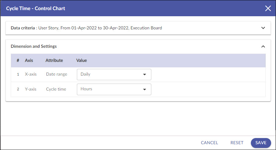
Data Criteria
-
Workitem type: Select the values based on your requirement.
Note: If you select the My Workitem option, the Release, Sprint, and Task Plan options won’t be selected as they are dependent on the form’s execution.
-
Start Date and End Date: Select both these dates from the calendar to limit the scope of data.
-
Select Filter: Select or create a filter to apply on the specified data.
-
Lane: Select the lane from the list box for which you want to plot the chart.
-
From andTo Column: Select the exact stages for which you want to generate by defining the Start Column and End Column.
Dimensions and Settings
-
X Axis (Date Range): Select the unit of measurement (Hours/Days/Weeks) for Cycle Time to be scaled on the X-axis in the chart.
-
Y Axis (Cycle Time): Snapshot of time (Daily, Weekly, Monthly, and Quarterly) for Analytics to be rolled up or unrolled on the Y-axis of the chart.
Note: If you select the Time Period as Weekly, then please remember that the week is considered from Sunday to Saturday.
To view the chart for the Lead Time, select Backlog in Start Lane and the End Lane as you want. You can view the chart for each Lane or All Lanes. If you select the ‘All’ option, the chart considers all cards that exited the last lane.
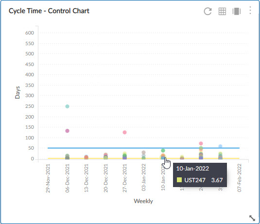
The green line indicates the mean or average time for the selected period. The red line above the green line is Upper Control Limit (UCL) and the one below the green line is the Lower Control Limit (LCL). See the control limit calculation here.
Interpretation
The cards falling within the range of UCL and LCL are indicated by green dots. The red dots above the UCL and below LCL indicate the metric for the item is beyond the control limit. There may be special cases for such cards. But several points outside these control limits are signals that the process is not operating as consistently as possible, and needs a change.
To find out the card that is out of control limits, rest your pointer on the outlier, you can see the card name and the metric. Click the ‘Click here’ link to view the card details.
Control Limit Calculation
As a definition, control limits statistically indicate whether any process is under control and stable. The upper control limit (UCL) and lower control limit (LCL) are calculated statistically from the cards’ data that are extracted as per the filter criteria applied on the analytics.
Once the mean (total time value of cards/count of cards) is calculated and the central line is drawn accordingly, the Control limits are defined with the standard deviation with an area of +/- 3 sigmas on either side of the central line. UCL is drawn above the central line and called as +3 sigma line. LCL is drawn below the central line and called as -3 sigma line. If the dots representing individual cards are falling within the standard deviation of the mean, then the process is considered to be in control. Any dots beyond the UCL or LCL is considered as an outlier and require a thorough analysis.