
Start with the video first to get a better grasp of the topic!
|
Skip Ahead to: |
Overview
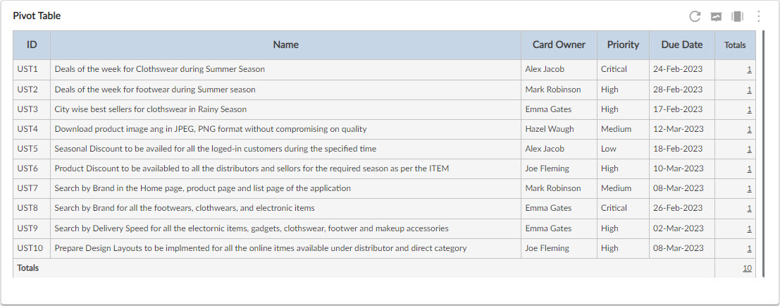
The Pivot Table is a powerful data summarization feature that you can use to quickly summarize the project data in a tabular or chart format. You can refine the data based on date filter or advanced filter or both, and design the analytics based on various attributes like Priority, Release, Sprint, and so on. It also saves the pivot structure as a report for future viewing purposes. Moreover, you can export the Pivot table into Microsoft® Excel, Word, and PDF to view them offline.
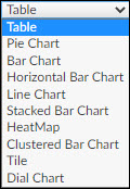
You can also change the table or chart format from the drop-down list. Note: By default, a Table is selected.
Moreover, you can export the Pivot table into Microsoft® Excel, Word, and PDF to view them offline.
The chart types that can be plotted with Pivot Table are as follows:
- Pie Chart
- Bar Chart
- Horizontal Bar Chart
- Line Chart
- Stacked Bar Chart
- HeatMap
- Clustered Bar Chart
- Tile
- Dial Chart
Configuring Chart in Pivot Table
The Pivot Table is plotted as per the data condition values set on its settings page. To interpret a Pivot Table:
- Navigate to Analytics Builder, and plot the Pivot Table. The Pivot Table dialog box opens.
- Select the required criteria such as workitem type, workitem status, filter, and date range. The Workitem Type field also shows the custom forms available in the project.
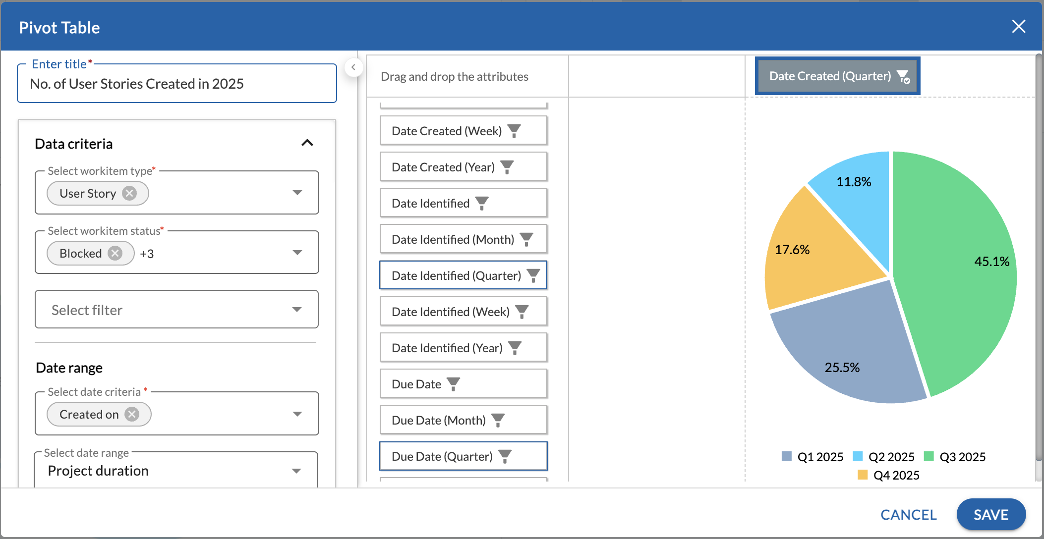
- Select the chart settings such as aggregation, and chart type from the drop-down list and select whether to show or not the total of the rows and columns.
- The fields applicable to the selected workitem types appear. Please note, that custom fields of the selected workitems also appear.
- For the bar chart, horizontal bar chart, and stacked bar chart, you can turn on the Show Trendline toggle to show a trendline in the chart. For the table, you can turn on the Show total row and Show total column toggle to see the total of the rows and columns respectively. If there are no total rows or columns to be displayed in the table, then the respective toggle under the Chart Settings will turn off. To see the total of rows/columns, place the respective attribute in the top row or left column respectively.
- For the Dial and Tile chart, click the Settings icon next to the drop-down list and define the settings such as different data conditions, data range, and color.
- Specify labels, and conditions, enter values, and select respective colors.
- Click the Save button.
When you use a date-type field (for example, Start Date, End Date, or Due Date) in a Pivot Widget, the system provides predefined time-based grouping options to aggregate data meaningfully, such as Week, Month, Quarter, and Year.
Dial Chart
The dial chart is represented in a semi-circle axis with a needle to visualize a single metric value against the metric’s LSL, Target, and USL. The axis consists of colored data range and interval markers, whereas the needle indicates the metric value. The metric value is also shown in the center of the dial chart.
In a Dial chart, you can compare a section of values against the total value. With that, you can measure the progress of a single value in a Dial Chart.
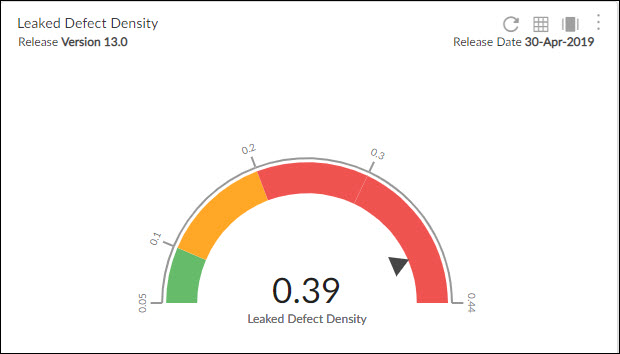
Interpreting the Dial Chart
The dial chart will be plotted as per the data condition values set on its settings page. To interpret a dial chart in Pivot Table:
- Navigate to Analytics, and plot the pivot table.
- Click the More Options icon and select the Settings option. The Pivot Table dialog box opens.
- From the drop-down list, select the Dial Chart option.
- To define the dial chart settings such as different data conditions, data range, and color, click the Settings icon next to the drop-down list.
- Specify labels, and conditions, enter values, and select respective colors.
Note: You must define one less than, one greater than, and one between conditions for a dial chart.
- To plot the chart for a specific value, select the attribute in the pivot table and choose the required criteria. Click Apply.
- The arrow on the chart will point toward the selected filter criteria of the table.
- Your total value will be displayed in the table that is equal to the value the arrow is pointing to.
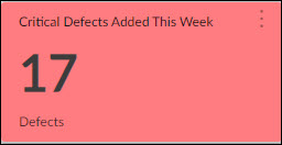
Tile
Tile is a visual representation of data that lets you select specific values represented in tiles of equal sizes. With that, you can track large volumes of data in a limited-space Tile Chart. Every tile is associated with some data so give a title to every tile. The color of the tile indicates the range of data. You can customize the way a tile chart is displayed to best accommodate the type of data being displayed.
Interpreting the Tile Chart
- Navigate to Analytics, and plot the pivot table.
- Click the More Options icon and select the Settings option. The Pivot Table dialog box opens.
- From the drop-down list, select Tile.
- To define the tile settings such as different data conditions, and color indicators, click the Settings icon next to the drop-down list.
- Add conditions, enter values, and select color indicators.
- To generate tiles for a specific value, select the attribute in the pivot table and click Apply.
- Your total value will be displayed in the table that is equal to the value of the selected criteria.
Note: Unlike another Analytics table, the tile can be plotted in 2/3, 3/3, and 4/3 size only.
Note: There are 3 thresholds for the pivot widget:
- Up to 100 projects can be plotted in a Pivot.
- Up to 10000 records can be shown in the pivot.
- It can plot up to 20 workitem types in a table.
When you export the Analytics page having tile charts in it, all the tiles will be shown in one page/sheet of the exported word/excel/pdf file.
Key Features
- Visualize the data across workitem types.
- Select the method of summation such as Count, Sum, Average, Minimum, Maximum, 80% Upper Bound, Sum as Fraction of Total, and so on.
- Drag and drop attributes Priority, Release, Sprint, and others to the Row or Column label and renders the table or chart according to your requirement.
- Drill down to the workitem level by clicking on the number. The associated workitems are displayed as a list and clicking any of them will open the workitem’s Details segment. If you make any changes to the workitem in the drill-down list view or the detail view of the workitem, the changes are immediately reflected int he Pivot Table.
- Export the Pivot table into Microsoft® Excel, Word, and PDF to view them offline.
Exceptions
- The Pivot table does not support the feature of saving the pivot structure in the form of reports for future use.
- Except for the Workitem Type Distribution and Testing Status Trend, all other Pivot tables support the table format only. So, you can generate and export the Pivot table only in table format.
- The drill-down feature is not available in the exported table format.