
Start with the video first to get a better grasp of the topic!
|
Skip Ahead to: |
Overview
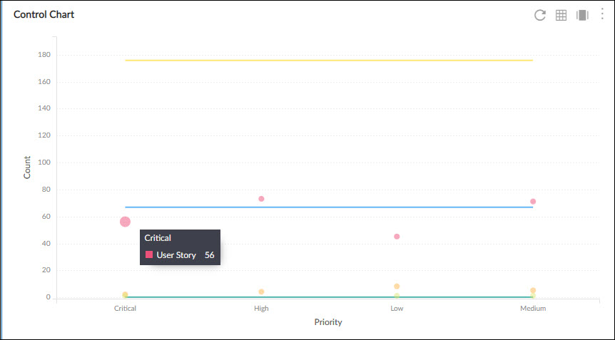
The control chart is used to study how a process changes over time. The data is plotted in time order. A control chart always has a central line for the average (Mean), an upper line for the Upper Control Limit (UCL), and a lower line for the Lower Control Limit (LCL). These lines are determined from historical data.
Configuration
To plot a Control Chart, perform the following steps:
1. Open the Analytics page and click the Add Widget icon. The Analytics Builder appears.
2. Click the Scatter Plot chart. The Settings page appears.
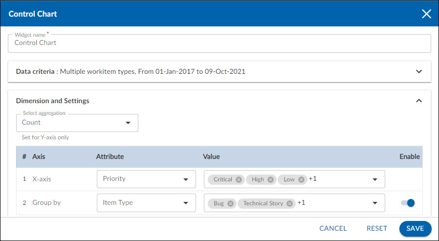
3. Enter the given information in the Data Criteria and Dimension and Settings as per your requirements:
Data Criteria
- Modify the widget name, if required.
- Workitem type – Select the required workitem types for which you want to plot the chart. A message is displayed on the screen if the selected workitem type has no data in it.
Note: If you select the My Workitem option, the Release, Sprint, and Task Plan options won’t be selected as they are dependent on the form’s execution. - Select workitem status – Select the workitem status such as All, Open, Closed, etc. for the workitem types.
- Create filter – You can create custom List views for viewing specific workitem group using the Advanced Filter option. Create a filter where you can set a combination of filter criteria and then apply.
- Date Range – The Date Range section provides flexible options for selecting date-based criteria and ranges:
- Select Date Criteria: Use the dropdown menu to choose how data is fetched. Options include Created on, Closed on, and Last modified on.
- Select Date Range: Choose dynamic or custom date ranges to automatically display data based on the selected period. The options include – Custom dates ( Requires additional selection of Start Date and End Date), Current month, Current quarter, Current week, Current year and many more.
- If “Custom dates” is selected, two additional dropdowns will appear to specify the Start Date and End Date.
Note: For Organization Analytics and Personal Analytics, the Date Range section will only display Start Date and End Date options.
Dimension and Settings
- Select aggregation – You can plot the chart based on the numeric field of the selected workitem type such as count, sum, percentage, etc.
Select Axis on the chart
- X-Axis – Select the attribute (and its values) which you want to be plotted on the X-axis of the chart. The attribute field shows all the fields which are common in the selected workitem types.
- Group Y – The Group By option lets you view the data points in different groups as per their selected attribute such as workitem type. If you select a percent field, then you need to specify the minimum, maximum, and interval of the values.
Note: You can only select one aggregation for each plot.
4. Click Save. The Control Chart will be rendered as per the set metrics.
Interpretation
The control chart gives an overview of the progress control of work over time while completing a project or task. It always has a central line for the average, an upper line for the upper control limit, and a lower line for the lower control limit. These lines are determined from historical data. The control chart will have various results, such as:
A. ‘’In Control” control chart
If the points are within the UCL and LCL, this pattern is typical of processes that are stable.
Three characteristics of a process that is in control are:
• Most points are near the average
• A few points are near the control limits
• No points are beyond the control limits.
B. Out-of-control limits
A special cause is present in the process if any points fall above the UCL or LCL. Action should be taken to find the special cause and permanently remove it from the process.
C. Rule of seven tests
If one of the following conditions is true, then it states that the situation is out of control:
• Seven points in a row above the mean
• Seven points in a row below the mean
• Seven points in a row trending up