In this article, we will help you understand how to configure a Form using Forms 2.0.
|
Skip Ahead to: Understanding Different Block Types Adding Field Segments to a Form Understanding Different Field Types Enabling Percent Complete Fields Adding Comments Block to a Form |
Introduction
Form 2.0 lets you configure forms to fit your business needs. Forms 2.0 lets you design forms using drag-and-drop UI, one, two, and custom column layouts, grouped fields, tables, formula-based fields, conditional color indicators, and real-time user presence. These capabilities help you design user-friendly forms based on business needs.
Video Reference
Configuring a Form
To configure a Form, navigate to the required project > Configure > Forms 2.0. Once you open the Forms 2.0 screen, perform the following steps to create a Form:
- Click the CREATE FORM button.
- Click the Get Started button.

- Select the Type of form, which can be:
-
Form Type (Standard Form):
- A Form is a traditional, standalone structure used to collect and organize data. It includes multiple fields and blocks that can be customized and configured.
- All configuration options are available when defining a form of this type, such as Menu Position, Form Color, Visibility Preferences, Time Tracking, and Percent Completion.
- Examples: A User Registration Form, Project Form, or Contact Form, where various fields like text boxes, drop-downs, checkboxes, etc., are used to gather user input. If you select Form Type, follow steps 4 to 10 below:
-
List Type (List Form):
- A List is a form type that is simplified and structured to handle specific sets of data, where each entry (or row) represents a unique data item. This is often used for forms where the goal is to manage multiple items in a list format (e.g., items in inventory or tasks in a project).
- Examples: A Task List, Priority List, or Inventory List, where each row represents an individual task, priority, or item with minimal data input. If you select Form Type, follow steps 4 to 10 below:
To learn more about configuring a List Form, click here.
-
- Enter the Form name, a short abbreviation for ID generation, the menu position where it should appear, the workitem color for display in Work Hub and Analytics, and a description.
- Enable Time Tracking: While creating a custom form, you can enable Time Tracking by selecting the Enable Time Tracking preference. Next, choose one of the following options to log effort: Log Time on To-Dos or Log Time on Cards. To learn more about these options, refer to the Time Tracking at Form Level section.
- Do you want to enable Percent complete: If you would like to enable Percent complete for the cards created under this form, select this checkbox.
- Define how form-based workitems should appear in Nimble — as cards on the Work Hub, only in List View, or in both — based on whether your team prefers card-based or spreadsheet-style tracking.
- Board & List View: The cards will be listed in both the Work Hub and also, Workitem listing.
- List View only: The cards will appear only in List View. These cards will not be listed in the Work Hub. Once List View only is selected:
- Cards will not be visible in Work Hub settings, Filters, or Color Schemes.
- Any previously materialized cards for this form will be moved to the Backlog.
- Click the NEXT button.
- Select the layout for the Form. For now, you can create a form from scratch.
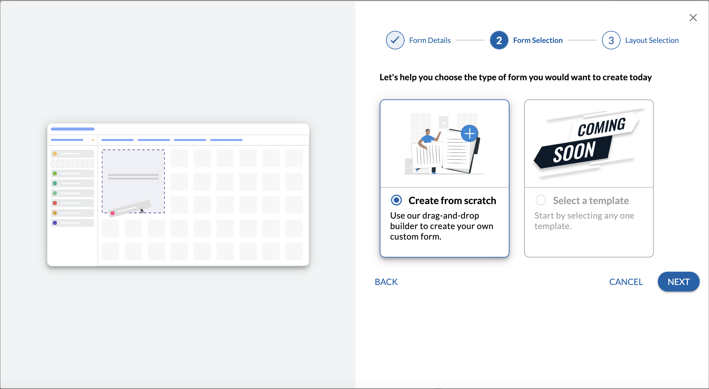
- Select the required layout for the form. You can create a form from a blank template.
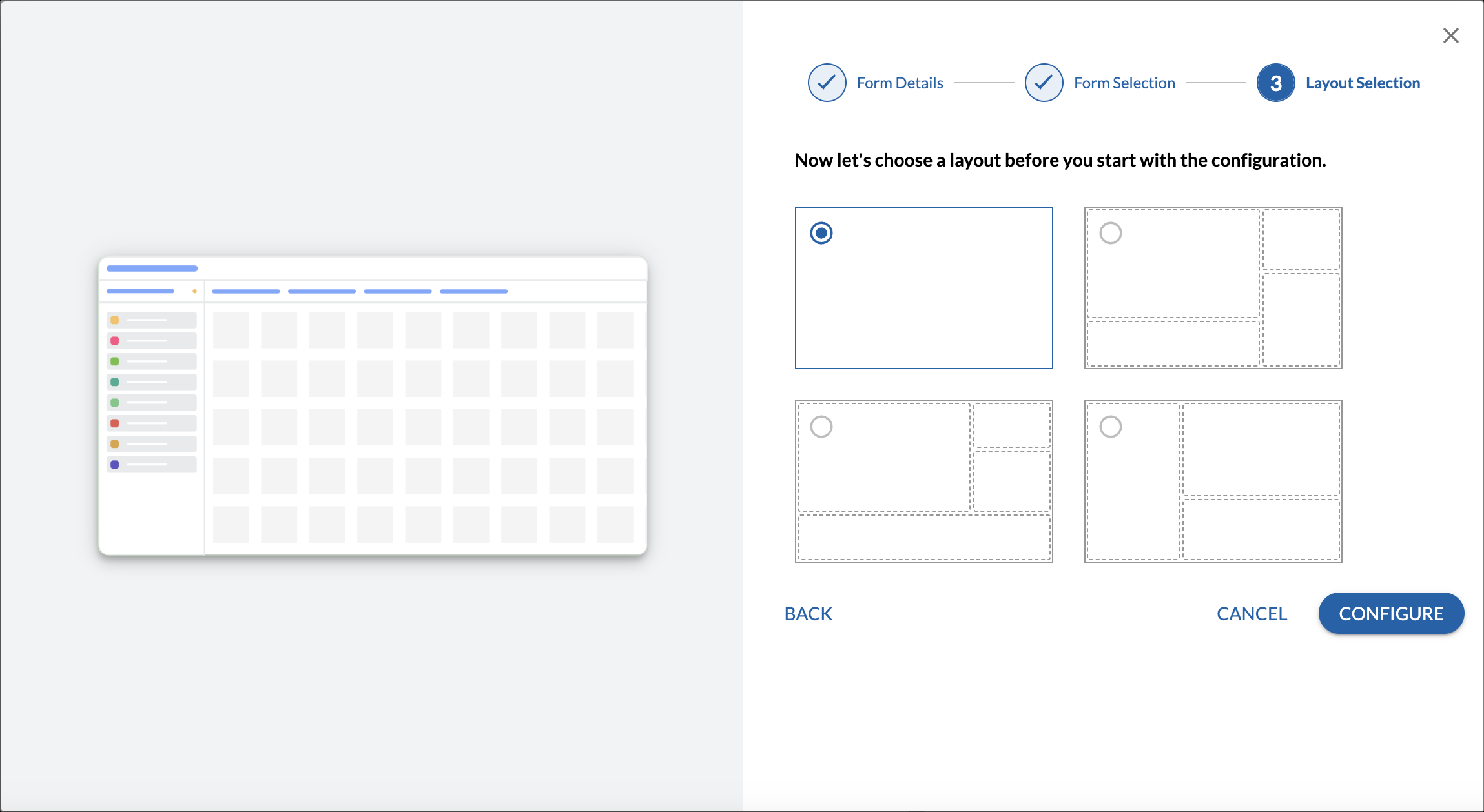
- Click the CONFIGURE button.
After you click the CONFIGURE button, you can configure your form. By default, the Name and ID are the two fields included in every form. You can select some more predefined (common) fields such as Due Date, Description, Priority, etc.

To select the predefined fields, select the required fields and click the SAVE button. To avoid these fields, click the CANCEL button. The default form is displayed with the form name, Name, and ID fields. Now you can configure your form’s field segments, fields, tabs, subblocks, and buttons as per the requirements.
Understanding Form Layout
In a form, there can be multiple tabs. In those multiple tabs, there would be multiple blocks of different types such as Field Segment block, Sub-block, Comment block, Attachment block, and Tags block which the configurator can drag and drop on the Tabs.
Each block type would have a different type of data associated with it. For example, an attachment block would show a list of attachments that the form has. Similarly, a Field segment block would have different kinds of fields in it.

Understanding Different Block Types
In the Form configuration left panel shows different kinds of blocks that the form can have. You might be wondering what are blocks in the form. Well, Blocks are the containers that will display, group, and store form information. Form information includes different fields, Data tables, Comments, Attachments, and Tags. With the help of the different block types, you can structure the form as per your requirements. Below is a quick overview of the different block types –
- Field Segment block: The Field Segment block will have a different kind of fields like text, number, dropdown, radio selection, etc. In a form, the configurator can have multiple such field segment blocks. By having multiple such field segment blocks configurator would be able to do logical mapping between fields and the block that they are present in the form. This also helps end users to access and fill forms quickly by having fields grouped logically.
- Sub-block: A sub-block in the form is added when the configurator wants to create a relationship between the primary block and the sub-block. There can be 2 kinds of relationship between a primary block and a sub-block.
One-to-One – A single instance of a sub-block is related to a single instance of the primary block.
One-to-Many– Multiple instances of sub-block are related to the single instance of the primary block.
Sub-block can never exist on its own. It can be accessed only when the base form is accessed where the relationship with the primary block exists. A sub-block can be either in the form of a field segment or a data table. - Comment block Comment block would show a list of all the latest comments that are posted in the form. Based on the size of the comment block end users would be able to either view comments or perform actions like Add, Edit, or Reply to the comments.
- Attachment block The Attachment block will show the list of all attachments that are posted in the form. The end user should be able to perform actions on the attachment block like view, add, and delete attachments from the attachment block.
- Tags Block The Tag block will show the list of tags the end users want to enter for the form. These tags can be used to filter data or derive analytics from it.
- Analytics block: The Analytics block allows users to display project and organizational dashboards (if access is provided) within a form. End users can view only the charts configured in the settings, as they are derived from the selected analytics.
Adding Tabs in a Form
When a Form is getting configured a default tab is created which is named the “Details” tab. There are other default tabs available in a Form such as Comments & Attachment, ToDos, and Linked Cards, System Fields and Activity Log that are disabled by default, however, you can enable or disable a tab by selecting/clearing the required check box.
ToDo: This tab allows you to add ToDos, assign owners, enter estimated hours, track status (open/closed), and delete ToDos. Learn more here.
Comments & Attachment:This tab allows you to add comments, reply, attach files, view or download attachments, and delete them when needed.Learn more here.
Linked Cards: This tab enables you to create parent-child relationships between cards, define dependencies, and visualize them as a mind map. Dependent cards are also visible in the Work Hub for better tracking. Learn more here.
System Fields: This tab allows you to view the system-generated fields not editable by the user. This will help you track the other information of the card such as Date Created, Date Closed, Status, etc. If the System Fields tab is not displayed, update the form and republish it.
Activity Log: This tab shows all actions performed on the item for easy tracking.
You can also add a new tab if you want.
Note: You can only delete the tab if it has no segments with fields.

To configure the tabs, perform the following steps –
- On the top-right corner, click Configure Tab.
- Select the checkboxes which tabs you want in your Form. By default, the Details tab is selected. Please note, that once you select a tab, you cannot clear the selection.
- To add a new tab, click the Add new tab icon. The tab appears in the form.
- Click the Save button.
- Add the segments and field in the newly added tab.
Adding Field Segments to a Form
A field segment is a section in a form that contains a group of logically related fields. A form can have more than one field segment. For example, in a Purchase Order form, the Purchase Order can be one segment, and Order Information, Shipping Information, and Payment Information can be other segments.
On configuring a new form, the system will create a default block which will have 2 default fields in it – ID and Name. The ID field is a system-generated field that will store a unique ID which is a combination of form abbreviation and numbers. It cannot be edited by the user. The Name field is the single-line text field where the user can enter the name of the Instance created.

To add a field segment in a form, perform the following steps –
- From the left pane drag and drop the Field Segment box to the space where you want to add the segment.

- Click the field segment. As you click the field segment, the field types and common fields get enabled in the left panel.

- Expand the required field type category and drag and drop the required field type to the space.

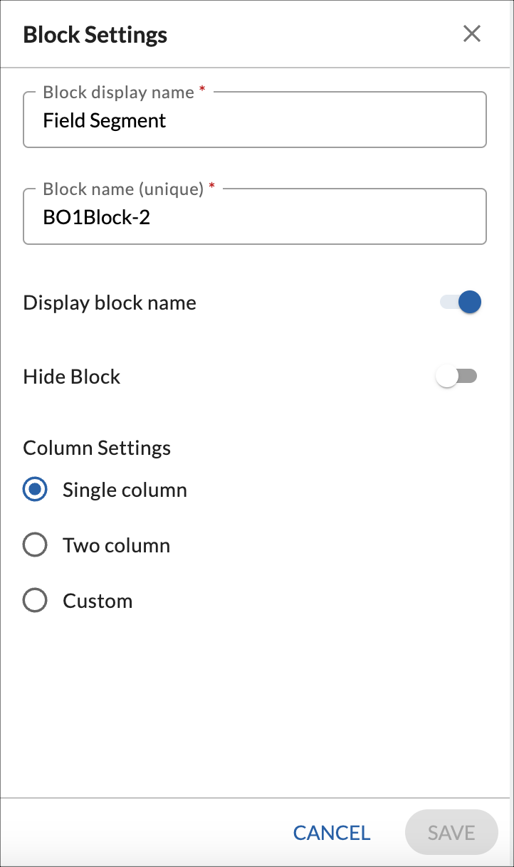
- When you drag and drop a field segment block you can access the settings for the same by clicking on the Settings icon.
- Field segment block settings include settings
- Block Name: Set the Name of the block that will be displayed to the end user.
- Block Unique Name Set a Unique name for the block which will be used internally by the system for referencing the field.
- Display Block Name: This property will display the Block Name. On disabling this property Block name that is set for the block would be hidden.
- Hide Block: By enabling this setting, the block will be hidden and fields inside it will no longer be accessible to end users.
- Column settings: The field segment can be configured as a Single Column, Two Column, or Custom. As the name suggests, in a single-column form, the fields are arranged in one column layout. In the two column form, the fields are arranged in two column layout and the custom layout form, have the flexibility to reposition fields and resize them to any width. This gives you the flexibility to design your forms in a way you visualize them.
- You can reposition the field segments in a form as per your business requirements.
Note: You can only create segments in the tab if it has no fields.
Adding Sub-blocks to a Form
A sub-block is a part or section in the form of logically related fields. It can have different types of field types or common fields in it. A form can have multiple sub-blocks in it each representing a business object. For example, a Purchase Order form can have multiple sub-blocks such as Order details, List of items, Shipping information, Payment information, etc. Each sub-block is treated as an independent object so that you can analyze them individually. These sub-blocks also appear as an independent work item in the Dashboard module so that you can plot charts on them to analyze their data.

A subblock can be of two types –
Data table
A data table sub-block is used to insert a list of items/ records in a form. It can have multiple columns of different types like Numbers, Single lines, Static drop-down, etc. If you have a list of records in your form with different data values like number, text, date, etc, then you can insert a data table sub-block in your form. You can also calculate the minimum, maximum, sum, and average on the number fields to summarize the values on all the rows. To do that, the sub-block should have the Summary Row enabled in it.

Field Segment
A field segment is a group of fields in the field segment format. It can have a group of different kinds of fields like text, number, URL, multi-line, formula field, lookup field, and master list fields.

Adding a Sub-block to a Form
To add a subblock in a form, perform the following steps –
- From the left pane drag and drop the Sub Block box to the space where you want to add the sub-block.

- Sub-block Details dialog box, specify the sub-block name.
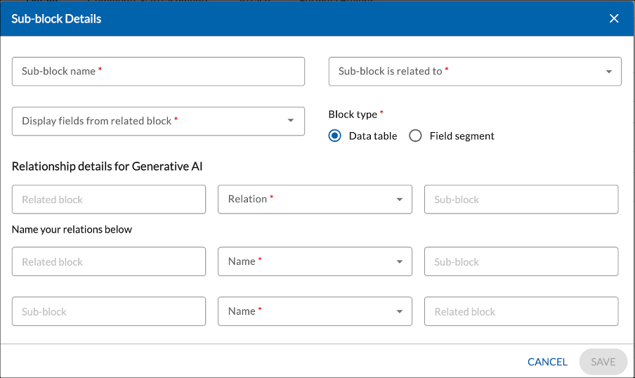
- Specify the field name to which this sub-block belongs. If you have not defined any field segments in the form till now, by default it belongs to the Primary Field Segment which contains the Name and the ID field. A sub-block can belong to the primary block as well as other sub-blocks. If a sub-block belongs to another sub-block which again belongs to a sub-block or main block then this creates a hierarchy of the blocks.
- Specify if you want to display the fields from the related field segment. It displays all the fields of the related sub-block. You can select the required fields from the list. For example, if the sub-block belongs to the primary field segment, you can select the fields that will be displayed in the sub-block.
- Select the block type as a Data table or Field segment. When you select field segment as the block type for a sub-block, then it is a sub-block with fields in it, just similar to the field segment block. When you select Data Table as the block type for the sub-block, then a tabular structure would be available to configure fields and store information
- Specify the required details to define the relationship for the Generative AI. This information helps AI in fetching the information to answer user queries in Nimble Assist. Relationships are majorly of two kinds.
Has one– By selecting this relationship between the primary block and the sub-bock we are establishing a one-to-one relationship. This means the single instance value present in the Sub-block is related to a single instance value available in the primary block.
Has many– By selecting this relationship between the primary block and the sub-bock we are establishing a one-to-many relationship. This means that the multiple instance values present in the Sub-block are related to a single instance value available in the primary block.
After defining the relationship from the primary block to the sub-block then we define a 2-way relationship for the Generative AI Use case.
Note: Gen AI Use case will be built in the future. Currently, we are just storing information on relationships. Its Practical usage for Generative AI will come in future releases.

- Click the Save button. Once the sub-block is saved, it appears in the form where you can configure fields in it.
- Depending upon the block type selected it would either display a sub-block of the field segment or a data table
- To add fields in the sub-block, click the sub-block. As you click, the field types and common fields get enabled in the left panel.
- Expand the required field type category and drag and drop the required field type to the space.
You can change the settings of a sub-block to meet your business requirements. To change the settings, hover over the sub-block and click the Settings icon. The Settings dialog box appears.
Settings of a Data Table sub-block
A data table sub-block has the following settings –
Display block name – Enable this toggle if you want to show the name of the sub-block on it. For example, if the name of the sub-block is Order Information, then disabling this toggle will not show the name of the sub-block on it.
Show pagination – Enable this toggle if you want to show the pagination in the data table subblock for the list of items.
Enable summary row – Enable this toggle if you want to enable the summary row for the list of items. The summary row can show the minimum, maximum, sum, and average of the number fields in the data table sub-block. To calculate the summary of the list of items, first enable the Summary Row option in the sub-block and then open the settings of the individual number field to select the appropriate function.
Block type – This option is already selected as the Data Table. However, you can select the Field Segment option to convert a data table sub-block into a field segment sub-block.
Relationship details for Generative AI – Provide the relationship details of the sub-block with the main block like one to one or one to many relationships.

Understanding Different Field Types
The form 2.0 has multiple field types available under many categories like Text/Number fields, Date fields, etc. The different options and settings available for these field types vary from one type to another. For example, the settings of a text field would be different from the settings of a date field. Below are the different field types available under each category. To know about these field types in detail, read here.
Text/Number Fields
| Fields | Description |
| Single Line | The single line field is used to store one-line information such as Name in a form. |
| Multi-Line | Multi-line fields are used to enter the description of an instance in the form. |
| Text Label | Text labels are used to give headers in the form to separate the sections. |
| Rich Text | Rick text fields are used to add text with formatting. You can also insert pictures and videos in the field if required. |
| URL | URL fields are used to store the URL of a webpage in a form. |
| Number | Number fields are used to store the numeric values in a form such as integer numbers, decimal numbers, Currency values, or Percentage values. Calculations can be done on such numeric fields. |

Date Fields
| Fields | Description |
| Date and Time | The Date and Time field is used to store date as well as time in a form. |
| Date | The date field is used to store only the date in a form. |

Selection Fields
| Fields | Description |
| Radio Group | Radio groups are used when we want the user to select only one option among the given options. |
| Decision Box | The decision box is a special case of the Checkbox group. It is used when we want users to select the check box which will act as a decision for the user. The decision box will always have one option associated with it |
| Static Dropdown | Static drop-downs are the lists that allow the user to select one value from the given list of values. Here options of the dropdown are pre-configured by the configurator |
| Checkbox Group | Checkbox Groups are used when we want users to select multiple options from the list provided in the form. |

Advanced Field Types
| Fields | Description |
| Master List | Forms 2.0 allows you to use system master lists in the fields of a form as drop-down. |
| Lookup | It allows you to use a field from an existing form to your form which acts as a lookup. |
| Formula | It allows you to define a formula on a field so that it automatically calculates the value in the field depending on the defined formula. For example, if you have two fields like Price and Quantity then you can define a third field amount which automatically calculates its value by multiplying the price and quantity of the items.
Similarly, you can use some basic functions in your formulas. To know more read here. |

Common Fields
The purpose of having a list of common fields in Forms 2.0 so that the configurator can use common fields across all forms. This will help to keep data consistent across forms. It is up to the configurator which of these Common fields s/he wants to enable for the form. These Common fields are editable which means once you insert them in your form, you can click the settings icon and define their settings as per your requirements. The following are the common fields available in Form 2.0 –
| Fields | Description |
| Due Date | Include this field to show the Due Date of the workitems. |
| Description | Include this field to show a detailed description of the workitem. |
| Estimate Hours | Include this field to enter the estimated hours of the workitems. |
| Priority | Include this field to show the priority of the workitems. It fetches its values from the Priority master list in the product. |
| Planned Start | Include this field to enter the Planned Start date of the workitems. The default date format is dd-mmm-yyyy. |
| Planned Finish | Include this field to enter the Planned Finish date of the workitems. The default date format is dd-mmm-yyyy. |
| Card Owner | Include this field to assign ownership of the work to a given team member. |
| Release | Include this field to select the releases from the Release menu of the project. |
| Sprint | Include this field to select the sprints from the Sprint menu of the project. |

Enabling Percent Complete Fields
You can enable a Percent Complete field in your form, helping you visualize and track progress of each instance of your corresponding card on the Work Hub. For example, if you have a form that records high priority tasks, you can track the task progress with a Percent Complete field.
- To enable Percent Complete fields in your Form 2.0, ensure it is selected as an option on the form configuration screen. It can be applied to existing forms as well.

- A Percent Complete form field will appear in your field segment after saving the form configuration. The values that can be entered in a Percent Complete field must be in percentage format only. You can configure Percent Complete in the field settings under the Preference tab.

- You can choose from the following preferences:

- Manual Percent Complete: This preference is suggested when it is difficult to evaluate the status of your card progress. For such scenarios, you can use this preference and manually enter the percent value in the Manual Percent Complete field of your form.
- Percentage of My Card ToDos Completed: This preference is suggested if completion of the ToDos of your card is important to track the status of your cards.
While accessing the listing for all instances created under a specific form, you can also add a Percent Complete column from Column settings for better visibility. You can learn more about how Percent Complete fields work here.
Note: The remaining Percent Complete preferences will be available in upcoming releases.
Viewing Percent Complete on Cards
You can view the value as well as the preference settings on the Percent Complete field even by hovering over the specific action icons on a card (that corresponds to the specific form instance) present in Work Hub and under the Linked Cards segment.
Configuring Fields in a Form
Steps to configure a field:
- Drag and drop the required field from the left panel to the field segment.

- Click the field. The Reposition, Settings, and Delete icons are enabled.
- Click the Settings icon. Depending upon the settings of the field type, Field settings vary by field type. To see the detailed information of every field type, click here.
- Settings of almost all fields are divided into 3 tabs which are Details, Validation, and Rules
- For the Details tab of the field property, you can set basic information like display label, help text, and specific format of the data. For example, if number field properties are getting accessed then properties like number format and number type would be available. In the case of the date, properties like the date format would be available to set
- For the Validation tab of the field property depending on the field type applicable validations should be available if it is a number field then it will have a character limit as one of the validation properties. Similarly, if it’s a date field then validation on date values like allow past dates, future dates, or all dates are available. Apart from this field-type-specific validation, there are also common validations like mandatory field, hide field, etc.
- In the Rules tab based on the field type configurator accesses the Rules Tab would be available. There are 3 kinds of Rules that one can define on the field level.
- Icon Decorator rule: This is available only for the number field. It displays Icons that are configured in the rule if the conditions are met.
- Font color decorator: With the help of this Rule configurator would be able to set the font color for the value of the field based on the condition mentioned in the rule
- Validation Rule: With the help of this rule configurator on the field can display a custom validation message.
Please note the above given are some basic validations which apply to most of the fields. However, the validations and the rules vary for field types. To read the Validations and Rules for all the Field Types, click here.
Adding Comments Block to a Form
The Comment block allows you to add and read comments in your form. The comment block must be of at least 8 columns and 7 rows to allow users to add comments using this block. If the comment block is less than 8 columns and 7 rows then you can only read the comments and can’t add new comments using this block. In that case, the user can add new comments using the Comments & Attachment section.
To configure a Comments section in the form, perform the following steps –
- Open the form in which you want to add the Comments segment.
- From the left panel, drag the Comments box to the required position.

- To reposition, click the Comments segment. The Reposition and the Delete icons are enabled. Click the Reposition icon and move it to the required location.
- By default, the size of the comment block is 5X5. Depending upon the size of the comment block end users would perform actions on the comment block
- When the comment block size is less than 8 columns and 7 rows, the end users cannot perform any actions on the comment block. The end users would not be allowed to Add, Edit, or Reply to the comment. It would be treated as a non-editable comment block.
- When the Comment block is of size greater than or equal to 8 columns and 7 rows then end users would be able to perform actions like Add, Edit, or Reply to the comment. It would be treated as an editable comment block
- To delete the Comments segment, click the Comments segment, and click the Delete icon.
Adding Attachment Segment to a Form
The Attachment block allows you to add attachments to a form. In the Attachment block, you can view the attachments, download attachments to your system, and delete them if required.
To configure an Attachment section in the form, perform the following steps –
- Open the form in which you want to add the Attachment segment.
- From the left panel, drag the Attachment box to the required position.

- To reposition, click the Attachment segment. The Reposition and the Delete icons are enabled. Click the Reposition icon and move it to the required location.
- By default, the size of the attachment block is 5 X 5. The configurator can resize the attachment block.
- To delete the Attachment segment, click the Attachment segment, and click the Delete icon.
Adding Tag Segment to a Form
The Tag segment allows you to add tags to the form. To configure a Tag section in the form, perform the following steps –
- Open the form in which you want to add the Tag segment.
- From the left panel, drag the Tag box to the required position.

- To reposition, click the Tag segment. The Reposition, and Delete icons are enabled. Click the Reposition icon and move it to the required location.

Once you configure a tag section in the form, open the form. Add the required tag in the tag section and press the ENTER key or the Spacebar key. A small box appears showing the multiple color icons to be assigned to the tag. Click the required color. The selected color is assigned to the tag.
Adding an Analytics Block to a Form
The Analytics block enables you to add plotted charts to a form. To configure an Analytics block, follow these steps:
- Open the form where you want to add the Analytics block.
- From the left panel, drag the Analytics block to the required position.
- To reposition the block, click on it. The Reposition, Settings, and Delete icons appear. Click the Reposition icon to move it to the desired location.
- Once the Analytics block is added:
- Click the Settings icon to open the properties panel.
- Configure the following settings:
- Display Label – Enter the name and unique Analytics name.
- Display Block Name: This property will display the Block Name. On disabling this property Block name that is set for the block would be hidden.
- Select Analytics – Choose a chart from the available project or organizational dashboards. This is a single-select dropdown.
- If you need to display multiple charts, add additional Analytics blocks to the form.
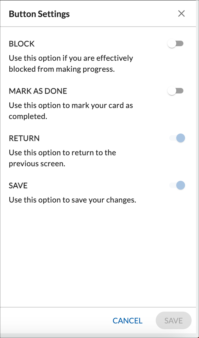
Configuring Buttons
After you define all the required block types in the form, you can configure the buttons that you want in the form. To configure the buttons, perform the following steps –
- Open the required form.
- Click the CONFIGURE BUTTONS at the bottom of the page. The Button Settings pop-up appears.
- Enable the toggle for the required buttons.
Previewing a Form
After you configure the required tabs, blocks, and buttons, in a form, you can preview it to see how the form will look before publishing. To preview the form, turn on the Preview toggle at the top of the page.

Publishing a Form
After completing your form configuration, you can publish it for end users. The published form appears in the menu you selected during creation. Click PUBLISH at the top of the page to make it live. Once published, the form always appears in the menu. If you make updates later, you must republish the form for the changes to reflect.
When working on a workitem created using Forms 2.0, you can see the profile pictures of users who are currently viewing or editing the same item.

Once the form is published, you can create its instances from the Form list view, Work Hub, and Nimble Cafe. You can also design the layout of the card in the Card Designer of the Work Hub so that you can see the required details of the card upfront on the Work Hub. It also gets available in the Analytics to plot widgets on it.
Deleting a Form in the Workitem Listing Level
When a form is created using Forms 2.0, you can manage its associated workitems directly from the Workitem Listing page. If you delete multiple form-based workitems, these cards/workitems are not permanently removed immediately. Instead, they are moved to the Data Purge section under Administration, acting as a temporary storage before permanent deletion.
- Navigate to the Workitem Listing page.
- Select the checkboxes next to the work items you want to delete.
- Click the Delete button.
- The selected items are removed from the list and moved to Administration > Data Purge.
These workitems remain in Data Purge until they are permanently deleted.
To learn more about the common features on the workitem listing page, click here.
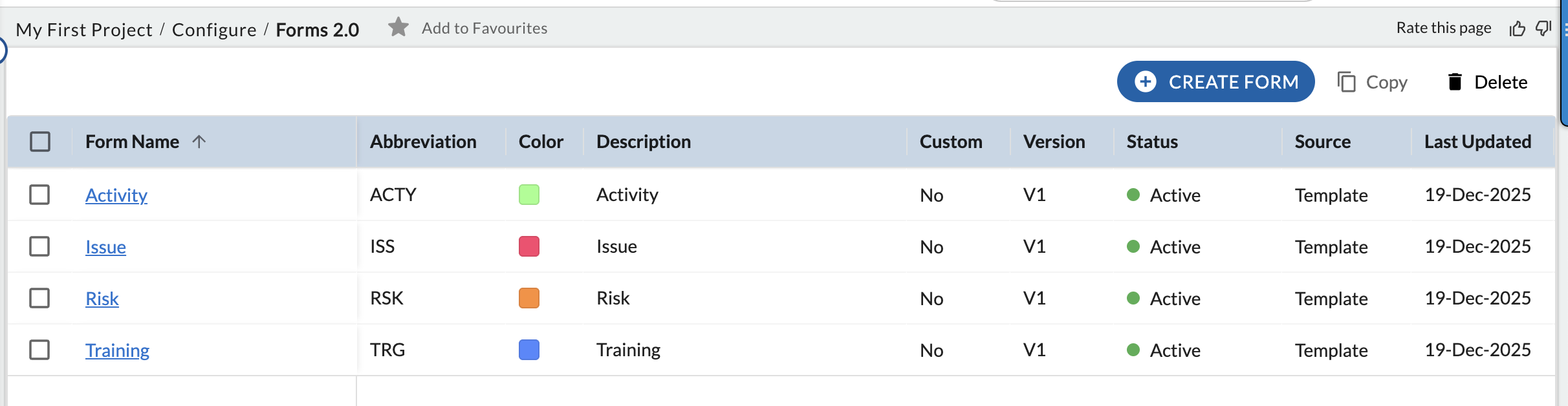
Forms 2.0 Listing
The Forms 2.0 listing provides a centralized view to create, publish, and manage forms within a project. A newly created form appears with the Draft status and Version V0. When published for the first time, the version changes to V1 and the status becomes Active. Each republish increments the version by one. If you edit a published form, its status changes to Active/Draft until the updates are published, after which it returns to Active with the updated version.
Each form is displayed as a row with essential details for quick identification and tracking. The Form Name can be selected to open the form for further configuration. Abbreviation and Color help visually distinguish forms when they are used across work items. The Description indicates the form’s purpose, while Custom shows whether the form is standard or custom. The Version, Status, Source, and Last Updated columns help you understand the form’s lifecycle, origin, and most recent changes.
The toolbar at the top of the listing allows you to perform key actions. You can create a new form using Create Form, copy an existing form using Copy to reuse its configuration, or delete a selected form using Delete. Deleting a form permanently removes it, subject to permissions and any existing dependencies.