
Start with the video first to get a better grasp of the topic!
|
Skip Ahead to:
|
Overview
Navigation
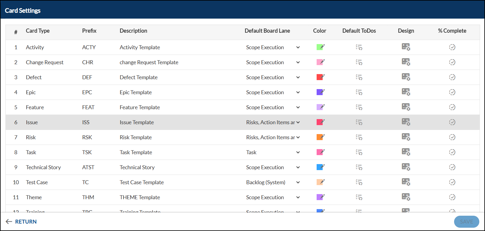
Navigate to the top breadcrumb, hover over the Project name, expand the Execute module, and select Work Hub.Then click More Options > Card Settings
Default Board Lane
The default board lane is the lane in which the card would be placed when it is created from the Work Hub.
- If set to None, no lane is selected, so a card created from the Work Hub will default to the first lane.
- If a Specific Lane is chosen, for example Story Grooming, new cards will be placed in that lane automatically.
Note: You can set the Default Board Lane of any card type as Backlog such that the newly added card types are directly added to the backlog system by default.
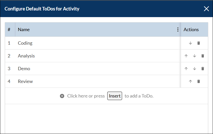
Setup Default ToDos
Team members working on a card can create a ToDo to manage their work that will help complete the card.
As a team, you can define a set of default ToDos for each card type, representing repetitive tasks. When a card is created, the ToDo list is automatically generated, and the owner only needs to update them.
You can add the default ToDos at the Process Template (PT) level or Project level.
Process Template Level
To add default ToDo(s) at the PT level, perform the following steps:
- To add default ToDos at the PT level, navigate to the Process Template and go to Execute > Work Hub.
- Click More Options > Card Settings > Default ToDos > Configure.
- The Default To-Dos pop-up will appear, where you can click the + icon to add a new To-Do, enter name, and save it.
- You can edit a To-Do by selecting it, renaming it, and saving, as well as delete it if needed.
- You can also move a To-Do up or down to change its order.
- After making changes, click Save and then choose PUBLISH or PUBLISH TO ALL based on your requirement.

PUBLISH: It updates the Default ToDos for the projects created from the PT where Default ToDos have not been modified at the project level.
For example, if a Development PT has Projects A and B, and you set default ToDos at the PT level, Project A may customize them while Project B keeps the PT-defined list. If you later update the ToDos in the Development PT and click PUBLISH, the changes apply only to Project B because Project A has its own customized ToDos.
PUBLISH TO ALL: It updates the Default ToDos for all the projects created from the PT.
So all the Default ToDos set at the project level are lost as they are overwritten by PT level ToDos.
As per the above example, using PUBLISH TO ALL will delete Project A’s customized ToDos and replace them with the ToDos from the Development PT. This means the default ToDos will be applied to both Projects A and B.
Project Level
The default ToDo(s) are added in the same way as mentioned for the PT level.
Note:
- If default ToDo(s) are set at PT level, they will be shown in the project level Default ToDo list. You can further Add or Modify the ToDos.
- Setting the Default ToDos at the project level will delink it from the PT level. So any changes applied in the Default ToDos of the PT level won’t be reflected unless PUBLISH TO ALL functionality is used.
Card Designer
Clicking the Card Designer icon opens the window where you can configure the attributes and icons to be shown on the card.
You can define the card layout by selecting the card attributes you prefer to track on the card and in the order, they should appear.
There are three sections in the Card Designer.
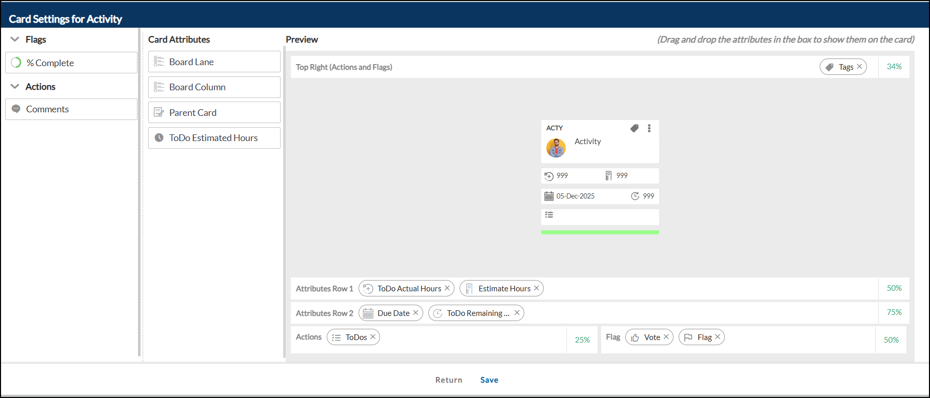
Note: By default, Block, comments, tags, and % Complete icons appear top-right, while Mind-map, ToDos, parent-child links, and attachments appear bottom-left.
Flag Icons
The Flag section lists all flags configured on a form. Flags appear on the right side of the last row of the card, up to four. To display a flag, drag it from the left panel to the Flag section below the card preview.
Flags stay in the position set in the preview. A mix of action items and flags, up to three, can also appear at the top of the card.
Note: If action items aren’t shown on the left of the last row, you can place flags there. For example, if two action slots are blank, they can hold two flags.

- Flag
- Vote
Team members can express their choice by voting on a card so that their feedback can be tracked. The number of votes can be tracked on the Votes field of the card.
- Block
If you are stuck for any reason while working on a card and effectively blocked from making progress, you can seek attention to it by blocking the card.

To block a card,
- Click the Block icon.
- In the popup window, select a Blocking Reason (optional) from the drop-down and enter a Blocking Comment (mandatory).
- Click ADD BLOCK while blocking a card. The Blocking reason and the Blocking comment will be seen in a tabular form.
Hovering over the Blocked icon on a card displays the blocking reason along with the user who blocked the card.
To Unblock, click the icon, enter a comment, and click Save.
Note: You will not be able to edit, move or create a spillover of a blocked card.
Action Items
Configured action items like Comments, Attachments, Linked Cards, To-Dos, Dependencies, Tags, and % Complete appear on the first left of the last row (up to 4 items). A mix of action items and up to 3 flags can also appear at the top.
Note: If flags are not shown on the right side of the last row of the card, then you can show their action items. For example, if two flags are shown there and the space of two flags is blank then that blank space can be used for 2 action items.
Card Attributes
The card attributes can be configured across two rows.
| Note: Card attributes with icons will be visible in the list. |
Drag and drop the attributes in the respective rows under the Preview section. The attributes will be shown in the same order as they have been configured in the row below the card.
Preview
You can get a preview of how the Detail view of a card type will look after you add or remove fields in the card type.
The sample card gives a preview, which refreshes automatically after every change. The changes are reflected when you return to the board.
Attributes Manager
- Card attributes can be customized across two rows, with up to four attributes per row depending on their data type.
- A field with Data Type String or Date occupies 50% of a row, while a Number field occupies 25%. Thus, a row can hold a maximum of two String/Date fields or four Number fields.
- By default, the card contains 6 attributes.
- To reorder, drag and drop an attribute between the desired fields.
% Complete
This option allows you to set the % Complete Preference for your card type. Learn more here.