
This article will familiarize you with the overview, configuration, and interpretation of the Bar Histogram chart.
|
Skip Ahead to: |
Overview
A bar histogram is a type of bar chart that is used to represent statistical information by way of bars to show the frequency distribution of continuous data.

Configuration
To plot a Bar Histogram using Analytics Builder, perform the following steps:
1. Open the Analytics page and click the Add Widget icon. The Analytics Builder appears.
2. Click the Bar Histogram chart. The Settings page appears.
3. Enter the given information in the Data Criteria and Dimension and Settings as per your requirements:
- Modify the widget name, if required.
Data Criteria
- Workitem Type – Select the required workitem types for which you want to plot the chart. A message is displayed on the screen if the selected workitem type has no data in it.
Note: If you select the My Workitem option, the Release, Sprint, and Task Plan options won’t be selected as they are dependent on the form’s execution. - Select workitem status – Select the workitem status such as All, Open, Closed, etc. for the workitem types.
- Create filter – You can create custom List views for viewing specific workitem groups using the Advanced Filter option. Create a filter where you can set a combination of filter criteria and then apply.
- Date Range – The Date Range section provides flexible options for selecting date-based criteria and ranges:
- Select Date Criteria: Use the dropdown menu to choose how data is fetched. Options include Created on, Closed on, and Last modified on.
- Select Date Range: Choose dynamic or custom date ranges to automatically display data based on the selected period. The options include – Custom dates ( Requires additional selection of Start Date and End Date), Current month, Current quarter, Current week, Current year and many more.
- If “Custom dates” is selected, two additional dropdowns will appear to specify the Start Date and End Date.
Note: For Organization Analytics and Personal Analytics, the Date Range section will only display Start Date and End Date options.
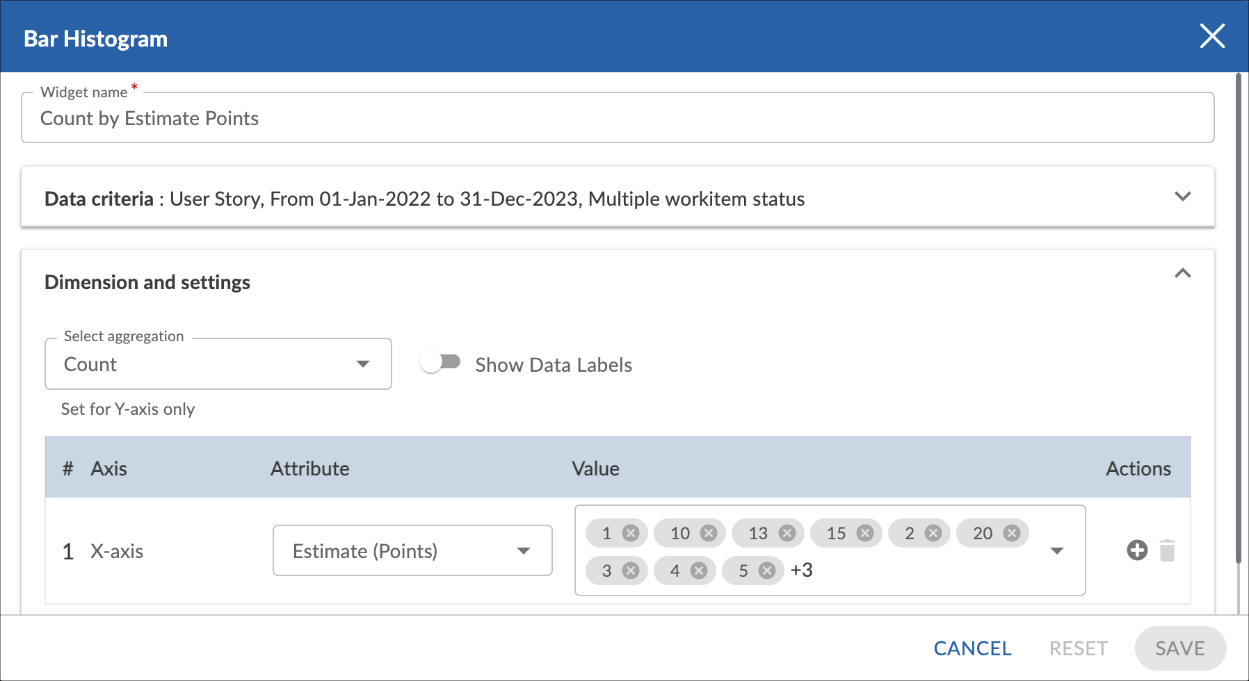
Dimension and Settings
Enable the Show Data Labels option to view the data labels/values on the chart.
Select the required aggregation and the attribute for each dimension you have selected. You can select one attribute (and its values) for each dimension. If you select a percent field, then you need to specify the minimum, maximum, and interval of the values.
You can plot a trend line on the widget. The trend line toggle gets enabled only if the release, sprint, or any other date dimension is selected at the X axis.
Note: You can only select one aggregation for each plot.
4. Click SAVE. The cart will be rendered as per the set metrics.
Interpretation
Like a bar chart, a bar histogram is made up of columns plotted on a graph. It has no space between adjacent columns. Here is how to read a histogram.
- The columns are positioned over a label that represents a continuous, quantitative variable.
- The column label can be a single value or a range of values.
- The height of the column indicates the size of the group defined by the column label.