
Start with the video first to get a better grasp of the topic!
|
Skip Ahead to: |
Overview
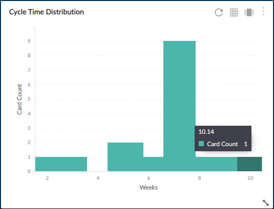
Cycle Time Distribution charts are histograms showing the frequency distribution of cards.
The distribution chart also enables you to view the troubled cards/exceptions. The number of cards or the percentages of cards that fall in ranges beyond the Upper Control Limit (UCL) is indicated as red bars. Check out the UCL calculation in the Cycle Time Control Chart section.
Configuration
To configure a Cycle Time Distribution Chart, perform the following steps –
1. Click the Add Widget icon on the Analytics page. The Analytics Builder appears.
2. Click the SKIP button at the bottom right of the Analytics Builder to see the Standard Widgets screen.
3. From the Lean Analytics section, click the Cycle Time Distribution Chart. The Settings page appears.
To plot the widget, specify the following information:
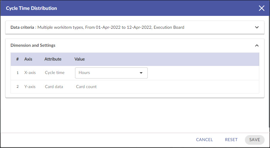
Data Criteria
-
Workitem type: Select the values based on your requirement.
-
Start Date and End Date: Select both these dates from the calendar to limit the scope of data.
-
Select Filter: Select or create a filter to apply on the specified data.
-
Lane: Select the lane from the list box for which you want to plot the chart.
-
From andTo Column: Select the exact stages for which you want to generate by defining the Start Column and End Column.
Dimensions and Settings
-
Y Axis (Card Data): Select the unit of measurement (Hours/Days/Weeks) for Cycle Time to be scaled on the Y-axis in the chart.
-
X Axis (Cycle Time): Snapshot of time (Daily, Weekly, Monthly, and Quarterly) for Analytics to be rolled up or unrolled on the X-axis of the chart.
Note: If you select the Time Period as Weekly, then the week is considered from Sunday to Saturday.
Interpretation
The frequency ranges are generated based on the actual Analytics (for example, average Cycle Time in the Cycle Time Distribution chart) rounded off to the nearest digit.
The height of the bars represents the count of cards/% of cards. On hovering over a bar, the tooltip displays the metric value and the count of cards / % of cards.
The red bar indicates outliers in the range i.e. cards that are beyond the UCL of the metric value. If there are multiple numbers of cards or the % is high, your process needs a change.