
Start with the video first to get a better grasp of the topic!
|
Skip Ahead to: |
Overview
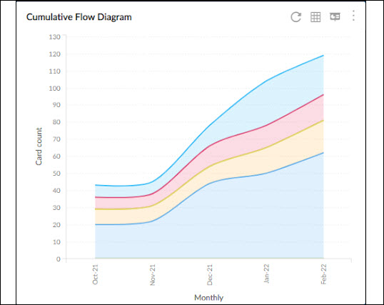
The Cumulative Flow diagram (CFD) provides a graphic depiction of how cards are moving through various statuses on the way to being ‘Done’. It shows us the total scope of a board, grouped by status, and thus lets us know how much of that scope is in a particular status at a given time. The CFD helps to track the performance of the board and how close you are to completing the board on a whole. It plots the distribution of cards in each state/column at a moment (date, calendar, week, month, and quarter) along the timeline.
Configuring the Chart
To configure a CFD chart, perform the following steps –
1. Click the Add Widget icon on the Analytics page. The Analytics Builder appears.
2. Click the SKIP button at the bottom right of the Analytics Builder to see the Standard Widgets screen.
3. From the Lean Analytics section, click the Cumulative Flow Diagram chart. The Settings page of the CFD chart appears.
To plot the CFD widget, specify the following information:
Data Criteria
-
Workitem type: Select the workitem type based on your requirement.
-
Start Date and End Date: Select a specific period, i.e. the Start Date and End Date from the calendar to limit the scope of chart data. View charts by selecting appropriate dates to analyze the recent performance of the team against the previous duration or the outcome of any process change. The chart considers cards that are lying in the chosen lanes/stages during that date range.
-
Select Filter: Select or create a filter to apply on the specified data.
-
Lane: Select the lane from the list box for which you want to plot the chart.
-
From andTo Column: Select the exact stages for which you want to generate by defining the Start Column and End Column. The charts consider all cards that exited the last column or have moved to or beyond Done column type and may or may not have entered the Start Column during the selected date range.
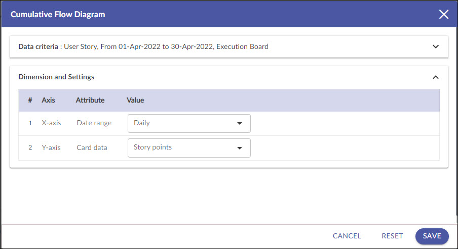
Dimensions and Settings
-
X Axis (Date Range): Snapshot of time (Daily, Weekly, Monthly, and Quarterly) for Analytics to be rolled up or unrolled on the X-axis of the chart. If you select the time unit as Weekly, then please remember that the week is considered from Sunday to Saturday.
-
Y Axis (Card Data): You can choose to plot the chart by ‘Card Count’ or ‘Story Points’ (provided you have Story Points entered for cards). Estimate entered for a Card can be interpreted as days/hours/story points (as selected by the enterprise).
Column Selection in CFD
The CFD has filter options to select the Backlog, Archive, and Board columns. Select specific child columns or Parent columns to roll-up child columns into parent columns.
To select Board columns for plotting the CFD:
1. Click Select Column in Column Selection.
2. In the Select Columns window, click the required column header to select. The check mark appearing indicates that the column is selected for calculation. To clear the selection, click the selected column again so that the check mark disappears. The selection is saved automatically.
3. Choose your own colors for the columns to avoid duplication and make it visually appealing, or even to highlight. Define the colors in the Board Editor by picking from the color palette. In the Select Column pop-up window, change the color of the column by clicking the color box at the right corner of the column, and selecting the color from the color picker box displayed.
4. Click the Back button at the bottom or Close icon at the top to close the window.
5. Click Apply to generate the CFD.
Visualizing the CFD diagram
On the CFD diagram generated, you can find typical information about the status of work on a particular day /week/month/quarter: how much work is done (‘Completed’ Column types), ongoing (‘In-Progress’ column types), and is in waiting (‘Backlog’ and ‘Ready’ column type). The vertical distance between two lines bounding a column is the WIP (# of cards) in that column at that point in time. Hover and rest your pointer on a vertical grid line to see the distribution of cards by count/estimates for different columns at a particular moment in the timeline plotted on X-axis.
Based on the overall pattern, you can also interpret what is the pace of progress; if the flow is consistently growing in parallel, then it should be OK. In the below image on 9th June, the ‘Ready for Deployment’ count is showing 26 from 20-April to 9th June. As you proceed to the next dates, you can see that the cards in the column have reduced steadily indicating progress. If the band widens it will indicate work piling up to be pulled.
The chart can also help you to spot all sorts of issues that a team may be facing: where the bottlenecks are in the workflow, work backing up at a particular status? If so, there is a bottleneck downstream of that status. This is where the Cumulative Flow Diagram shows its real value. You can decide to take no tasks further in the column, limit your WIP, avoid task-switching, or identify any bottlenecks in consecutive columns.
CFD Export
The CFD can be exported in Microsoft Excel format, along with the CFD data. Click the Export icon on the toolbar. You can open the file in Excel or your preferred spreadsheet application. If you have filtered the chart for a specific lane, column, date range, etc., the chart and the data will be exported for the specific cards.