
Introduction
Funnel charts show the graphical representation of how cards move across a swimlane on the Work Hub. The top layer of the chart shows the count/number of cards in the left-most column while the bottom layer shows the number of cards that have reached the right-most column through the swimlane. The downward shape of the funnel chart shows the decreasing number of cards from the left column to the right column. It represents how data moved through a process and have a decrease in its number.
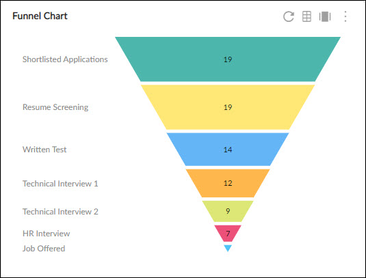
For example, the recruitment team can use the funnel chart to track how many candidates were approached for a job opening, how many of them got shortlisted, how many of them moved to the different stages of the interview, and finally how many of them grabbed the offer and joined.
Ideally, the number of cards should be decreasing from moving left to the right but if the count is not decreasing, then the chart won’t be plotted downward.
Configuring the Funnel Chart
To plot a Funnel chart, perform the following steps –
- Open the Analytics page and click the Add Widget icon. The Analytics Builder appears.
- Click the Funnel chart. The Settings page appears.>
- Enter the given information in the Data Criteria and Dimension and Settings as per your requirements.
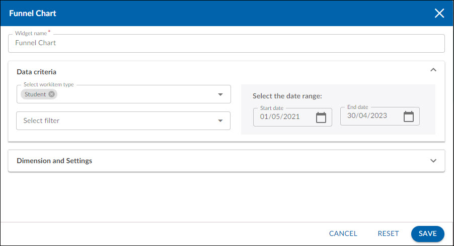
- Widget Name – Modify the widget name if required.
Data Criteria
- Select Workitem type – Select the workitem type for which you want to plot the chart. You can select any number of workitems for the chart. If the selected workitem type has no instances in it, a message is displayed on the screen.
Note: If you select the My Workitem option, the Release, Sprint, and Task Plan options won’t be selected as they are dependent on the form’s execution. - Select Filter – Select the filter that you want to apply to the workitems for the chart. You can also create a new filter.
- Date Range – Select the start date and the end date under the data criteria to plot the chart. By default, it loads the project start and end dates.
Dimensions and Settings
- Select aggregation – You can plot the chart based on the numeric field of the selected workitem type such as count, sum, percentage, etc.
- Display as – Select the Value, Percentage, or Both option depending upon how you want to show your data on the chart.
- Lane – Select the value stream which cards you want to plot on the chart. You can select any lane available on the Work Hub of that chart.
- From column and To column – Select the beginning and the ending column of the Bard lane which process/ flow you want to plot in the chart.
Interpreting the Chart
Each layer (starting from the top) in the chart represents a column on the selected lane. The percentage on these layers indicates the number of Cards available in those columns. As the cards move from the left to the right on the lane, the number keeps decreasing and so the Funnel chart is plotted downward.
If in some scenarios, the cards increase through the different stages of the process, then the chart is plotted in a different shape to notify the data is not following the right flow.
Best Use
A Funnel chart is best used in the recruitment process where a hiring manager can see the entire hiring process on the board and track their overall status like how many candidates appeared for the interview at the beginning and how many students moved to the next stages and how many of them finally made it to get the offer.