
This article will familiarize you with the overview, configuration, and interpretation of the Spider chart.
|
Skip Ahead to: |
Overview
The spider chart is used to compare values between data points on multiple attributes. Each attribute is a spoke, with value indicated by distance from the center. One polygon is traced for each data point. However, the value of the spider chart is often perceived based on polygon area, which depends on the order of attributes. It is suggested to use a parallel coordinate plot or multiple grouped bar charts to avoid this distortion.
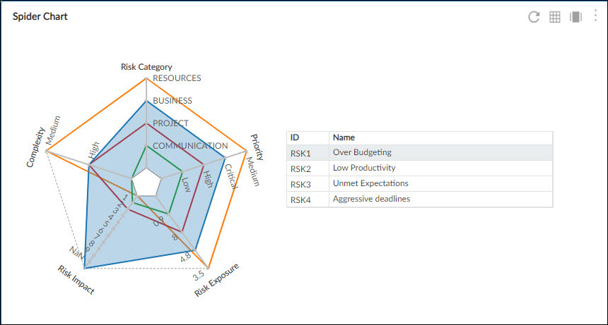
The Spider chart enable you to track performance based on its projects with respect to their goals, so that you can focus on those who are under-performing.
Configuration
To plot a Spider chart using Analytics Builder, perform the following steps –
1. Open the analytics page and click the Add Widget icon. The Analytics Builder appears.
2. Click the Spider Plot chart. The Settings page appears.
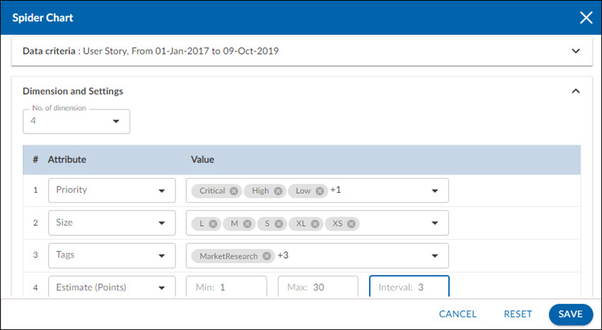
3. Enter the given information in the Data Criteria and Dimension and Settings as per your requirements
- Widget Name – Modify the widget name if required.
Data Criteria
- Select workitem type – Select the workitem type for which you want to plot the chart. You can select any number of workitems for a scatter chart. If the selected workitem type has no instances in it, a message is displayed on the screen.
Note: If you select the My Workitem option, the Release, Sprint, and Task Plan options won’t be selected as they are dependent on the form’s execution. - Select workitem status – Select the workitem status such as All, Open, Closed, etc. for the workitem types.
- Select workitem value – Select the workitem instances for which you want to plot your chart.
- Date Range – The Date Range section provides flexible options for selecting date-based criteria and ranges:
- Select Date Criteria: Use the dropdown menu to choose how data is fetched. Options include Created on, Closed on, and Last modified on.
- Select Date Range: Choose dynamic or custom date ranges to automatically display data based on the selected period. The options include – Custom dates ( Requires additional selection of Start Date and End Date), Current month, Current quarter, Current week, Current year and many more.
- If “Custom dates” is selected, two additional dropdowns will appear to specify the Start Date and End Date.
Note: For Organization Analytics and Personal Analytics, the Date Range section will only display Start Date and End Date options.
Dimensions and Settings
- No of Dimension – Select the number of dimensions you want to see in your chart. You can select at least 3 dimensions and can increase the number of dimensions to a maximum of up to 8.
Interpretation
The Spider chart consists of a sequence of equiangular spokes. Each spoke or dimension on the chart represents one attribute of the workitem. The Spider chart enables you to see the workitems with respect to the values of the attributes. For example, if one dimension is representing the Size attribute, then the different data points on the dimensions represent the different sizes like S, M, L, etc. Next to the chart, a table is shown with the workitem ID and their names. Hovering over a workitem (ID and name) highlights the values of that particular workitem in the chart.