
Start with the video first to get a better grasp of the topic!
|
Skip Ahead to: |
Overview
A value-added activity or work is something that directly adds value to a product or service that customers are ready to pay for them. For example, activities like coding software, providing 24 hours customer support for a service add direct value to the customers, and therefore they are willing to pay for them.
A non-value-added activity or work is something that may not necessarily add any direct value to the product or services and so customers may not pay for them. For example, training of employees is important in an organization, but it does not add any value to the customers directly and therefore can be called a non-value-added service.
Configuration
To plot a Value VS Non-value Added Trend, perform the following steps:
1. Open Analytics Builder and go to Standard Widgets. Click the Value VS Non-value Added Trend from the Agile Analytics group of metrics.
2. The Setting page appears where you can specify the settings for the widget:
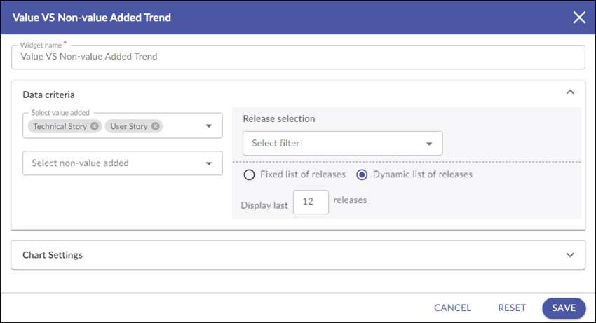
Widget name: Modify the name, if required.
Data Criteria
1. Select value added/ non-value added: Both the drop downs enlist the value added and non-value added workitem types for that project in their respective fields. Only the closed workitems of the selected releases are fetched.
Note 1: By default, user story is a value-added item, and bug and Adhoc work are non-value-added item.
Note 2: The default eForms will automatically change for this widget in the default Release Analytics page in the agile projects. Moreover, the change will also get reflected in the widgets which have been plotted already but no widget settings are made to make a selection of a workitem type.
2. Release selection: There are two ways to select the releases for plotting the chart.
Select filter: Open the Select filter drop-down and choose an existing item filter for your releases from the drop-down. You can also create an item filter by clicking the Add icon. Moreover, you can also modify an existing filter by clicking the Edit icon. The specified number of releases matching to the applied filter will be plotted in the widget.
a. Fixed list of releases: Select this option to choose specific releases from the given date range. To select specific releases, specify a date range in the From and To fields. All the releases whose start date falls between the given date range will be displayed. Select the releases that you want to plot in your widget. Note: Only past releases (releases with an end date earlier than the current date) are available for selection.
b. Dynamic list of releases: Click this option to dynamically plot the chart based on past releases (releases with an end date earlier than the current date). To select the dynamic releases, enter the number of the releases in the Release field. Note: You can select a maximum up to 99 releases. By default, the past 12 releases are selected.
Chart Settings
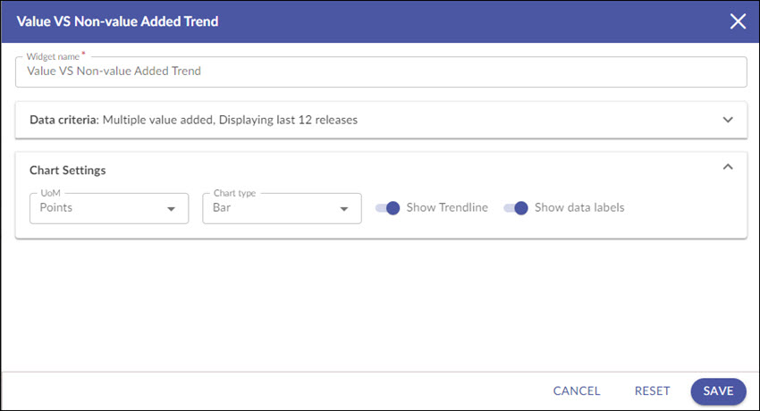
3. UoM: Select the unit of measurement as points or workitem count for the releases to be plotted.
4. Chart type: Select the chart type as a line or bar chart to plot the widget.
5. Show trend line: Select this option to show the trend based on the linear progression of the selected analytics.
6. Show data labels: Select this option to show the labels on the chart.
Interpretation
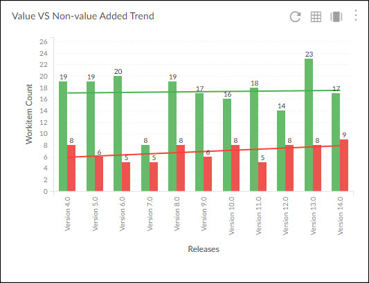
For each project, the names of releases are displayed on the X axis and the Estimates (Points)/ Workitem Count are shown on the Y axis.
The bar chart: The bar chart represents two bars (Business value and non-business value) for each release.
The green bar shows the total number of workitems counts or the sum of estimated points of those workitems that have been tagged as value added.
Similarly, the red bar shows the total number of workitems counts or the sum of estimated points of those workitems that have been tagged as non-value added.
Best Use
The value-added vs. non-value added trend helps you visualize how much time is being spent on billable (like testing and coding) and non-billable service (like meetings and training). It also helps you understand the trend of activities for past releases and get a visual indication of the distribution of the value-added and non-value added activities so that you can bring in the right balance between these two types of activities in your system.