What are Gantt Charts?
Project/ Work Management 101
Modern projects can span anywhere from several weeks, months, quarters, or even years. In this time, there will likely be numerous tasks and deliverables that the team needs to accomplish. It is vital for a project team to track every task over the course of a project to ensure that they’re making the right adjustments to meet their deadlines and achieve their goals.
To make tracking a project’s overall progress more convenient, a team can employ the use of a Gantt chart, a time-tested project management tool that’s been used for over a century. In this article, we’ll be taking a deeper look at Gantt charts and why they’re still used to this day.
What are Gantt charts?
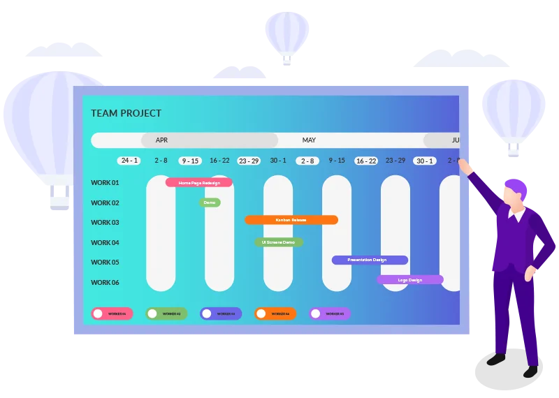
A Gantt chart is a tool that helps project managers and their teams visually track the progress and completion of each task within a project. Its main purpose is to provide an overview of a project’s various deliverables on a timeline, indicate what it’s Planned Start and Finish dates are, and track how long it takes for a task to be actually completed (with the Actual Start and Actual Finish dates). Gantt charts visualize this information, and in turn help project managers make informed decisions regarding adjustments to the project team.
Besides showing teams a list of tasks and their progress, Gantt charts also clearly visualize dependencies – as some tasks within a project can only begin after the completion of a related one. Defining the links from start to end of a project helps teams identify the critical path to success which then helps them deliver the most amount of work in the least amount of time.
Gantt charts have been used for over a century, but the Gantt charts that teams use today are far from what they were originally. Let’s take a look at how they’ve changed over the years.
History of Gantt charts
The Gantt chart is named after an American mechanical engineer and management consultant, Henry Gantt. Gantt had the idea to use charts to track the progress of projects. A key distinction between the first Gantt charts and their modern iteration is that the first ones used full bars instead of boxes. While this allowed him to use Gantt charts much like we do today, they had to be redrawn completely after every change. This made original Gantt charts unwieldy and time-consuming to use, in spite of their benefits.
Sometime after Gantt’s passing in 1915, Gantt charts were changed to be more efficient to use. Teams started using blocks, shading them over the course of the project rather than drawing and shading a full bar. This change also meant that the charts no longer had to be completely redrawn after minor adjustments.
When personal computers and the internet started becoming more accessible, Gantt charts, as well as other project management tools, began shifting away from physical charts to digital versions. Today, Gantt charts are used almost exclusively through software applications.
Parts of a Gantt chart
Schedule/timeline
Each of these days or weeks is represented by a block, which is then shaded depending on whether the corresponding task was being completed during that time. For example, if a task takes three days to complete, it will take three shaded blocks on the Gantt chart. These blocks are what make Gantt chart a useful tool for tracking not just how long a task is being worked on, but from when and until when it was being worked on as well.
Gantt chart progress bars also have “planned” and “actual” parts to each bar. This can help teams compare their planned estimates to how things are actually going in the execution phase. This can help teams identify what unforeseen problems they faced during execution that were not accounted for during the planning phase–and strategize means to remedy these issues.
When there are dependencies between two tasks, the predecessor’s bar would end right where the following task begins. This feature of Gantt charts is what allows teams to track dependencies relative to the progress of their preceding tasks.
Gantt Charts are, by their very design, predictive and are best suited for projects where many requirements such as timeline and scope are already declared upfront. A Gantt chart is supposed to be able to track the progress of a project’s various tasks within a given time frame, such as three weeks or a quarter.
This makes Gantt charts the preferred method of progress tracking for traditional project management and industries that utilize such methodologies, such as manufacturing and construction.
When it comes to Agile projects, Gantt charts take a different role. Not every Agile project begins with a specific timeframe, as some projects can begin without the team knowing how many weeks or months it will take to complete–or even be supported after a given time. This makes plotting out the tasks of an Agile project onto a Gantt chart almost impossible.
Instead, Gantt charts are used at a higher-level, managing multiple smaller Agile projects and their key milestones rather than tracking individual tasks. Similarly, there are situations where a team should and shouldn’t use a Gantt chart–which we can identify by looking at their advantages and limitations.
Advantages of Gantt charts
One of the main benefits of using a Gantt chart is that they provide a high-level visualization of a project’s overall progress. This is useful for a handful of reasons.
One benefit of providing such a view is that it visualizes a project’s overall progress. This creates transparency within the project team by making delays visible. This then allows the project team to strategize potential adjustments to help a project meet deadlines.
Additionally, it boosts motivation within a team when they see that their project is on schedule. Teams that feel they’re doing good work usually tend to keep the momentum, culminating in a successful project delivery if managed properly.
Another key benefit that Gantt charts provide is they provide clarity on how various tasks are related and dependent on each other. While dependencies can easily be managed individually, it becomes much more complicated when managing dozens upon dozens of them within a project.
A Gantt chart gives project managers a visualization of these dependencies which then enables them to strategize the most optimal flow of work. By doing so, the project manager increases the team’s chances of success.
As an overview of an overall project, Gantt charts can be used to provide information both within a project team and with external stakeholders.
Internally, this helps the team stay on the same page by keeping track of how the project is progressing. This helps teams understand the progress on their current task, and how much left they must do, as well as monitoring the progress of their any concurrent tasks.
Externally, Gantt charts can be used to provide updates to stakeholders. As higher-level stakeholders tend to not be overly involved in projects, comprehensive yet simple to understand visualization tools, such as Gantt charts, can be helpful in providing important information. Additionally, Gantt charts can also be used to help set expectations and deadlines with the project’s stakeholders.
Limitations of Gantt charts
Perhaps the biggest limitation of Gantt charts for modern teams is that they are best used in projects where there is an upfront plan, with specific start and end dates set in stone. While this is the norm for certain projects and within specific industries, this is no longer the case for every project.
Many modern teams use Agile methodologies, especially in software development and IT functions, which don’t typically use highly-detailed upfront plans. As a result, Gantt charts simply cannot be used in Agile environments, if at all, because they require a specific timespan.
That is not to say that Gantt charts have no place in Agile. Instead, they are used for a different purpose in these kinds of environments. Instead of giving a detailed view of deliverables, they can be used to give a high-level view of a project, allowing teams to monitor a project’s overall progress rather than track that of specific tasks.
Gantt charts tell a story, but alone, they don’t tell the whole story. As the purpose of a Gantt chart is to show how much time has been spent on specific tasks, other information such as amount of work required as well as costs incurred aren’t part of what a Gantt chart is supposed to show.
While the length of a task’s progress bar may be indicative of the amount of resources used for it, this isn’t always the case. At times, a task can have a relatively short progress bar spanning only one or two blocks while still being costly. Other times, a task can span days or weeks yet require only minimal resources. In this regard, Gantt charts are inherently flawed.
While this specific flaw can be somewhat remedied through the use of software, Gantt charts aren’t designed for large-scale, long-term, and complex projects with over a hundred different tasks to be completed, such as a DevOps transformation.
Having too many tasks in a Gantt chart makes it difficult to create, update, and understand. Gantt charts are valuable tools because of their inherent simplicity and ability to depict a project’s progress at a glance. When one is overly complicated with too many tasks, some of that value is lost.
When to use a Gantt chart?
To summarize, Gantt charts are a great tracking tool for when project teams need a simple visualization for how their project is progressing. Teams should use a Gantt chart when they are delivering projects using traditional project management methodologies, such as Waterfall, as these would provide all the information necessary for them to be created.
The bird’s eye perspective can also be invaluable for both project teams and their stakeholders. It allows anyone to see how a project is progressing, and if there are any adjustments that can be made to improve the overall delivery of the project.
The Gantt chart is not the be-all-end-all of project management tools–in fact, there is no such thing. However, it is still a valuable tool that every project manager should know how to use. Most project managers, and especially executives, still like to have a “timeline view” of where a project and its tasks are in terms of timeline and completion status. Whether it is a full program or project, or a product Release or a Program Increment (PI) in a scaled agile context, people would like to see a timeline view – essentially a Gantt view of both the high level phases/ tracks as well as the detailed tasks, milestones and dependencies.
Nimble Enterprise and SwiftKanban tools have a variety of tools – including a “roadmapping” timeline view for Agile teams, and a full function tasks plus Gantt chart capability for more traditional projects – that can help you and your team in the delivery of any type of work or projects. If you are interested, you may request a demo here.
Recent Blog Posts


