What is a Burndown Chart? Guide for Agile Teams
- 5 mins read
-
By Marjan Venema
- Updated on May 30, 2024
Overview
In the world of project management, burndown charts have emerged as a powerful visual tool for tracking progress and monitoring remaining work. As a critical component of Agile methodologies like Scrum, burndown charts provide teams with a clear and concise way to visualize their progress over time, enabling them to identify potential roadblocks and make informed decisions throughout the project lifecycle.
What is a Burndown Chart?
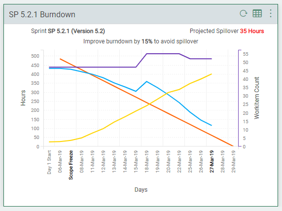
A burndown chart is a graphical representation that displays the amount of work remaining over a specific period, typically a sprint or release cycle. It plots the remaining work or effort (usually measured in story points or ideal hours) against time, allowing teams to track their progress and determine whether they are on track to complete their planned work within the allotted timeframe.
There are two main types of burndown charts:
Task Burndown Chart: Tracks the completion of individual tasks or user stories within a single sprint or iteration.
Release/Sprint Burndown Chart: Provides an overview of the remaining work across multiple sprints or releases, helping teams monitor their overall progress toward a larger project goal.
How Do You Read a Burndown Chart? What Does It Tell You?
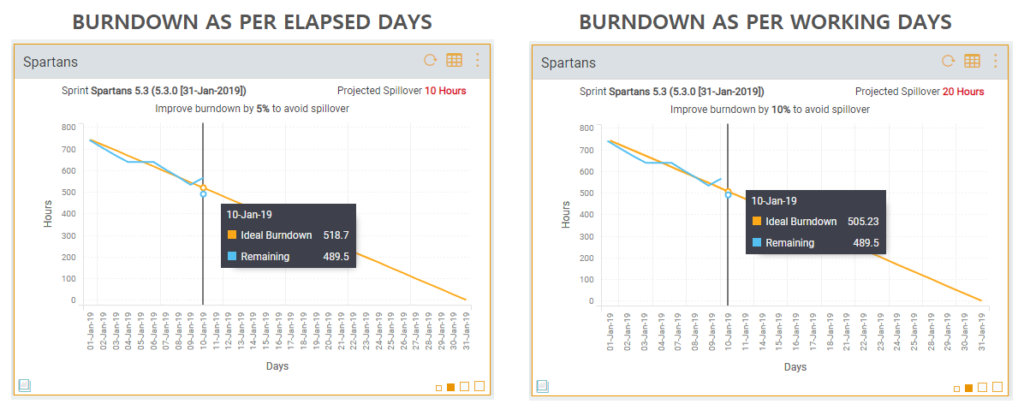
A burndown chart is a simple visualization of how work progresses. It tells you in a single glance whether actual remaining work (the vertical bars) is ahead (below) or behind (above) the ideal work remaining line (the straight line).
That ideal work remaining line assumes that you complete work at the same pace all the time. That’s not likely to happen and it would be better named the average work remaining line.
Purpose and Benefits of Using Burndown Charts
Burndown charts originated in Scrum. Ken Schwaber created them as a simple way to show teams their progress in a Sprint.
Even so, burndown charts are not just for Scrum teams. You can use them just as well with Kanban, Lean, or XP (eXtreme Programming).
Burndown charts serve several crucial purposes in Agile project management:
1. Tracking Progress and Remaining Work: By visualizing the remaining work over time, burndown charts enable teams to quickly assess their progress and identify any deviations from their planned trajectory.
2. Identifying Potential Delays or Scope Creep: If the actual burndown line diverges significantly from the ideal line, it may indicate potential delays, scope creep, or other issues that require attention and corrective action.
3. Improving Transparency and Team Communication: Burndown charts provide a shared understanding of the project’s status among team members, stakeholders, and managers, fostering transparency and facilitating effective communication.
4. Supporting Data-Driven Decision-Making: By providing a clear representation of progress and remaining work, burndown charts empower teams to make informed decisions based on objective data rather than subjective assumptions.
And you can use them to visualize progress for any scope of work. So, for:
-
Scrum Sprints or iterations in general
-
Epics.
-
Releases.
-
Projects.
Why Is a Burndown Chart Important? Or: What Do You Get Out of It?
A burndown chart shows you the reality of how work is progressing. No more guesses needed. Obviously, this is only the case if you keep the data feeding your burndown chart up to date.
A burndown chart keeps everyone in the picture and involved with progress or lack thereof. This works best if you display it on an information radiator, for example a large monitor in a place where it’s in everyone’s face.
A burndown chart helps you spot slower than expected progress. So you can identify and deal with what’s causing it before it gets out of hand and becomes a problem.
A burndown chart is easy to understand. Its simplicity makes it a highly effective progress tracker.
The limitations of a burndown chart, or what it doesn’t tell you. Being nice and simple, burndown charts also have some limitations you want to be aware of.
Burndown charts are focused on their little piece of the pie and you won’t get any indication of scope changes in the rest of the pie. For example if you’re looking at a Sprint burndown, you won’t see scope changes in the rest of the backlog. The only burndown that has the complete picture is the project, or product, burndown.
Burndown charts only show the amount of work. They don’t show which user stories have been completed or whether those were the right stories to complete.
The usefulness of burndown charts is directly related to the accuracy of your estimates. Time estimates are notoriously inaccurate. Humans simply have too many cognitive biases for accurate time estimates. Story points are better as they are about complexity and relative sizing. But estimating anything remains fraught with biases.
Burndown charts don’t tell you the reason for an increase in remaining work. It can come from adding work or increasing the remaining estimate of existing work. They also hide the effect of removing work, because it looks like work completed.
You can mitigate this limitation by also showing work completed and work added. For release burndowns also showing removed work is a good idea. These refinements make scope changes easy to spot.
You can mitigate this limitation by also showing work completed and work added. For release burndowns also showing removed work is a good idea. These refinements make scope changes easy to spot.
While a burndown chart can alert you to ice cream and soda or trouble in paradise, they can’t predict when an epic will be complete. That depends on your decision in which iterations to include the epic’s stories.
The average work remaining line shows the delivery date (day) for the initial workload. But when you regularly work slower or faster than that average, the delivery date becomes inaccurate. And scope changes throw a real spanner in the works.
To mitigate this, add an average work remaining line from the last completed iteration. And base it on the average velocity realized to date. Optionally you can also add work remaining lines for the lowest and the highest realized velocity. That’ll give you an “earliest” and a “latest” projection.
Fire up Your Progress Tracking With a Burndown Chart
Now that you know what a burndown chart is and what it does and doesn’t tell you, it’s time to transform your knowledge into action.
Order that large monitor — it’ll take some time to arrive. Then find the burndown charts in your Scrum or Kanban board software. And set up something simple to show them on that monitor. That big beautiful information radiator that’ll keep everyone in the loop.
Just imagine how you, actually the whole team, will be better able to deal with issues as they arise instead of when they’ve become problems. And what that’ll do for your stress levels.
Take your Agile project management to new heights with Nimble’s powerful sprint burndown chart functionality. Gain real-time visibility into your team’s progress, optimize workflows, and drive successful outcomes with our user-friendly platform. Signup for a free trial of Nimble.
Share the Knowledge
About Author:
Marjan Venema
Simplifying Project Management!
Explore Nimble! Take a FREE 30 Day Trial
PM 101
What Is a Statement of Work in Project Management?
A Statement of Work (SoW) is a formal document that comprehensively outlines the specifics of a project. It serves as a definitive guide, detailing the project’s objectives, deliverables, scope, timelines, and the roles and responsibilities of all parties involved.
What are Stakeholders? Definition, Types, and Importance in Business
Understand stakeholders in business: their roles, importance, and management strategies. Learn how to effectively engage stakeholders and use tools like Nimble to boost project success.
Discover what defines a project, its key characteristics, and lifecycle stages. Learn how effective project management drives organizational success and explore modern tools for streamlined project execution.
What Is Task Management? Strategies for Time Management, Organization, and Workflow Efficiency
Master task management strategies to boost productivity and efficiency. This guide covers planning, prioritization, time optimization, workflow streamlining, and overcoming procrastination for successful project delivery.
What is an Action Plan? A Guide to Creating Effective Project Goals – (With Examples)
Learn how to create and implement effective action plans to boost project management and personal productivity. Discover key components, practical uses, and best practices for achieving your goals.
What Is Project Portfolio Management (PPM)? A Short Guide
Discover the essentials of Project Portfolio Management (PPM), an approach to managing projects and programs within teams, departments, or organizations by taking a strategic portfolio approach.
A Gantt chart is a tool that helps project managers and their teams visually track the progress and completion of each task within a project.
What is Sprint Planning? How to do Effective Sprint Planning?
Sprint Planning is the process of planning the scope and other related aspects of a Sprint. Sprint Planning is done before the start of a Sprint in what is known as a Sprint Planning meeting.

