Kanban systems provide organizations some simple but powerful metrics that can be directly correlated to business benefits. Metrics in Kanban focus on measuring “time to value” or “time to market” and using these measures for continuous improvement generates direct business value.
Some of the key Kanban metrics are covered below – SwiftKanban provides all of these and more!
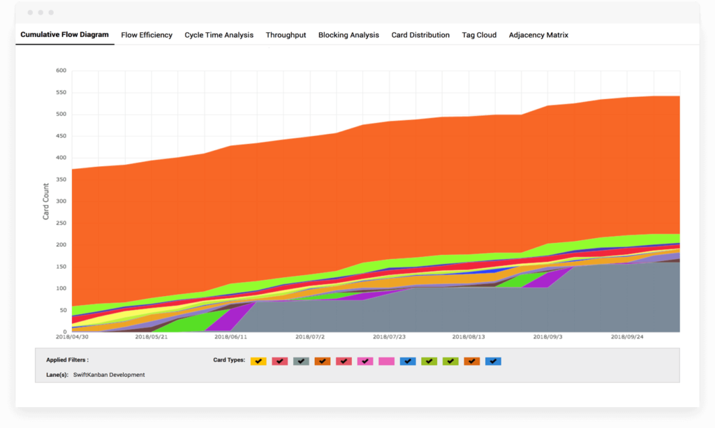
Cumulative Flow Diagram (CFD) is a simple yet powerful metric that provides you rich information about your system/ team capability at a glance.
The CFD is a time-based plot of the cards as they move from the left to the right on a Kanban board. As cards start from the Ready queue or column, the CFD plots the number of cards at each stage of the Kanban workflow or value stream. Typically, CFDs get plotted on a daily basis – but for faster moving boards, you could even plot them on an hourly basis.
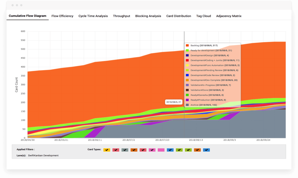
The various color bands indicate the different stages of the workflow. The height of each band at any point of time indicates the number of cards in that stage at that point in time.
The topmost band is typically the “Backlog” where work items originate and the bottom band is the archived or completed cards (the archive is the ‘bin’ where cards are ‘stored’ when completed. On a physical board, you might have an envelope or a tray where you keep completed cards. In a virtual Kanban system like SwiftKanban, they simply get ‘closed’ and move off the board into an ‘archived’ status.
Collectively, the CFD tells you how many cards moved into and out of each stage per unit of time, and cumulatively, how many cards traversed the board and got done. The slope of the CFD is an indicator of what your Kanban system’s throughput is – the higher the slope, the greater the throughput, throughput being the number of cards delivered per unit of time.
A CFD is a rich source of information on your team’s performance and provides you with the following insights:
Overall, the CFD gives you a comprehensive picture of your Kanban system’s delivery capability. Given that most teams work on a mix of different types of work items, and have a mix of skills and experience in its people, the CFD gives you a composite picture of what a particular team can do, and use that to predict what it can deliver in the future.
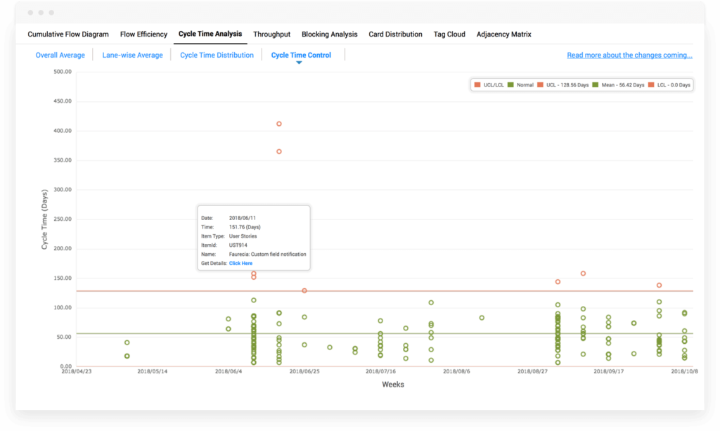
Every process varies. If you sign your name five times, they will look similar, but no two signatures will be exactly alike. There is an inherent variation, but it varies between predictable limits. When you are signing your name if you get bumped, you get an unusual variation due to what is called a “special cause”.
There’s also “common cause” variation. Consider a Tennis player. If he has good control, most of his serves are going to be where he wants them. There will be some variation, but not too much. If he does not have control, his serves are not going where he wants them; there’s more variation. Here there are no special causes – no wind, no change of ball – just more “common cause” variation. This results in loss of the service and easy points for the opposition and may cost him the game – expensive! Likewise, in most processes, reducing common cause variation saves money.
Control charts help visualize this variation. Control charts have the following information:
When a process is in control, since data is normally distributed, 99.7% of the data will fall within the +/- 3-sigma control limits. When data points fall outside of this control limit, the analysis is done to identify and eliminate data due to “special causes”. Then by further process improvement even common cause variation can be reduced. This leads to substantial business benefits, especially in terms of the team’s or system’s predictability and its ability to make reliable commitments about its service delivery.
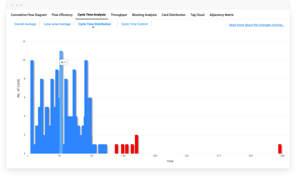
The Lead Time distribution chart is a frequency distribution chart of how often do cards get completed at various values of lead time or cycle time.
If you have played the getKanban game in a Kanban training, you will have plotted this chart. This gives you a great visual insight into how likely you are to finish any given work item in a certain amount of time.
Looking at the chart above, you might say with an 80-90% confidence factor that any work you get can be done in no more than 10 days (assuming the time unit on the chart is days). That is to say that 80-90% of all your work gets done in that much time – so, you have reason to believe that any new work that comes along should get done within that time as well, with the 80-90% confidence.
In SwiftKanban, it shows you the normal distribution and the outliers, as calculated based on the +/- 3-Sigma spread around the mean.
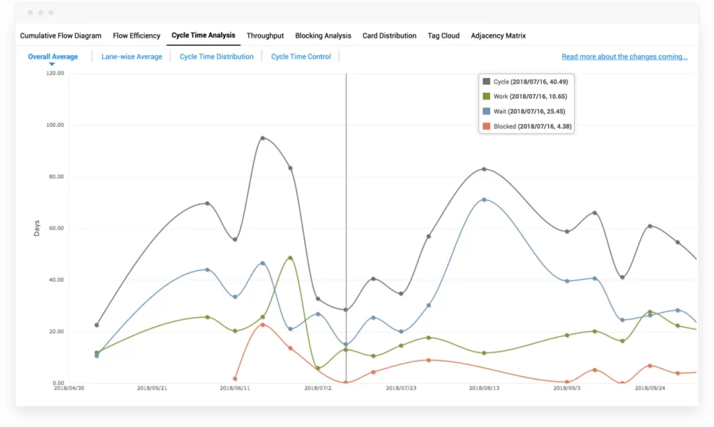
The average cycle time chart gives you exactly what it implies in its name – the average cycle time trend over any given period of time. While working with averages is not the best way to make predictions about any specific item or a set of items (such as user stories in a sprint or release), it serves to give you a useful insight of its trend over a period of time.
Looking at the chart, you can immediately understand whether cycle time is increasing (bad) or decreasing (good!). Using a combination of the three different cycle time charts, your team can quickly catch such trends and make process adjustments to ensure that cycle time does not increase.
Cycle time of any card is the total time the card spends on the board – which is the total of all Work times (when the card is being worked on) and all Wait times (when the card is either waiting to be pulled from the initial Ready column – or in one of the intermediate Done columns, waiting for handoff to a team member who will pull that card to the next stage. Average Cycle Time, is the average of cycle times of all cards completed during any given time period.
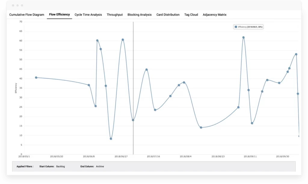
The flow efficiency chart is an amazingly insightful chart that highlights the critical impact of wait stages in your Kanban system. Most of us don’t realize this that all of the workflows or value streams with a number of wait stages – which might be handoffs between stages or wait caused by external resource dependency or waiting due to customer or vendor input.
As explained in this excellent write-up on Flow Efficiency by Julia Wester, wait stages contribute tremendously to Cycle Time and Flow Efficiency, which is the ratio of Work time/ Cycle Time (or Work Time/ (Work Time + Wait Time)), is impacted inversely by it. The more your wait times, the lower your Flow Efficiency.
As evinced in research presented by many in the Kanban community, including Hakan Forss, even some of the best teams see a flow efficiency of no more than 25% to 40%. This means that 60 – 85% of the time, work is waiting for someone to pull it, or for some external input (dependency on the customer, another team, a vendor, etc.)!
Kanban systems enable this measurement very easily – and give you tremendous insight into your system’s Flow Efficiency and help you figure out how you can improve it!
One of the key aspects of Kanban systems is to improve flow in your work process. Using tools such as WIP Limits and visual cues such as Blockers (blocked cards) and WIP Limit violations, a Kanban system highlights to you various impediments to flow in your system.
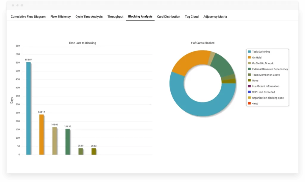
A Blocker Clustering chart helps you highlight some of the root causes of why cards may be getting blocked on a Kanban board – and help you deal with those root causes.
SwiftKanban provides you a couple of charts that help you understand just how often are cards getting blocked – and how much is it impacting you in terms of time lost due to blocking.
The longer cards are blocked, the longer the cycle time and lower the flow efficiency. Blocker Analysis can help your team discuss how to reduce blocking and improve cycle time performance and flow efficiency.
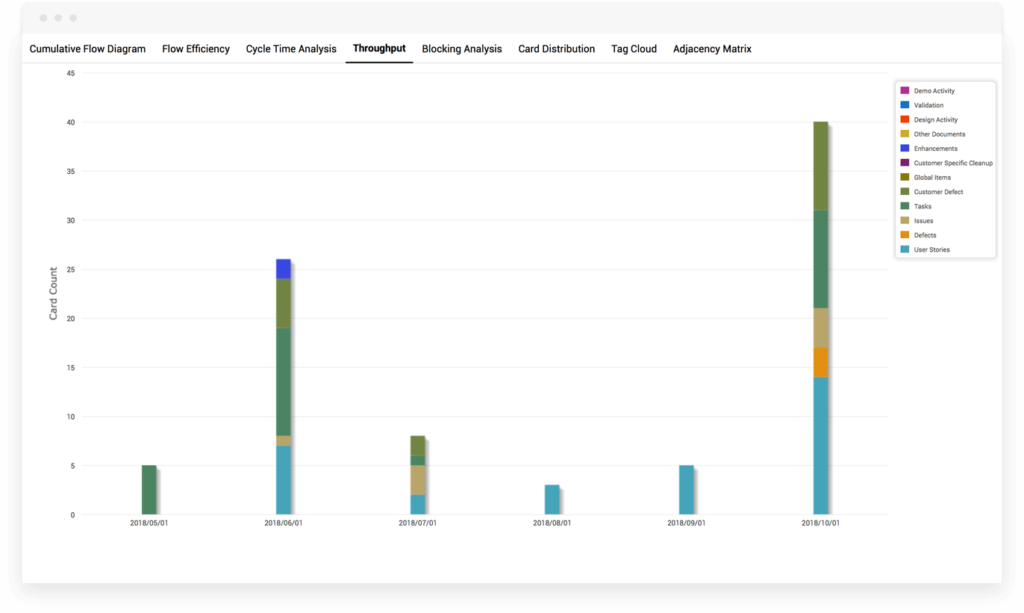
Another chart that provides a detailed insight into your Kanban system’s delivery capability is the Throughput chart. Throughput is the number of cards delivered per time unit or per delivery ‘bucket’ such as a sprint or a release.
This is another excellent chart that helps you understand your team’s capability and make appropriate commitments to your customers about how much work can your team deliver in a given sprint or release or in a given amount of time.


