
In this article, we will help you understand capacity in ESP Analytics.
|
Skip Ahead to: |
Overview
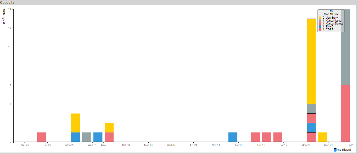
It is a series of stacked bar charts showing the capacity over time based on the historical data of cards exiting the selected region of the value stream.
A card that exits forward to the right (downstream), or is archived is considered to have completed the journey through the selected region successfully and is included in the calculation of capacity.
Applying Filters
You can apply filters based on card attributes and the value stream stages to refine your data for the analytics. Moreover, the time range for the analytics can also be adjusted using the Temporal Range Filter. Read more about them here.
Calculation Logic for Capacity
Cards exiting the selected region of the value chain within the Temporal Range form the basis of capacity analysis. We begin with the set of cards that exit the region successfully. This set is filtered based on the filter selections. Then it is grouped by the Time unit specified in the filter setting. Each time unit group (bar) is further sub-grouped by the attribute specified in the Color by filter. Finally, these groups are rendered on a time axis where each bar represents the number of cards exiting the selected region in that time period and the colors represent different types of cards as per color by selection.
A card may exit the selected region of the value chain in the following manner:
- Forward: The card moves across the selected value chain region boundary to the region on the right (or is archived).
- Back: The card moves across the selected value chain region boundary to the region on the left or to the backlog (not shown in the value chain).
- Deleted: The card is discarded or aborted. That is, the card is removed from the selected value chain region.
- Other: The card is moved from the value chain being analyzed to some other value chain not presently being analyzed.
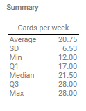
Summary
The Summary section shows the average number of cards exiting the selected region of the value chain for a week. The data is shown in various statistical ways like Average, Min, Median, Max, Standard Deviation, and Quartile values (Q1 and Q2).
Card Distribution
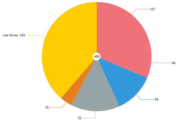
The pie chart shows the breakdown of all cards exiting the selected region of the value stream by the Color by attribute of the card like Card Type, Class of Service, Size, and so on for the time interval selected in the Temporal Range Filter.
Calculation Logic for the Card Distribution
Cards exiting the selected region of the value stream in the time range selected using the Temporal Range filter form the basis for demand distribution analysis. These cards are filtered based on the filter selection. The filtered set is then grouped by the Color by attribute and shown as segments of the pie chart. The total number of cards is shown in the center of the pie.
Capacity Histogram
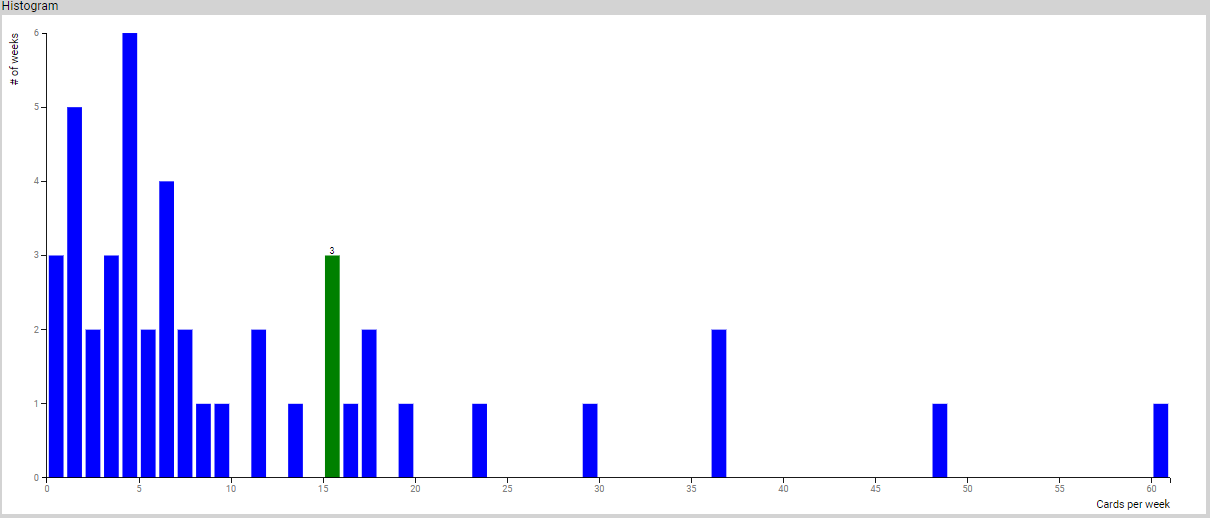
The x-axis represents the capacity, i.e., the number of cards exiting the selected region of the value stream per time unit, and the y-axis represents the number of time units for a given unit time capacity.
Calculation Logic for Capacity Histogram
Cards exiting the selected region of the value stream form the basis of Capacity analysis. We begin with the set of cards that exit the region. This set is filtered based on the filter selections. Then it is grouped by the number of cards (exited the value stream) per Time Unit specified in the filter setting. Finally, these groups are rendered on the x-axis where each bar represents the number of Time Units when those groups of cards exited the selected region of the value stream.