
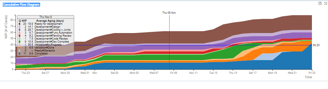
The Cumulative Flow Diagram (CFD) provides a graphical representation of how the work is moving through the system, helping stabilize the system, act upon bottlenecks and control the scope of work. It is a simple, yet very informative tool that depicts the work in progress (WIP), entry rate, exit rate, lead time, throughput, elapsed time, completed, remaining, and total scope of work.
Applying Filters
You can apply filters based on card attributes and the value stream stages to refine your data for the analytics. Moreover, the time range for the analytics can also be adjusted using the Temporal Range Filter. Read more about them here.
Calculation Logic for CFD Chart
The CFD is a stacked area chart. The lowermost region represents the cumulative count of the cards that have been completed, i.e., have moved from the selected region forward to the right, have entered the “Done” column, have been Archived, or moved to some other swim lane. All other regions represent the WIP of columns stacked top to bottom in order of their position in the selected region. The CFD for each day is calculated by recording the WIP of each column at the end of the day, along with the number of cards completed on that day.
The tool-tip on the CFD chart shows the WIP as well as average aging (the average time the cards have spent in the column) for each queue for the given day.
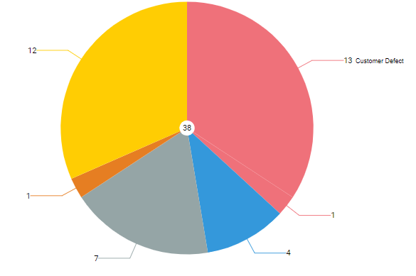
Demand Distribution
The pie chart shows the breakdown of all cards entering the selected region of the value stream by the Color by attribute of the card like Card Type, Class of Service, Size and so on for the time interval selected in the Temporal Range Filter.
Calculation Logic for the Demand Distribution
Cards entering the selected region of the value chain in the time range selected using Temporal Range filter form the basis for demand distribution analysis. These cards are filtered based on the filter selection. The filtered set is then grouped by the Color by attribute and shown as segments of the pie chart. The total number of cards is shown in the center of the pie.
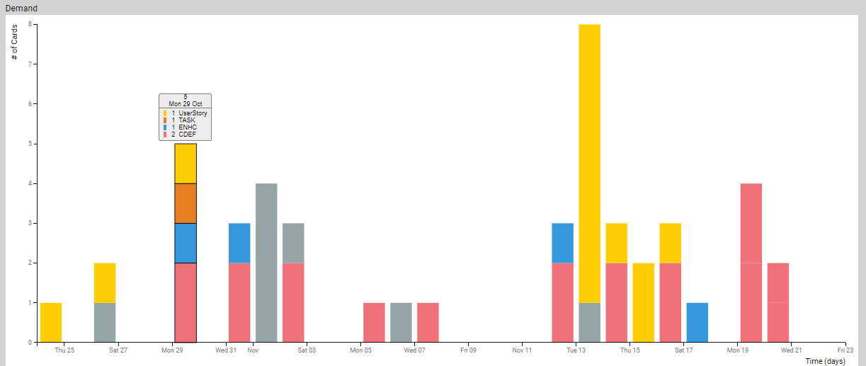
Demand
The stacked Bar chart of count of number of cards entering the selected region grouped by Time unit selected in the filter. Each bar is further color coded by the card attribute selected in the Color by filter. For example, if the Time unit is week and Color by is Card Type, each bar is further sub-divided by the card type attribute where the height of each color region corresponds to the number of cards with given type.
Calculation Logic for Demand Stacked Bar
Cards entering the selected region of the value stream form the basis of demand analysis. We begin with the set of cards that enter the region. This set is filtered based on the filter selections. Then it is grouped by the Time unit specified in the filter setting. Each time unit group (bar) is further sub-grouped by the attribute specified in the Color by filter like sub-group by card type or card size. Finally, these groups are rendered on a time-axis where each bar represents the number of cards entering the selected region in that time period and the colors represent different types of cards as per the Color by selection in the Filter.
Capacity
It is a series of the stacked bar chart showing the capacity over time based on the historical data of cards exiting the selected region of the value stream.
Calculation Logic for Capacity
Cards exiting the selected region of the value chain within the Temporal Range selected form the basis of capacity analysis. We begin with the set of cards that exit the region. This set is filtered based on the filter selections. Then it is grouped by the Time unit specified in the filter setting. Each time unit group (bar) is further sub-grouped by the attribute specified in the Color by filter. Finally, these groups are rendered on a time-axis where each bar represents the number of cards exiting the selected region in that time period and the colors represent different types of cards as per color by selection.
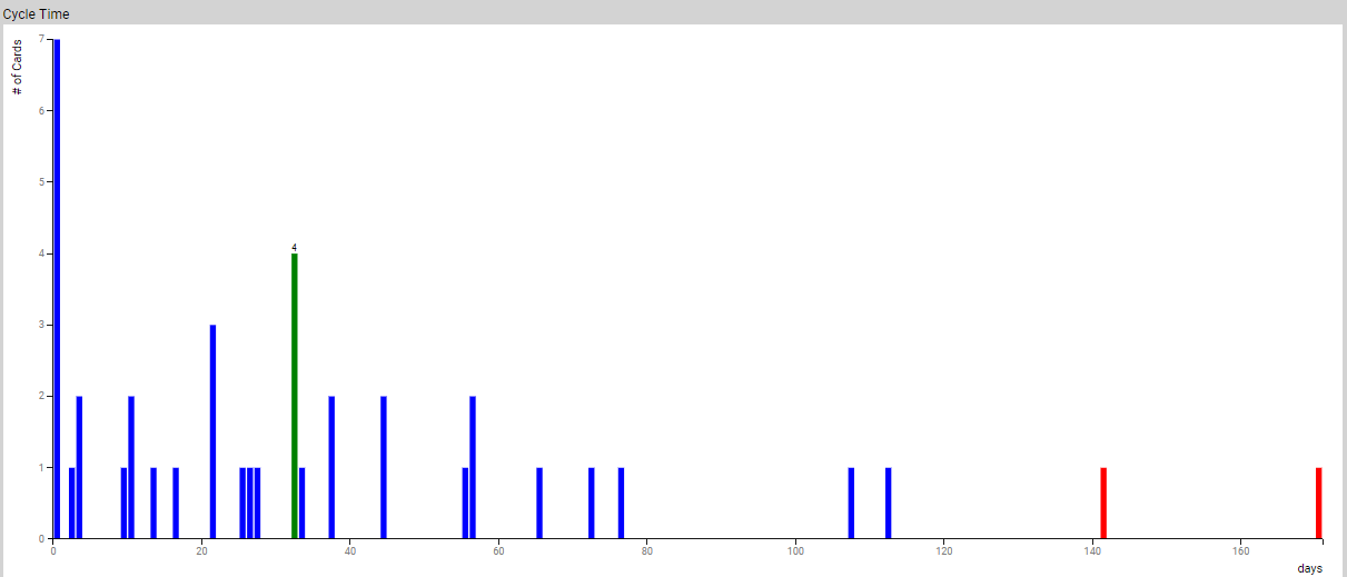
Cycle TIme
It is the histogram of cycle time where the x-axis is the cycle time, and y-axis represents the number of cards that have cycle time that falls within the time-bucket representing the width of the bar. The outliers are colored in red.
Calculation Logic for Cycle Time
Cards that exit the selected region of the value stream during the time interval selected in the Temporal Range Filter, pass the filtering criteria and have entry time defined form the basis for cycle time calculation. These cards are grouped into Time unit wide buckets based on their cycle time to form the histogram. Cards that fall outside the box-and-wiser plot are considered to be outliers and are colored in red.