
In this article, we will help you understand the Abort and Discard Analytics
|
Skip Ahead to: |
Overview
One of the core properties of Kanban is to measure and manage the flow. The success of flow is greatly influenced by the movement of the work, which needs to be fast and smooth. But, we often fail to achieve that momentum due to the waste generated by the system.
In a typical Kanban scenario, waste is created when the Kanban cards were added to the board, moved along the Kanban value stream, but discarded out of board without completing the lifecycle.
So, in an Upstream Kanban, where you typically manage and evaluate ideas or requests before it reaches the commitment point, any card gets deleted is termed as Discarded. When a card after being evaluated and committed at the planning stage moves to the actual execution board, or the Downstream Kanban, and then gets deleted, it is referred to as Abort.
Once you identify the “upstream” and “downstream” sections of your board (assuming both of them are in the same Board) and start discarding or aborting cards, depending on whether they are in the upstream section of the board or in the downstream section, you are ready to view how you are managing the waste via the Discard and Abort Analytics.
Both the actions, Discard and Abort, generate waste in the effort, time, or system liquidity, which are captured and analyzed using the Discard and Abort Analytics. Once you identify and measure them using the following two analytics, you will be able to better manage your waste and remove them gradually.
We have a very interesting and insightful blog on the Upstream Kanban. If you are interested to explore more about it, read here.
Discard Analytics
The Discard Analytics is interpreted both in the Discard Rate and Reason Code format.
To access the Discard Analytics, navigate to the Main menu and select the Analytics option. On the Analytics page, navigate to the Discard Analytics widget.
Settings Filter for Discard Analytics
On the Discard Analytics wizard, click the Filter![]() icon. Set the filter options:
icon. Set the filter options:
- Time Period: Snapshot of time (Daily, Weekly, Monthly, Quarterly, and Yearly) for the discarded cards to be rolled on the X-axis of the chart.
Note: If you select the Time Period as Weekly, then please remember that the week is considered from Sunday to Saturday.
- Start and End Date: Select both these dates from the calendar to limit the scope of data.
- Card Type: Select the required attribute values based on which you want to plot the chart.
- Lane: Select the lanes from the list box for which you want to plot the chart.
- Start and End Column: Select the exact stage for which you want to generate by defining the Start column and End column.
- Plot Chart By: Render your chart based on the Discard Rate, which shows the number of cards discarded. You can also select the Include completed cards checkbox to compare the discard rate as against the cards that have successfully moved beyond the Upstream column or been archived.
Alternatively, you can also select the Reason Code to render the bar chart based on various Reason Codes used while discarding cards.
Interpreting Discard Analytics
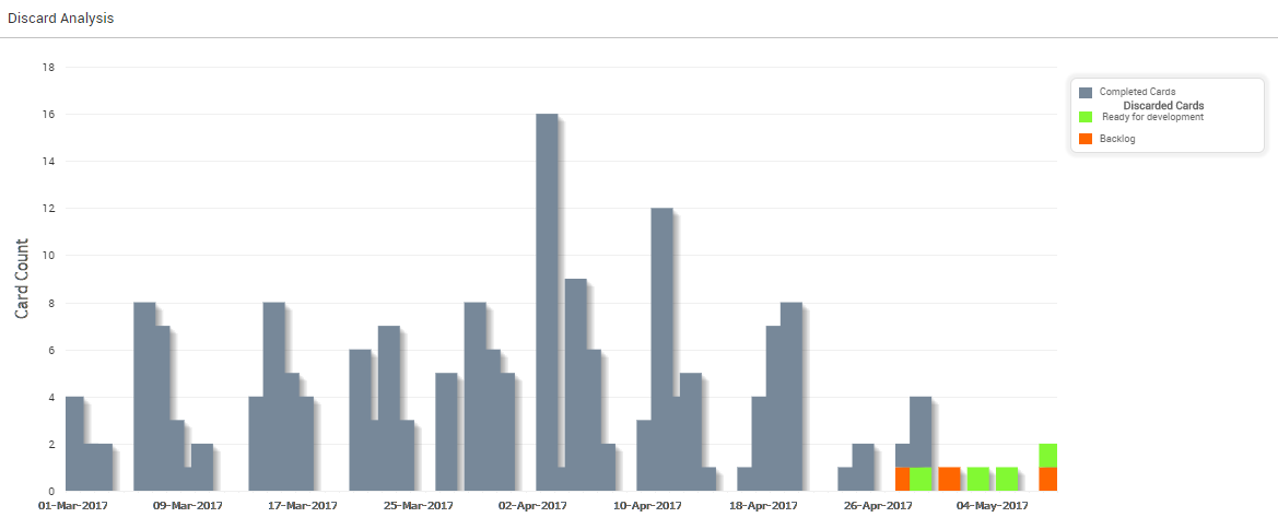
Discard Rate
The following diagram by Discard Rate shows the bar chart based on the number of discarded cards against the completed cards. The gray bar shows the completed cards, whereas green and orange colors represent the number of discarded cards at two different upstream columns.
Discard by Reason Code
The following diagram of Discard Analysis by Reason Code shows the distribution of cards based on the Reason Code being chosen while discarding cards at the upstream column.

Abort Analytics
To access the Abort Analytics, navigate to the Main menu and select the Analytics option. On the Analytics page, navigate to Abort Analytics.
Settings Filter for Abort Analytics
On the Abort Analytics wizard, click the Filter icon. Set the filter options:
- Time Period: Snapshot of time (Daily, Weekly, Monthly, Quarterly, and Yearly) for the aborted cards to be rolled on the X-axis of the chart.
Note: If you select the time unit as Weekly, then please remember that the week is considered from Sunday to Saturday.
- Start and End Date: Select both these dates from the calendar to limit the scope of data.
- Card Type: Select the required attribute values based on which you want to plot the chart.
- Lane: Select the lanes from the list box for which you want to plot the chart.
- Start and End Column: Select the exact stage for which you want to generate by defining the Start column and End column.
- Plot Chart By: Render your chart based on the following parameters:
o Abort Rate, which shows the number of cards aborted. You can also select the Include completed cards check box to compare the abort rate against the cards that have successfully been completed and archived in the Downstream columns.
o You can also select the Reason Code to render the bar chart based on various Reason Codes used while aborting cards.
o The Abort chart by Effort indicates the (work and wait) time spent on those cards before being aborted.
Once you select the Effort, you need to set the representation of it in Cycle Time (work and wait time) or To-Do (sub-tasks of the aborted cards).
Interpreting Abort Analytics
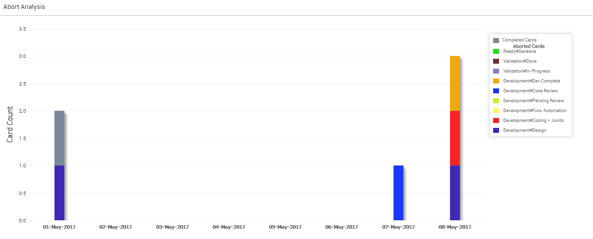
Abort Rate
The following diagram shows the Abort Rate. The stacked bar displays the number of cards aborted at various stages of the development during the selected time range.
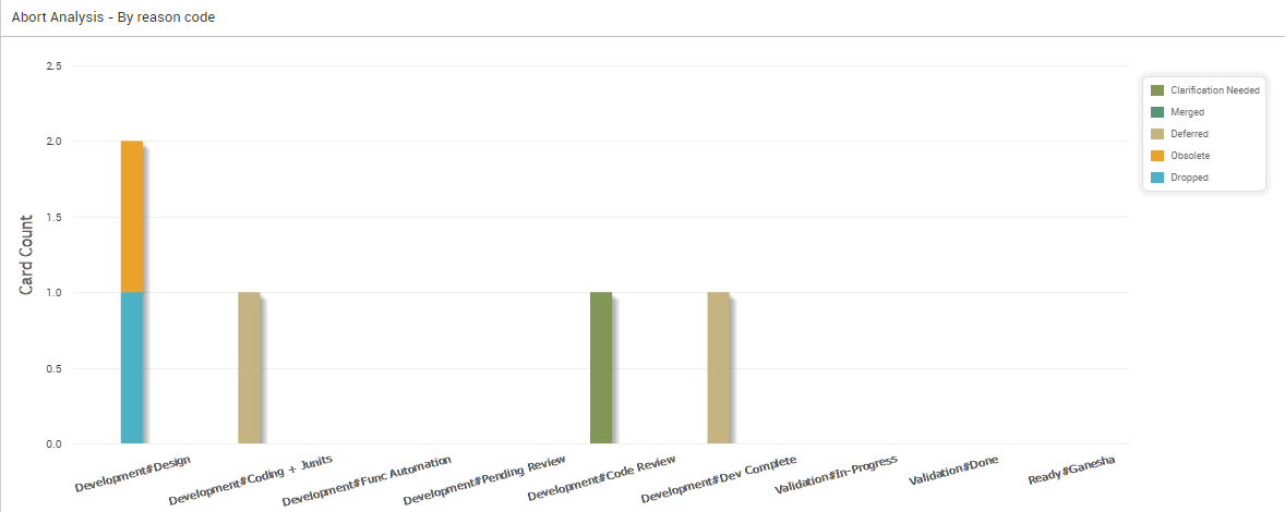
Abort by Reason Code
The following diagram shows the Abort Analytics by Reason Code. The stacked bar displays the number of cards aborted at various stages of the development, where each color on the bar represents a reason code.
Abort by Effort
The following diagram plots the Abort analytics by effort, where colors on the bar represent work time and wait time.
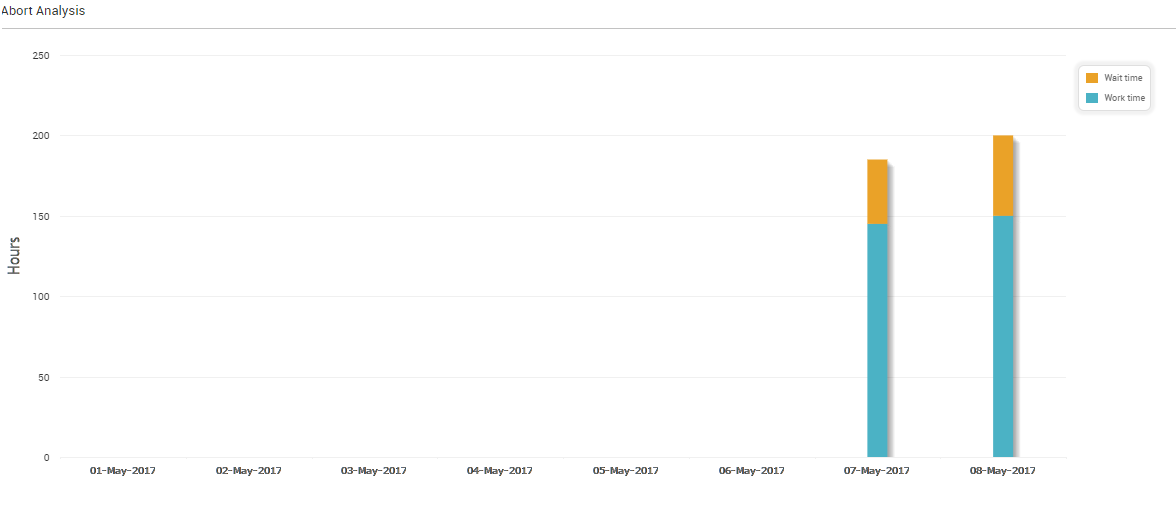
To better understand the Abort by Effort analytics, it is important to know what is work time and wait time.
Work Time = (Time spent by a card in the ‘In-Progress’ column types) – (The time the card was blocked in these columns)
Work Time represents the time a bug/feature was worked upon. On a SwiftKanban board, it means the time spent in a column of type, ‘In-Progress’. Average Work Time metric reflects the actual time spent on work-items eliminating the time spent on waiting to be pulled in the next “Working” column and the blocked time. The Work Time is a measure to analyze your team’s productivity.
Wait Time = (Time spent by a card in the ‘Ready’, and ‘Completed’ Column Type) – (The time the card was blocked in these columns)
Wait time is computed as the time any card was lying idle waiting to be pulled in the next “Working” column. On a SwiftKanban board, it means the time spent in a column of type, ‘Ready’ and ‘Completed’. It represents the time a bug/feature was waiting to be pulled from the previous column.