
In this article, we will help you understand the Analytics Features.
|
Skip Ahead to: Customize Your Analytics Widgets View |
Overview
By tracking the key analytics, the product helps you to measure the flow and find blockages and wastage. The analytics can help you gain greater insight into your processes and help you make improvements.
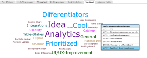
Tag Cloud
|
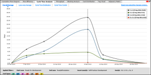
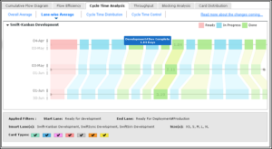
Cycle Time Average
|
Cycle Time Column wise Average |
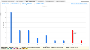
Cycle Time Distribution
|
Cycle Time – Control
|
Throughput Card Count/Card Estimates
|
Card Distribution
|
Blocking Analysis
|
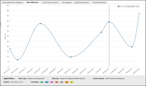
Flow Efficiency
|
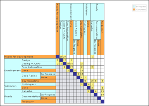
Adjacency Matrix
|
Navigating to Analytics
To generate the charts and analytics, click the Main menu and select Analytics. All the Analytics widgets, by default, are displayed on the page.
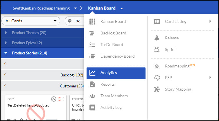
You can use the top menu bar of the Analytics page to perform the following tasks:
- Settings: Use this icon to select the widgets that you want to view on the Analytics page. To know more about it, read the Customize Your Analytics Widget View section here.
- Save Layout: Use this option to save the layout after you change the settings or reposition the widget.
- Common Filter: Use this option when you want to apply common Filter criteria to all the widgets. Read more about it in the Selection of Filters section here.
- View Sample Analytics – Use this icon to see the sample widgets for all the Analytics pages. To know more about the sample Analytics, read here.
Exploring Analytics Widgets
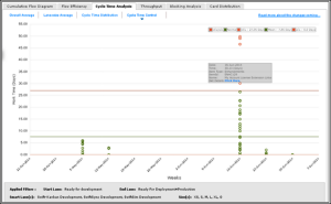
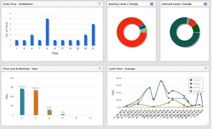
- Cycle Time:
- Overall Average: Displays the Cycle Time, Wait Time, Work Time, and Blocked Time in a single view. By including Backlog lane in filters, view the Lead Time.
- Column-wise Average: shows a comparative column-wise trend of cycle time.
- Cycle-Time Distribution shows the histogram of card distribution in different ranges of Cycle Time.
- Cycle Time Control: Can be filtered to view outliers beyond Cycle Time control limits.
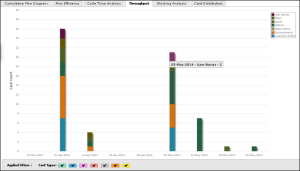
- Throughput: Enables SCRUM teams in measuring throughput in terms of card estimates/points delivered in a Release / Sprint.
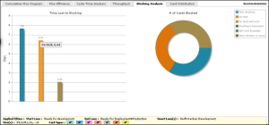
- Blocking Analysis: provides you with some great Root Cause analysis and the impact of blocking on your organization!
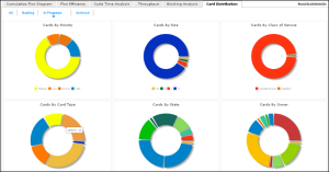
- Card Distribution: gives you a simple Dashboard of the % distribution of cards based on key attributes such as Priority, Class of Service, and so on.
- Flow Efficiency: shows you how much percentage of the team was spent on actually working on a card, excluding the wait and blocked time.
Note: We now have a contemporary widget-style Analytics view that has all charts in a single view.
Selection of Filters
The product provides you with several filter options for viewing the chart for specific columns, period, card types, and so on.
To select the filter options, perform the following steps:
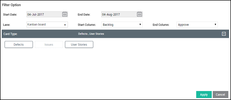
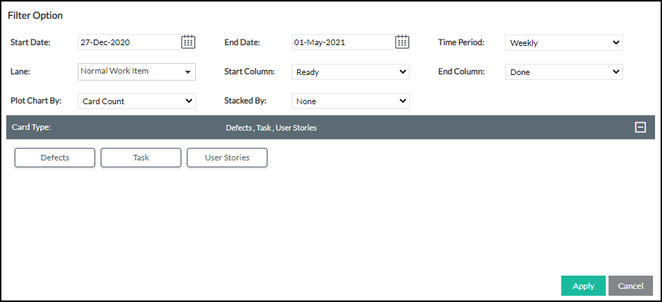
- In the Analytics tab, click the Filter icon on the Side toolbar. The description of the filter options specific to an Analytic is described in the respective Analytic page.
Select the options accordingly, in the filter window, and click Apply. The chart will be refreshed. - Select a specific period, i.e. the Start Date and End Date from the calendar to limit the scope of data. View charts by selecting appropriate dates to analyze the recent performance of the team (e.g. change in Average Cycle Time) against the previous duration or the outcome of any process change. The date range in the Blocking Analysis has a different implication.
- Select specific card types.
- Select one or all Lanes if you have defined more than one. If you select the ‘All’ option, the chart considers all cards that exited the last column or have moved beyond the Done column type of each lane.
- Choose exactly the stages for which you want to generate by selecting the Start column and the End column. The charts consider the cards that have either moved to or beyond the Done column type, archived or exited the End column in the date range, and may or may not have entered the Start column. The column selection in the Blocking Analysis has a different implication.
- Select ‘No. of Cards’ or ‘% Cards’, which will be scaled on the Y axis (Available for Cycle Time Distribution Chart only). The Time Period selection is not applicable here.
Important Information about the Filter
- You can apply the Filter on the Analytics from two different places. First, the common Filter that is available on the side toolbar of the Analytics page. When you set and apply the Filter from the side toolbar, it gets applied to all the Analytics widgets and also overrides any existing Filter applied at the individual widget level. But after that, if you set specific Filter criteria for a specific widget, then the common Filter that you had applied earlier from the side toolbar gets overridden.
- The filter options selected for generating analytics persist within and across sessions so that you don’t have to select the options every time. To help you interpret the charts better, the footer below the charts displays the selected filter options, such as Start Column and End Column, Class of Service, etc.
- When a value for a Filter option is marked with an asterisk, it denotes that the value is deactivated.
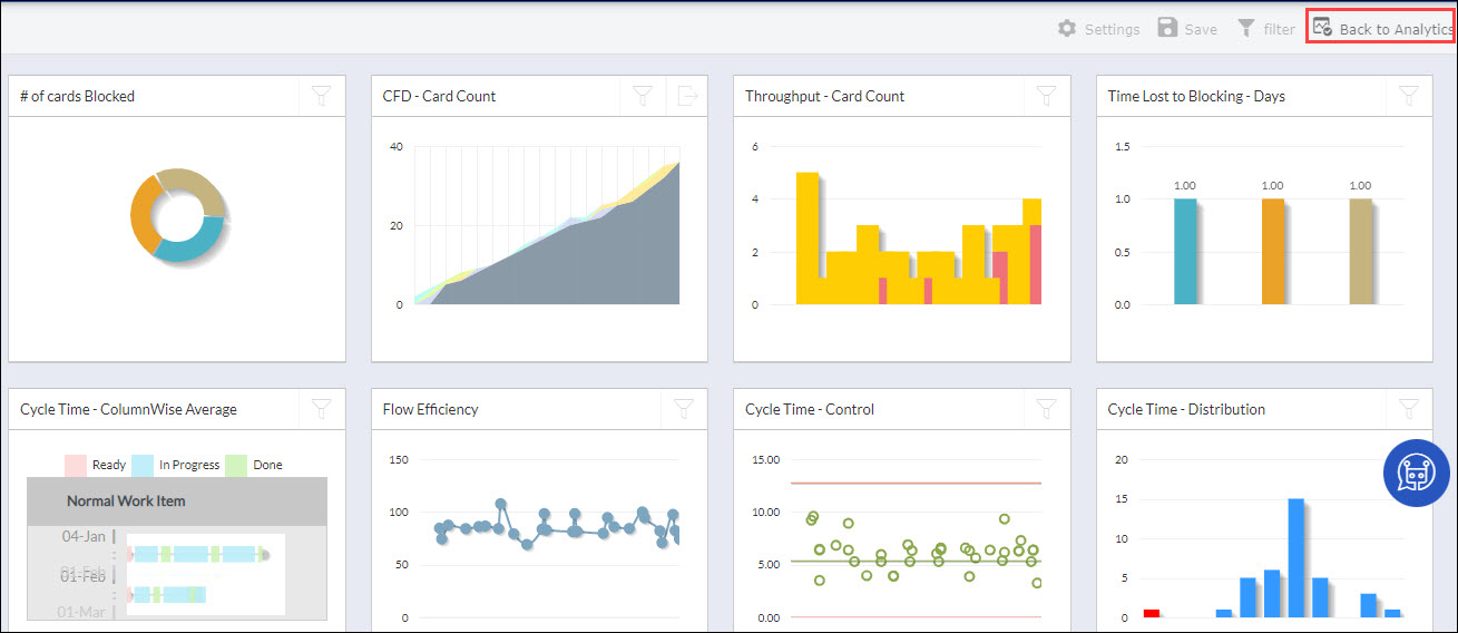
Analytics Widgets
When you open Analytics in the new view, all the charts are arranged in a single view as widgets. The contemporary widget-style lets you reorganize the widgets by dragging and dropping the charts as you want, by holding onto the chart header.
- Extend the chart to view more details by dragging the right corner of the chart outwards and drag it inwards for a smaller view.
- Double–click the chart header to see a maximized view of the chart. Double-click on the Column header of the maximized view to revert to the minimized view.
- Individual filters for every chart will override the common filter available for all charts on the toolbar.
- Click the Save icon on the toolbar to save your reorganized layout, which persists across sessions.
- In the Card Distribution widget, click the attribute drop-down list in All Cards, Backlog Cards, In-Progress, and Archived to view the chart for that value. For example, All Cards- Class Of Service.
- In the Throughput and CFD widget, click the filter to plot the chart by Card Count or Card Estimates.
- In the Cycle, Time Control, and Cycle Time Distribution widget shown by default, in the filter, select Work Time, Wait Time, Blocked Time, or maintain Cycle Time option in the Metric list. The chart is plotted and renamed accordingly.
Customize Your Analytics Widget View
By default, all the analytics are organized into thirteen widgets in the new Analytics view. You can customize the new Analytics view to track specific charts that you want to focus on. You can remove widgets that you don’t want and add them back whenever you want.
To select the widgets in the Analytics view, click the Settings icon on the toolbar. In the Settings pop-up, all widgets are selected by default. To remove a widget, clear the check box for it. To add a widget, select the checkbox for it. Click Apply to apply the settings and save. The customized settings will persist within and across sessions.
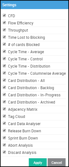
You can see that the widgets removed will leave empty spaces. You need to reorganize by dragging and dropping the widgets for a better view. The reorganized view needs to be saved (Click Save on the toolbar) to persist across sessions.
Viewing Sample Analytics
Whenever your account is created and you visit the Analytics page (without having enough data such as cards, team members in your account), all the widgets on this page appear blank. Therefore, it is difficult to visualize how each of the Analytics widgets is plotted and also interpreted.
To resolve this issue and help you get a comprehensive understanding of the Kanban metrics, the product provides you with sample metrics for all the widgets on the Analytics page. The sample metrics are available in read-only mode, so you cannot change the data of the widgets. However, you can export the data of the sample metrics and plot them based on various Filter options available on the individual widget.

By default, this Sample Analytics feature is available to Admin, Manager, and Member roles.
Navigating to Sample Analytics
To view the sample Analytics, click the View Sample Analytics icon on the top main bar of the Analytics page.
To go back to the main Analytics page (where you can view the actual data), click the Back to Analytics icon on the top main bar.
Note: In the Sample Analytics mode, the Settings, Common Filter, and Save Layout icons remain disabled.
Plotting the Sample Widget with a Different Value Set
You can plot a sample widget for a different value set by clicking the Filter icon and changing some of the properties like Start Date, End Date, Time Period, and so on.
When you plot a widget by applying your filter criteria, the widget is rendered as per that criteria and persisted till you log out of the application. When you log in again, the sample analytics are loaded with the predefined fixed data, and the previous filter criteria that you set earlier are not persisted.
To plot the widget with a different value set, perform the following steps –
- Click the Filter icon in the top-right corner of the widget.
- Specify the values in the filter criteria and click Apply.
Exporting a Widget
You can export a few widgets to an MS Excel file. The Export functionality is available for CFD Card Count, Release Burn Down, and Sprint Burn Down.
To export a widget, perform the following steps –
- Click the Export icon on the widget.
- Specify the location for the Excel file to be saved and click the Save button.
Important Point:
- If you try to open a card from the Sample Analytics View, the card will be opened in the read-only mode with the Details, Movement Log, and ToDo tabs only.
- The Sample Analytics is designed based on the 6-month data of a project.