
In this article, we will help you understand the Scope Forecast.
|
Skip Ahead to: |
Overview
Scope Forecast Analytic helps you visualize the impact of your future delivery in terms of Lead Time and the Cost of Delay. Based on the current cadence of a board for a specific duration, the Scope Forecast chart can render predictive data on the Cost of Delay while taking into account your calibration on the Cost Function and the scope of deliverables (Defect, Enhancement, User Story, Task and so on).
Filtering the Data Set
- Navigate to Board > ESP Module, and then select the Lane and enter the start and end date for which you want to plot the chart.
- You can perform any of these activities to further refine your search and narrow down the scope of the chart:
- You can define the Start and End column to further filter your data on the chart.
As you apply any of these filters, the chart will be refreshed and rendered automatically.
Reading the Diagram
To render the Cost of Delay chart, you must first fulfill the following criteria:
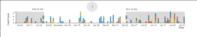
1. This is the feeder CFD chart (image 1) where you can specify the date range by dragging the slider. The data of your existing board during that specific period will be the base for the cost function.

2. In the Lead Time Forecast chart, enter the volume of deliverables like Enhancement, Defect, User Story, Task and so on for your future board(for which you want to calculate the cost function), and then click the Update Scope button.
a. The chart shows the probability percentage of those number of deliverables if completed by a certain number of days.
b. In image 2, the chart predicts that, based on the existing capability, you have 52% chance of completing 5 Enhancements, 3 Customer Defects, 4 Tasks, and 2 User Stories within 153.7 days.

3. In the Cost Function chart ( image 3), enter the graph interpolation as either Smooth or Linear, enter the date range for which you want to plot the Cost Function, enter the maximum value of the cost (This amount will be on the top of the Y-axes), and then click the Update Cost button.
You can now manipulate the data points, and decide by which time the cost of delay will be incurred, and how steadily the cost will grow bigger. In image 3, there is no cost of delay if you start working on the deliverables ( mentioned in image 2) in March, Likewise, the cost of delay grows to almost $500, if started in May, and $1000 in August or beyond. You can calibrate these data points based on your acumen.
4. The Cost of Delay chart depicts the growth of expected cost at various start date. For example, as per image 4, you start incurring the cost of delay even if you start working on your deliverables way before March, the cost goes to the highest in April itself and retains the same till August.
Interpreting the Diagram
You can take an informed decision on how to mitigate the cost of delay to an extent by looking at the dimension in the Scope Forecast chart.
The chart helps us to decide the right time to start a board, and balance between not to start too early as it may forgo the option and opportunity to do something else that may provide value, and not too late so that we end up incurring the cost of delay beyond an acceptable limit.