
|
Skip Ahead to: Define Links Between Card Types |
Overview
As an Account Admin, you can define important settings in SwiftKanban at the enterprise level using the Admin Settings page. The Admin Settings on this page are available in the tiles format, and based on your requirement, you can go to any of them and make the necessary updates. Note, when you update some of the settings at the enterprise level, such as Card Types with the configuration and links, Master Lists, Board Templates, and Admin Policies, they get passed into the individual Boards under that enterprise.
Prerequisites
You must have Admin access to view and navigate to the Admin Settings page.
Accessing Admin Settings
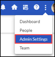
To define the Admin settings, from the control panel, click the More Options icon > Admin Settings page.
Admin Settings Page Layout
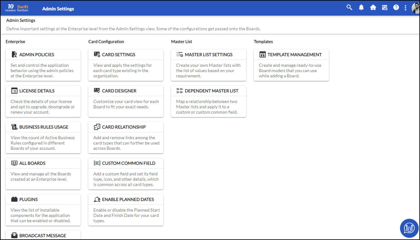
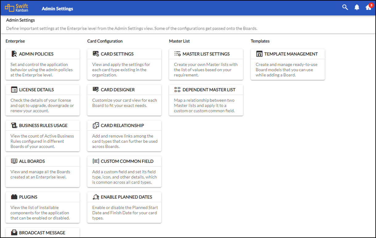
The Admin Settings page is designed in tiles mode. All the settings at the Admin level are grouped under individual tiles, and clicking any of them takes you to the particular settings. For example, if you want to update the Admin policies, then click the ADMIN POLICIES tile. All the tiles are grouped under 4 categories: Enterprise, Card Configuration, Master List, and Templates. All the tiles are stacked vertically under each of these categories.
Get to know about each of these tiles by clicking the links in the following table:
Enterprise |
Card Configuration |
Master List |
Templates |
Business Rules Usage
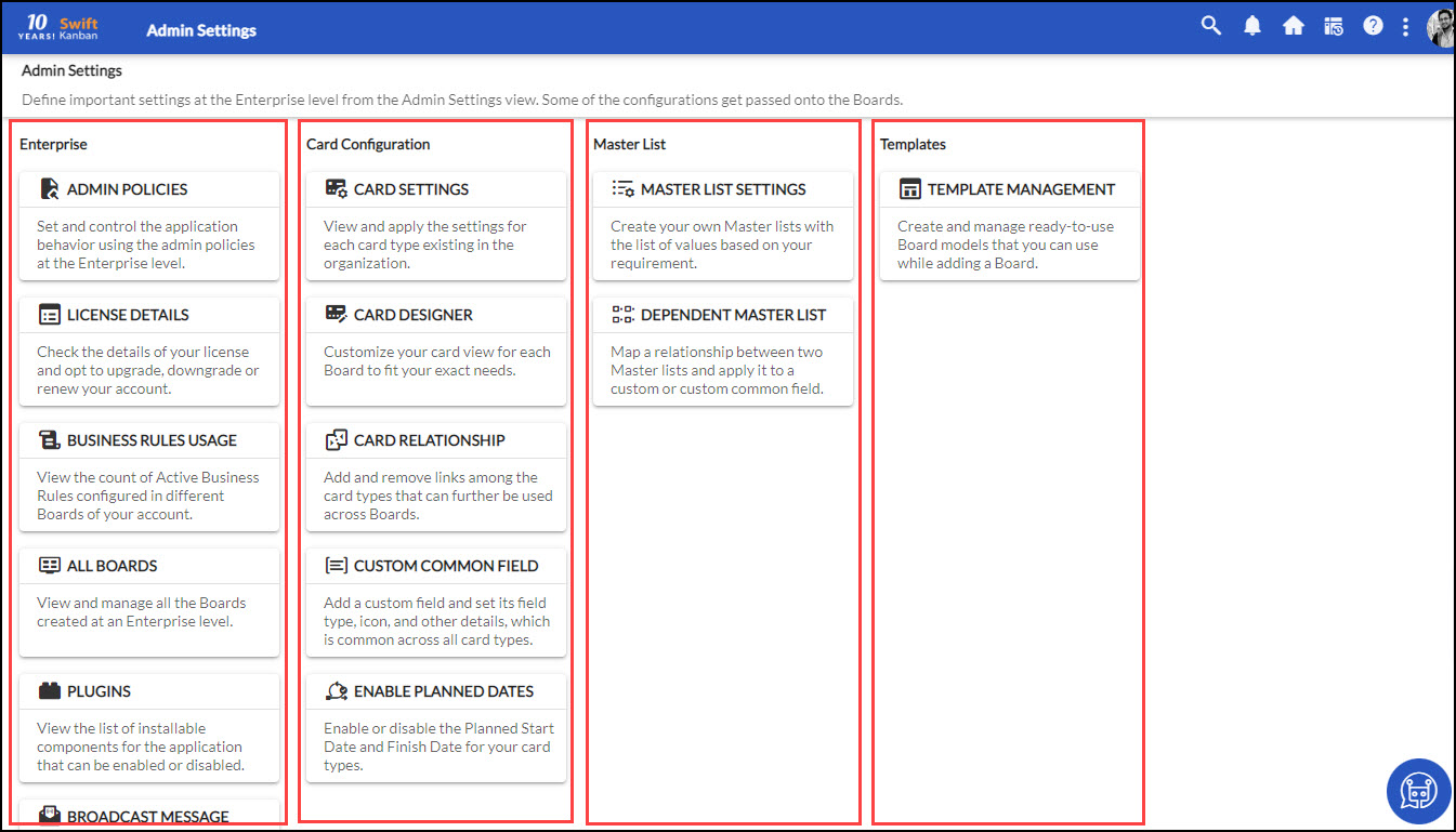
As an Admin, you can view the count of the Active Business Rules configured in different Boards of your account by clicking the Business Rules Usage tile on the Admin Settings page. The Business Rules Usage page will display the count of business rules that are available via license, the count of active business rules that are configured in boards, and the count of active business rules utilized in different Boards.
Note: The Business Rules Usage tile will only be available if the Business Rules license is configured.
All Boards
As an Admin, you can view and manage all the Boards under an enterprise by clicking the All Boards tile on the Admin Settings page. The All Account Boards page displayed all the Boards that you have access to, irrespective of whether you are invited to them or not. 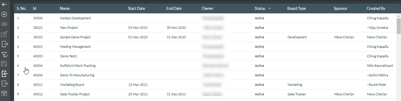
On the All Account Boards page, you can perform various Board-related activities based on your access level. To perform these activities, use the following options from the side toolbar of this page :
-
- Add Board: We have explained how to add a board on this Help page.
- View and Edit Board Details by selecting a board and clicking the View or Edit icon.
- Filter Boards: Filter Boards based on the Board attributes. Click the Filter icon and in the empty filter boxes above any columns, type the text to be searched and select values in the filter lists.
Note: By default, the filter will be applied on the listing to display only the Active (Open) Boards. You can modify the filter by clicking the Filter icon and selecting All to include both Active and Closed Boards.
-
- Sort Boards based on any column name by clicking on that column label.
- Import or Export Board: Using the Import or Export feature, you can either import the board details into SwiftKanban or export the board details to a zip folder on your system. Get to know more about Import or Export from this Help page.
- Delete Board: Delete Board by selecting the board and clicking the Delete
 icon. You can only delete a single board at a time. This option will be available if you have an ‘Admin’ or ‘Manager’ role at the organizational level.
 - Reopen Board: If you have the Account Admin or Organization (Org.) In the Admin role, you can reopen a closed Board. Get to know more about it from this help page on reopening a Board.
Broadcast Message
By using the Broadcast Message, you can keep the entire team aware of important announcements. You can set this message by clicking the BROADCAST MESSAGE tile on the Admin Settings page.
Note: You must have Admin access to broadcast a message.
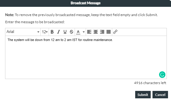
To broadcast a message, add your message in the Broadcast Message dialogue box and click Submit. All users of the account on login will be able to view this message at the bottom right of the screen.
Note: The broadcasted message persists on the screen till you remove the message from the Broadcast Message dialogue box and click Submit.
Card Settings
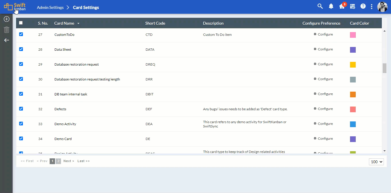
By navigating to the Card Settings page, you can view both the default (factory-shipped) and custom Card Types, add or delete a custom Card Type, add or modify their attributes, assign a distinct color to the card types, and configure card % progress and child % progress for each of those Card Types. When you perform these configurations at this enterprise level, they get passed on to the individual Boards under that enterprise.
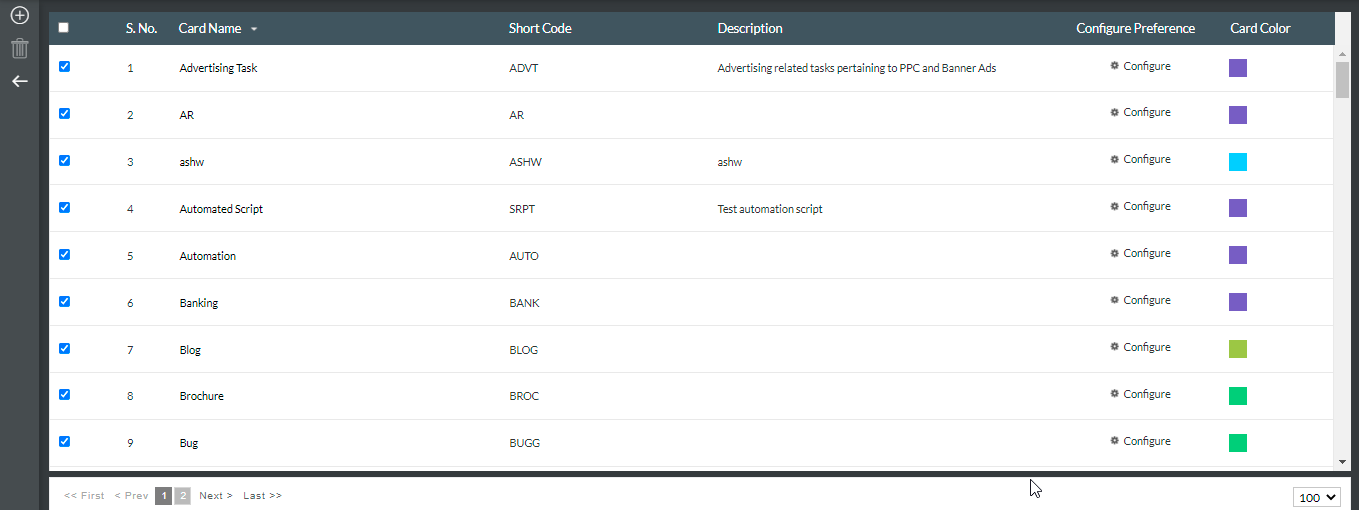
The List view of the Card Settings page displays both the default and custom card types along with the attributes such as Short Code, Description, Card Color, and so on. You can sort the card types in ascending or descending order by clicking the arrow on the Card Name or Short Code column.
From this Card Settings page, you can perform the following tasks for the Enterprise:
Create your own Card Type
There are some default card types, like User Story, Defects, Task, and so on, that are already created for you. But, if you want to create your own Card Type at the enterprise level, you can do so from this page.
To create your own Card Type, perform the following steps:
- On the Card Settings page, click the Create icon on the side toolbar.
- Enter the Card Name. Ensure that the card type name does not contain any of these special characters — [ ]? / \ *. The export process of cards will fail due to the limitation of Microsoft Excel that the worksheet name cannot contain these characters.
- Enter the Short Code to identify the card type. Note, you will not be able to change the Short Code once the Card Type is created.
- Select the color for the card type that will be used to identify the card type on the board. You may change the color later.
- Enter the description for the card type. The description that you add to any card type can act as an explicit policy that can guide the usage of various card types. This can be viewed by the team members on the Kanban board before adding a card by just hovering on the ‘Card Type’ label in the ‘Legend’ menu.
- Click Submit.

The Card Type is now displayed in the List of Card Types.
Note 1: The Card Type you create on the Admin Settings > Card Settings page is not enabled by default in the individual Boards under the enterprise. You need to go to the Board Settings > Card Settings page of a particular Board and enable that Card Type by clicking the checkbox.
Note`2: You can create a Card Type from any of the Boards, which will also be automatically displayed on the Admin Settings > Card Settings page. You can enable that Card Type for the Board from where you have created it, change the card color, and define a default To-Do list for it. However, you can configure the custom fields and preview the list and pop-up view of a Card Type only from the Admin Settings > Card Settings page.
Copy an Existing Card Type
Instead of creating a Card Type from scratch, you can copy an existing one directly from the Admin Settings > Card Settings page. The Copy Card Type option automatically carries over all configured fields—including custom fields—from the selected Card Type to the new one. This helps reduce repetitive configuration effort and speeds up Card Type creation.
To copy an existing Card Type, perform the following steps:
- Navigate to Admin Settings > Card Settings.
- Hover over the Card Type you want to copy and click the Copy Card Type option.
- In the dialog that appears, enter the Card Name and Short Code for the new Card Type.
- Click Submit.
The new Card Type is created with all the fields from the copied Card Type already configured.
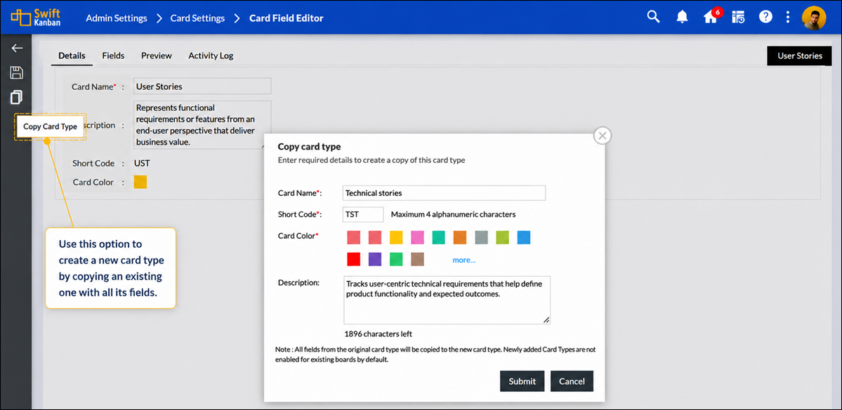
Note: The Copy Card Type option is available only under Admin Settings > Card Settings. It is not available at the Board Level Card Settings.
Add and Modify Attributes of a Card Type
Once you create the Card Type, you can go on adding and modifying its attribute fields. Let’s get to know more about it.
- First, double-click the Card Type for which you want to add or modify the attribute fields.
- The Card Field Editor is displayed. Before you start adding or modifying the attributes, get to know about this editor.
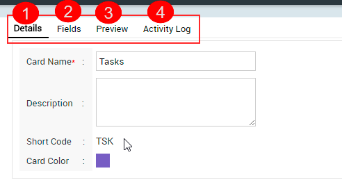
The Card Field Editor is divided into 4 tabs:-
1. Details: You can edit the card name and description.
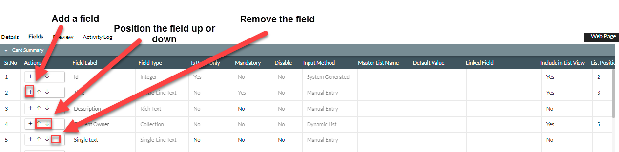
2. Fields – It is a tabular representation of the fields of that selected Card Type. Each row represents a field in the card. You can add, delete or reposition the fields just by clicking their respective buttons. You can also select to view or not view the field in the List view of the card type.
The existing fields in the Card Type are- Title, Description, etc., and metric-related fields. These are system fields or attributes that appear by default. You can add new fields and also modify fields.
3. Preview – You can get a preview of how the Detail view of a Card Type will appear after you add or remove fields in the card type. It consists of two types of previews: Popup Preview and Full Preview.
4. Activity Log – The Activity Log maintains logs for every change, which will enable you to track the changes made in the configuration of card types.
Before you start adding and configuring the attribute field, remember the following information:
For default fields (ID, Title, Description, Priority, Class of Service, Size, Current Owner, and metrics-related fields), you cannot modify any fields, except the Include in List View option. Additionally, for the Description field, you can set it as Mandatory or Non-mandatory. Some default attributes like Id, Title, Description, and Current Owner, can’t be disabled.
Now, to add and configure a custom field, perform the following steps:
1. On the Admin Settings > Card Settings page, double-click the card type to which you want to add an attribute.
2. To add a field (attribute), click the Add New Field icon. A blank field row is added below.
3. From the Available Field Types section in the drop-down, select the Field Type (for example, Integer) in the new field. The blank row now displays the Field Type, i.e., New Integer Field, in red.
Currently, eight field types are supported:
| Field Type | Maximum Number of Instances in a Card Type |
| Single-Line Text | 10 |
| Multi-line Text | 10 |
| Regular Text | 40 |
| Integer | 50 |
| Decimal | 50 |
| Boolean | 25 |
| Date | 25 |
| Collection | 10 |
Note: If you select Multi-Line Text for a field, then that field will not appear in the card pop-up. But it will be displayed in the List view.
4. Click to select and define the field properties for the new field. Enter appropriate values to configure the field. The Field Type and List Position are displayed by default.
- Enter the name of the field in the Field Label. Note that these special characters i.e. #,@,%,/,,&,$,?,*,|,:,<,>,-,’ – are not allowed in the field label. Select the attributes for the new field as explained below. To save the newly created field, click the Save icon in the Side toolbar.
- To mark the field mandatory, select Yes in the Mandatory option, and select No.
- To make the field available to capture information, select No in the Disable option for the field to appear in the card type.
- For the field to be listed in the List view of the card type, select Yes in the ‘Include in List View’ option, and select No. For example, Project > Backlog » Issues displays the Issues List View with the field columns displayed in the order defined in the List view.
- In the Input method, to enable users to enter a value, select Manual Entry. To enable users to select values from the available list, select Static List. (The list of values can be maintained by editing the required Master List in the Admin Settings > Master List Settings tile.
- To select the position or modify the position for an already displaying column, double-click the List Position cell for the column/field. Enter the value. If the position is already selected for another field, modify the position of that field. Ensure that the position does not repeat for any other field, and the position values are sequentially correct.
- Alternatively, use the Move Up and Move Down icons to reposition the field.
5. You can click the Preview tab on the toolbar to preview the modified layout of the card type.
6. To delete a field, click the Delete Field icon.
6. Save it by clicking the Save All icon in the side toolbar.
After you add custom fields for a Card Type in the Admin level, they will also be available at the Board level. You need to select them for the required Card Type in the Board and enable them to be available.
Delete Card Attributes
You can delete a card attribute (field) even if its cards are created for that card type and text is entered in that field. You cannot delete default card attributes such as ID, Title, Description, Priority, Class of Service, Size, Current Owner, etc., and metrics-related fields.
You can also add attribute values to a list of attribute values. For example, you may want to add an attribute value, UI Enhancement, to an attribute User Story Classification in the User Story card type. See Define Master Lists.
Update Card Attributes
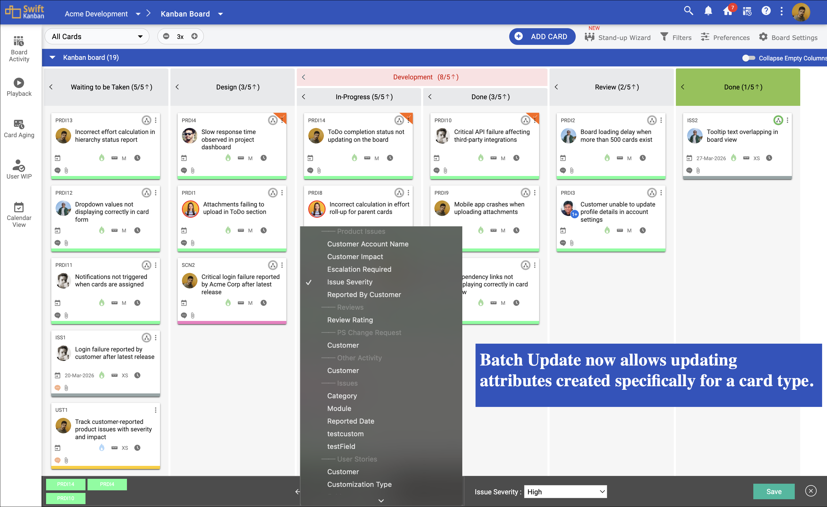
Batch Update allowed users to update only Common Attributes and Custom Common Attributes. You can also update custom attributes created for a specific card type directly through Batch Update. This allows teams to modify multiple Product Issue cards at once without opening each card individually.
To understand this better, consider the following example.
Suppose a card titled “Customer Unable to Generate Analytics Report” has been created under the Product Issue card type. The issue was reported by a customer who is unable to generate analytics reports from the dashboard after a recent update. The card contains the following custom attributes: Issue Severity and Customer Impact. Now, assume that the same issue is affecting multiple customer accounts, and several similar Product Issue cards have been created.
So, you can select multiple Product Issue card types and use Batch Update to update attributes such as Issue Severity as High and Customer Impact as Major for the selected cards.
Configure Preference
The Configure Preference has two different sections: % Progress Preference, where you can set Card % progress and Child card % progress, and you can set the Default description.
Set % Progress Preference
As an Admin, you can set how Card % Progress and Child % Progress attributes are to be calculated for each Card Type at the enterprise level. It is a default configuration that becomes available to a newly created Board. The Board Manager can then change the default preference of both these attributes at the Board level.
1. To configure the Card % progress and Child % Progress attributes for a Card Type, click the Configure icon shown on the Configure Preference column on the Card Settings page.
2. On the configuration page, select the preference for calculating the value for the Card % progress and Child % Progress attributes. But before you set the preference, we suggest you go through this Help page to better understand the various options available and their overall impact on the % calculation.
Set Default Description
As an Admin, you can add a default description for your card types. This can be important information, or you can set a default structure in which you want your team members to add the description for each card type. For a better understanding, check the screenshot below. For defect settings, we added a default description as an action for adding defects. Once done, click the SAVE button. When you add a Defect card type on the Board, then the following description will be available.
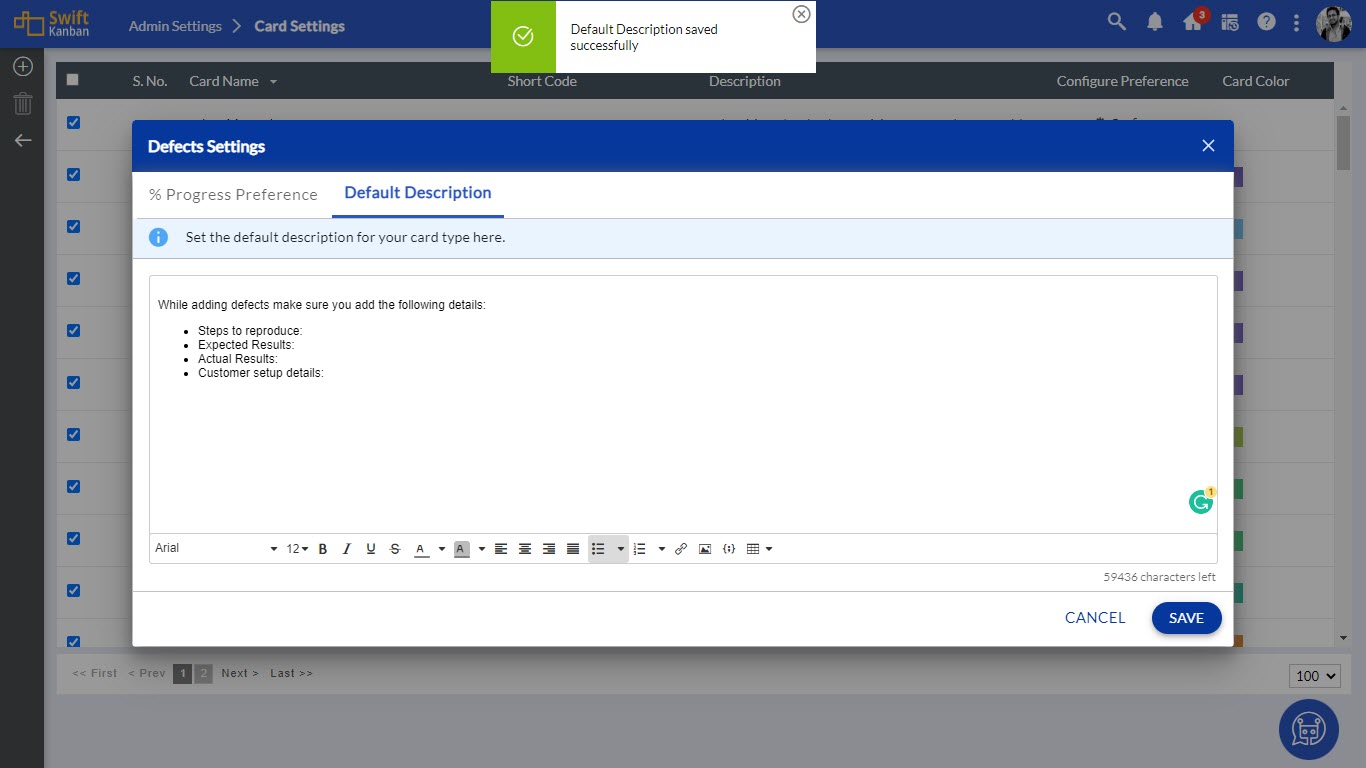
You can set the default description for your card types at the board level as well. Note: If you set a default description at the Admin level, but then set another default description at the Board level. Then, the Board-level description will be available for the card types. To know more, click here.
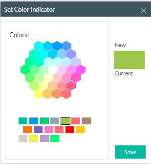
Define Card Color
As an Admin, you can assign a distinctive color to the Card Types to make them visually distinguishable. To apply a color or change the existing color for a Card Type, click the color box of a Card Type, and on the Set Color Indicator widget, select the color from the color palette.
Design Card Sticky View
The CARD DESIGNER tile on the Admin Settings page helps you design the card’s sticky view. The card designer allows you to configure more attributes and icons to add a better look and feel to your cards. In the Card Configure View, you can customize your card stickies based on the selected Card Type, such as User Stories, Defects, Enhancements, Issues, etc. For better understanding, view the sample card sticky designed in Card Configure View with the selected attributes, flags, and actions. Thus, the design of your card on the Kanban Board and Backlog Board will be modified depending on what you select and unselect.
Note: The card stickies on the Dependency Board have the Default card view.
The first row of the card shows fixed attributes like the Card ID, Title, Profile Pic, Options, and three flags and actions. The second and third rows show the attributes that are selected in Card Attribute on the right side of the window. The last row shows the flags and icons.
To view an attribute with its values, select it in the Attributes menu. To hide it, clear the selection. Just drag the attribute and drop it between the two attributes as you want to change the order. Make the changes once the previous change is saved successfully.
To view actions and flags on a card, select the checkboxes in the top and bottom icon toolbar. The Actions are shown on the first half of the last row of the card. The Flags are shown on the second half of the last row of the card. Note: A total of 8 flags and actions can be shown in this row (four flags and four actions). The bottom icons can be shown by selecting them in the bottom toolbar, whereas the top icons can be shown by selecting them in the top toolbar.
In the General Card Settings, for the Owner, you can either set Grey Scale Image, which shows the owner’s image in a greyed color, or Colour Image, which shows the owner’s image in color. For the Attribute Rows, you can either select One Row or Two Rows to represent the card attributes.

Note that the default enterprise settings are inherited by the board. However, if the board has changed the configuration, the changes will reflect for the board, overriding the enterprise settings. For example, if the Admin has hidden the ‘Rank’ for the Enterprise and the attribute is seen on the board, it means that it is not hidden on that board. The change made in the enterprise will not be inherited by an existing board unless the changes are made to the board.
Define Links Between Card Types
The Card Relationship tile on the Admin Settings page lets you link Card Types to indicate relationships. Thus, when cards are created on the Board, only cards of these Card Types can be linked to each other based on these settings. For example, by linking a user story to a defect, you can later trace the origin of a user story and understand the defect that led to the development of that feature.
Defining links between Card Types can be interpreted as one-way or two-way dependencies, depending on the context of the cards. These links can be defined in a loosely coupled manner for greater flexibility between cards on the same board or cards across different boards, or across Lanes.
Define Parent-Child Links Between Card Types (Card Hierarchy View)
You can define the parent-child hierarchy between the required Card Types. For example, if you set the relationship of Epic Card Type as Parent to Feature Card Type as a child in the enterprise, you will then, on your board, be able to link a Feature card as a child to an Epic card, which will be the Parent, once linked. Get to know more about defining the parent-child links from this Help page.
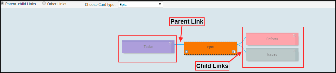
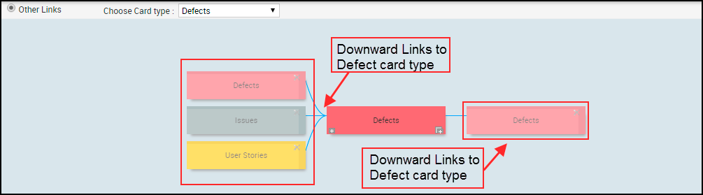
Define Links Between Card Types (Other Links View)
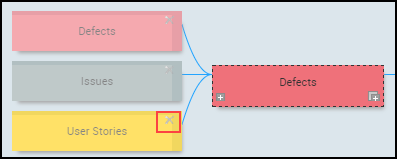
The Other Links view displays the card in the center. If links are already set, it displays the links to the card types at the backdrop with the selected card type, highlighted.
For example, in the image below, you can see:
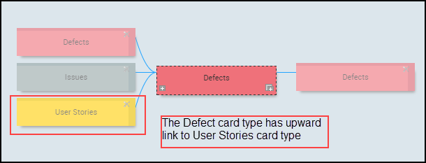
Upward Links: The Defect card is linked to User Stories, Defects, and Issues card types on the left. This is an upward link from the Defects card type to these card types. Subsequently, when a Defect is linked upward to a user story on a board, it indicates that the User Story has originated from the Defect.
Downward Links: That Defect card type is also linked on the right to a Defect card type. This is a downward link to the Defect card type. So, when a defect is linked downward to a Defect, it indicates that the Defect was a result of another defect.
You can add and remove links to the card types and define links that can be used across boards in your enterprise.
Note that you will be able to add upward/downward links only if those card types are not linked upward/downward. You can add links only to the card selected in the Choose Card Type list and cannot create links further to the linked card types. To create further links, select that card type in the Choose Card Type list and then add links.
To add an upward link to a card type:
1. Choose the card type from the list.
2. Click the Add upward link icon on the card type. In the card type list, select the card type that you want to link and click the Save icon. To link multiple card types, use CTRL + click to select multiple card types. The list displays only those card types that are not yet linked upward.
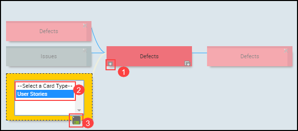
The card type is displayed on the left and connected to the Defect card type.
To add a downward link to a card type:
1. Choose the Card Type from the list.
2. Click the Add downward link icon. In the new Card Type link, select the card type that you want to link and click the Save icon. To link multiple card types, use CTRL + click to select multiple card types. The list displays only those card types that are not yet linked downward.
The card type 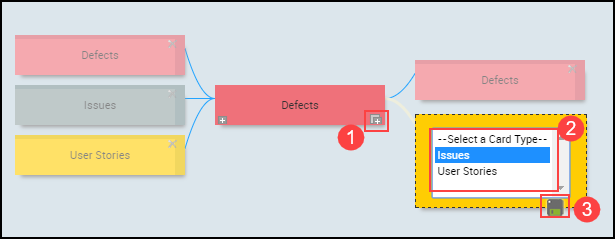 displayed on the right gets connected to the Defect card type.
To remove the upward or downward link from the selected card type, click the Delete upward/downward link icon (x) on the card type that you want to disconnect.
After you have defined links between card types, the team members can link cards according to the settings. For example, if there is no upward link defined from a Defect card type to a User Story card type, team members will not be able to link user stories to defects upward.
Note: SwiftKanban lets you define a parent-child relationship between different card types. This can be useful in situations where a larger (or parent) card needs to be broken down into several smaller (or child) cards for better planning and execution. This entire Card Hierarchy approach in SwiftKanban is through a highly visual interface that enables linking new child cards and existing cards to parent cards.
Add Custom Common Fields
The Custom Common Field enables you to customize the information for a task in the Card View by adding custom fields to the card. It also gives you the flexibility to customize the attributes of the card. Depending on the requirement, the customization can be done at the Admin level as well as at the Board level.
At the Admin level, using the Custom Common Field feature, you can add a custom field, which is common across all card types. You can also set the field type, input method, icon, and other details for that Custom Common Field.
Note: The Custom Common Fields, which are created at the Admin level, can be shared across all the boards.
To add the Custom Common Field, perform the following steps:
1. On the Admin Settings page, click the CUSTOM COMMON FIELD tile. The Custom Common Fields page is displayed.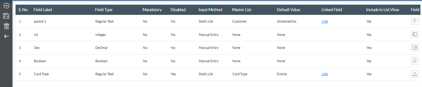
2. To create a common field, click the Create Common Field icon from the Side toolbar.
3. In the new field, enter the following details:
| Fields | Description |
|---|---|
| Field Label | Name of the Custom Common field |
| Field Type |
Note: It is not visible to the user under Card View.
|
| Mandatory | Decide whether you want compulsory input for that particular field. |
| Disabled | Hide the field from the card by selecting Yes from the drop-down. By default, it will be No. |
| Input Method | Manual Entry of values |
| Master List | Once you select the Input Method as a Static List, this field will be activated, and the dropdown values will display all the Master Lists. Select the desired Master List from the drop-down and set its Default Value. |
| Default Value | Based on the Master List you have selected, the related default values will be displayed as a drop-down value. Select the most appropriate default value. |
| Include in List View | If you want to add fields in Card List View, then select Yes from the drop-down. |
| Field Icon | It is a symbol or indicator that will help you identify a particular field. Click the edit view under the Field Icon to get a list of icons. Select any one icon from the list that will best define your field. |
4. After adding each Custom Field, click on the Save icon from the Side toolbar.
Converting Card Type Specific Fields to Custom Common Fields
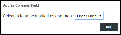
You can not only create a Custom Common Field but also convert an existing field into a Custom Common Field. You can create your own fields for each Card field editor, depending on the requirement. If you require a particular field in all the Card Types, then you can add it with the help of the Custom Common Field icon, as mentioned above. But if you have already created a field for a few Card Types and now you decide to add the same field for the remaining Card Types, then the Add as Custom Common Field icon will solve the issue.
For example, you have 10 Card Types, of which you have added a custom field of field type: Integer to six Card Types. Now you have decided to add this field as a Common Field for all Card Types (including the ones that will be created in the future). To achieve this, add the same custom field to the remaining four Card Types, then go to the Custom Common Fields Page, and from the toolbar, click the Add as Custom Common Field  icon.
icon.
Note: The Add as Custom Common Field icon is available only when the same field (with the same field label and same field type) is added to all Card Types.
To add a field as a Custom Common Field, perform the following steps:
1. Go to Admin Settings > Card Settings tile. On the Card Settings page, double-click the Card Type to add custom fields.
2. On the Fields tab of the Card Field Editor page, add the custom field by clicking the Add new Field icon.
3. Under Layout, scroll down till the end and click the plus icon to add a new row. Now, drag the required custom fields from the Available Fields Types section.
4. Once you have added the field types under the Layout tab, you will get the attributes related to that particular field to type under Settings. Add Field Label and Field Type.
Note: For each Card Type, the Field Label and Field Type should be the same.
5. Now, go to Admin Settings > CUSTOM COMMON FIELD tile. On the Custom Common Fields page, select the Custom Field that you want to convert to the Custom Common Field, and click the Add as Custom Common Field icon. 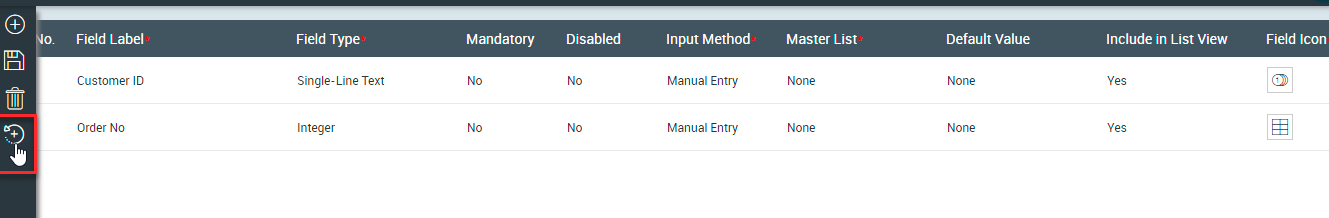
Note: Irrespective of whether a field is enabled or disabled at the Admin level, a custom common field is always visible in the Card Designer at the Board level. However, to edit the values of the same common field, you need to enable it at the Admin level.
Enable Planned Dates for Card Types
To enable or disable the Planned Start Date and Planned Finished Date for the Card Types that are used to track the Planned duration in the Roadmapping dashboard, perform the following steps:
1. On the Admin Settings page, click the ENABLE PLANNED DATES tile.
2. On the Enable/Disable Planned Dates for Card Types widget, select the Card Types for which you want to enable the Planned Start Date and Planned Finished Date fields and click Submit. 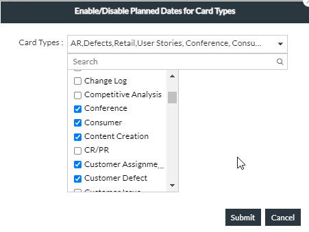
3. To disable the Planned Start Date and Planned Finished Date fields for the card types in bulk, unselect the card types and click Submit.
Define Master Lists
Master Lists are used to create a field, which will contain certain attributes related to this field. There are a few default Master Lists, such as Class Of Service with values such as Expedite, Fixed Delivery Date, Standard Class, and Intangible Class. Get to know more about creating or updating the Master List from this Help page.
To define the Master List, go to Admin Settings > MASTER LIST SETTINGS tile. On the Master List settings, you can create or modify the Master List. To know more about how to create, update, and use the mapping feature of the master list, click here.
Map Master List Relationship
You can map a relationship between two Master lists and apply it to a custom or custom common field. This can be extremely beneficial if you want to populate separate combinations of parent-child field values for a card, like Country-State, City-Localities, and so on.

Get to know more about the mapping Master List relationship from this Help page.
Add and Manage Board Templates
Templates in SwiftKanban are ready-to-use Board models (comprising Lane Settings, Card Types, and Board Policies) that you can select while creating a Board. Template in SwiftKanban can be a great feature when you plan to save the time and effort of creating a Board from scratch or reuse any existing Kanban board as a template to create a similar type of Board in the future.
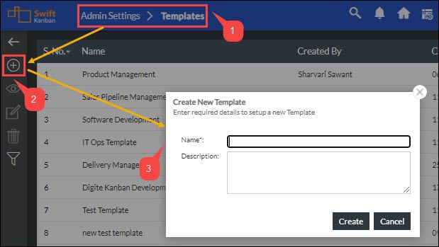
Get to know how to create a Board Template or save a Board as a Template from this Help page.