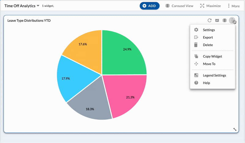
Personalize Your Chart Colors for Better Visual Impact
We have added the ability to customize chart colors in Nimble Analytics. With this enhancement, you can now tailor your charts to align with your brand, highlight specific trends, or simply match your visual preferences. Whether you are creating reports for stakeholders or analyzing data for internal use, the flexibility to choose your colors makes your insights easier to interpret and more impactful at a glance. Learn more here.