
Start with the video first to get a better grasp of the topic!
|
Skip Ahead to: |
Overview
List views are useful to monitor items in a group to follow up on their status, workflow queue, priority, or any other specific attribute. For example, you may want to track Todays or Past Due items in your Inbox or defects in your project that are marked with ‘Critical’ priority.
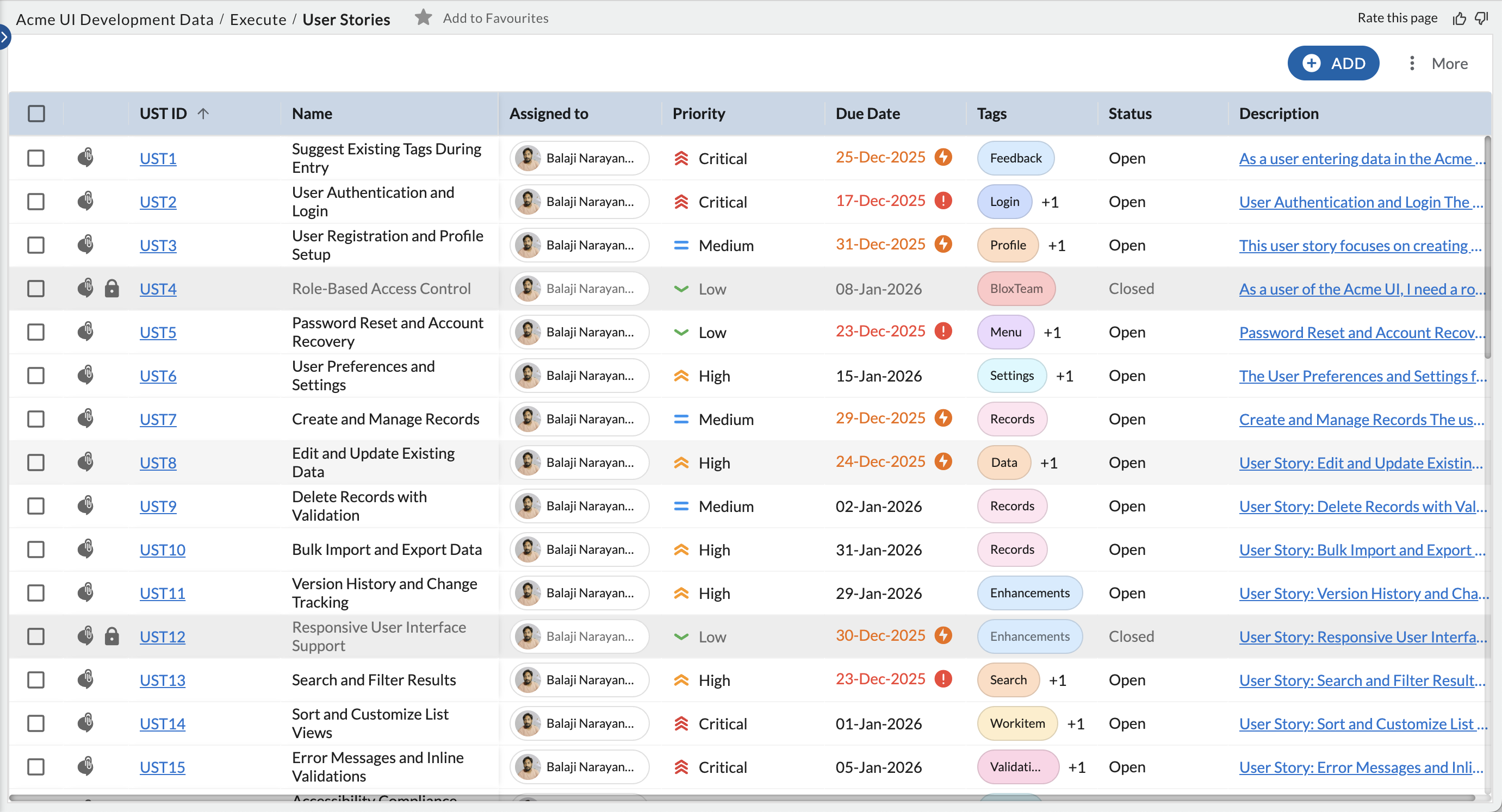
The List view of a feature displays the workitems created in a grid view with columns based on the work-item attributes.
By default, the List view displays all workitems with ‘Open’ status along with corresponding attribute values such as Open, Medium, etc. The column headings such as Status, Priority, etc. represent the attribute values. The column headings are actually the fields configured for the workitems. You can scroll through left and right to view all the columns, and up and down to view all workitems.
Other information that is visible on the Workitem Listing Page is:
- Fields providing the percent value to track the progress of a workitem can now be viewed as a percent progress bar on the workitem listing page.
- Multi-select fields like Tags, Card Owners, etc. are represented using chips.
- Toggle for checkbox fields on the workitem listing page.
- A Comment icon is available next to the ID of the workitems to help you quickly navigate to the comments section and collaborate on a workitem. Just like the comments icon on the card, they will be color-coded to help you know if there is a recent comment(green), an old comment (blue), or no comment (grey).
- A Lock icon is available next to their ID to indicate they are closed.
- Due date and Planned Finish Date columns show the color indicator along with the date to show whether the workitem is past due (red), due in the current week (orange), or next week (green).
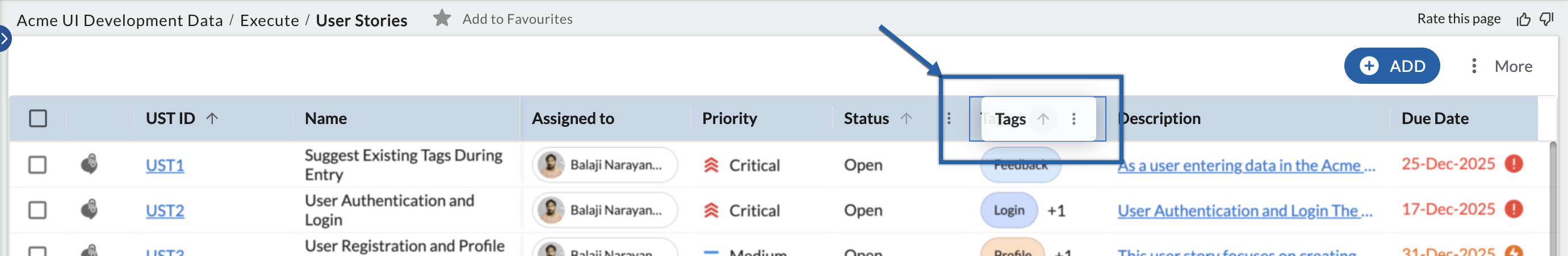
Drag and Drop Columns
To reposition columns back and forth for better viewing, long press the column header, drag it to the desired position, and drop. The new order of the columns also gets updated in the saved Column Settings. This way, the same order of columns is reflected wherever the column settings is used for listing workitems such as Work Hub List view and the drilled-down List view in Analytics’ widget for the specific card type.
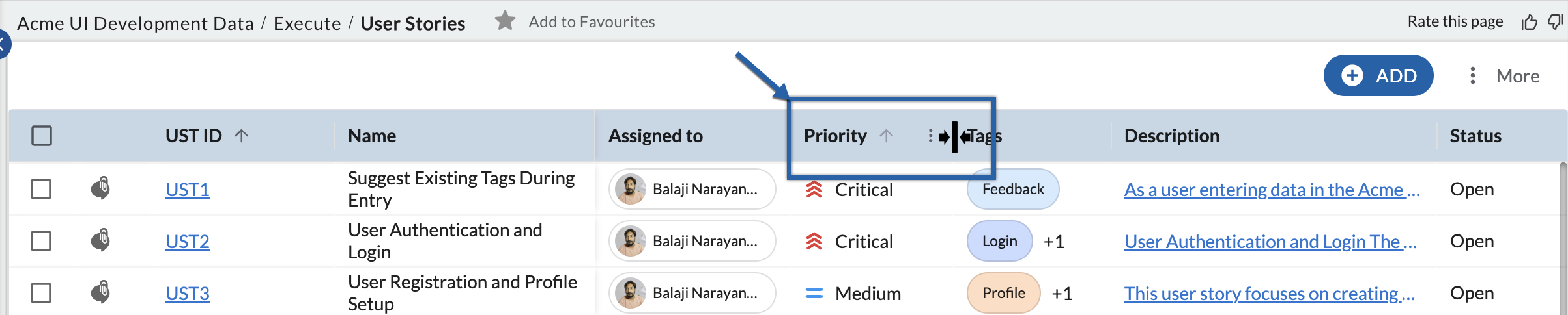
Adjust the Column Width
All columns have a uniform width by default. You can resize the column widths as required to view the complete column value. To adjust the width of a column, drag the boundary on the right side of the column heading, hold on to the double-headed arrow, and drag it to your left to reduce the column width or to the right to increase it until the column is the width that you want. The adjusted column widths persist across sessions.
To view specific workitems or columns, you can customize the default views or create custom views grouped on a few attribute values. When any filter is applied, the column heading for that specific column is highlighted in Bold and Italics font.
Column Options in List View
Each column header includes a menu that lets you control how data is displayed in the list view. Using this menu, you can pin columns, sort data, or apply filters.
Pin to Left / Pin to Right
Pinning a column keeps it visible while scrolling horizontally.
-
Pin to left: Pins the selected column to the left side of the list. A dark vertical divider appears after the pinned column. All columns to the left of this divider remain fixed and do not move when you scroll horizontally.
-
Pin to right: Pins the selected column to the right side of the list. Columns pinned to the right move together when you scroll horizontally.
You can pin more than one column. Pinned columns help keep important information visible when working with wide lists.
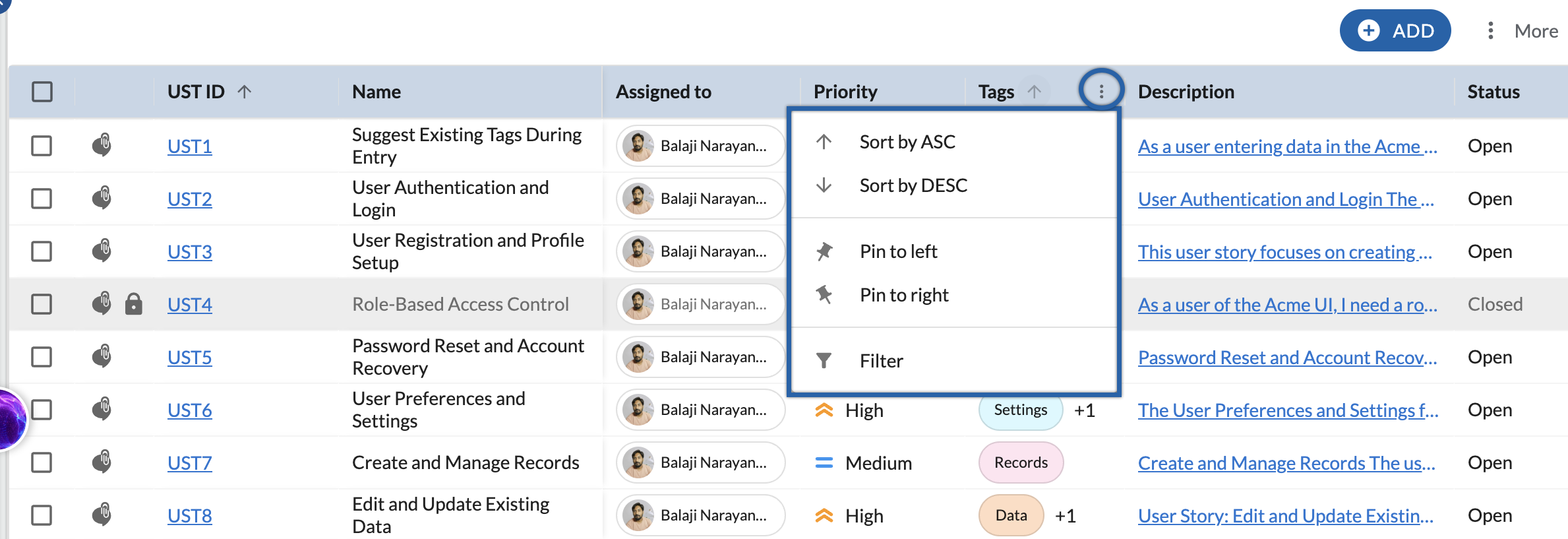
Sort by ASC / Sort by DESC
Use Sort by ASC or Sort by DESC to arrange the list based on the values in the selected column. Learn more, here.
Filter
Filtering lets you display only items that meet specific conditions for the selected column. Learn more, here.