
Start with the video first to get a better grasp of the topic!
|
Skip Ahead to: |
Overview
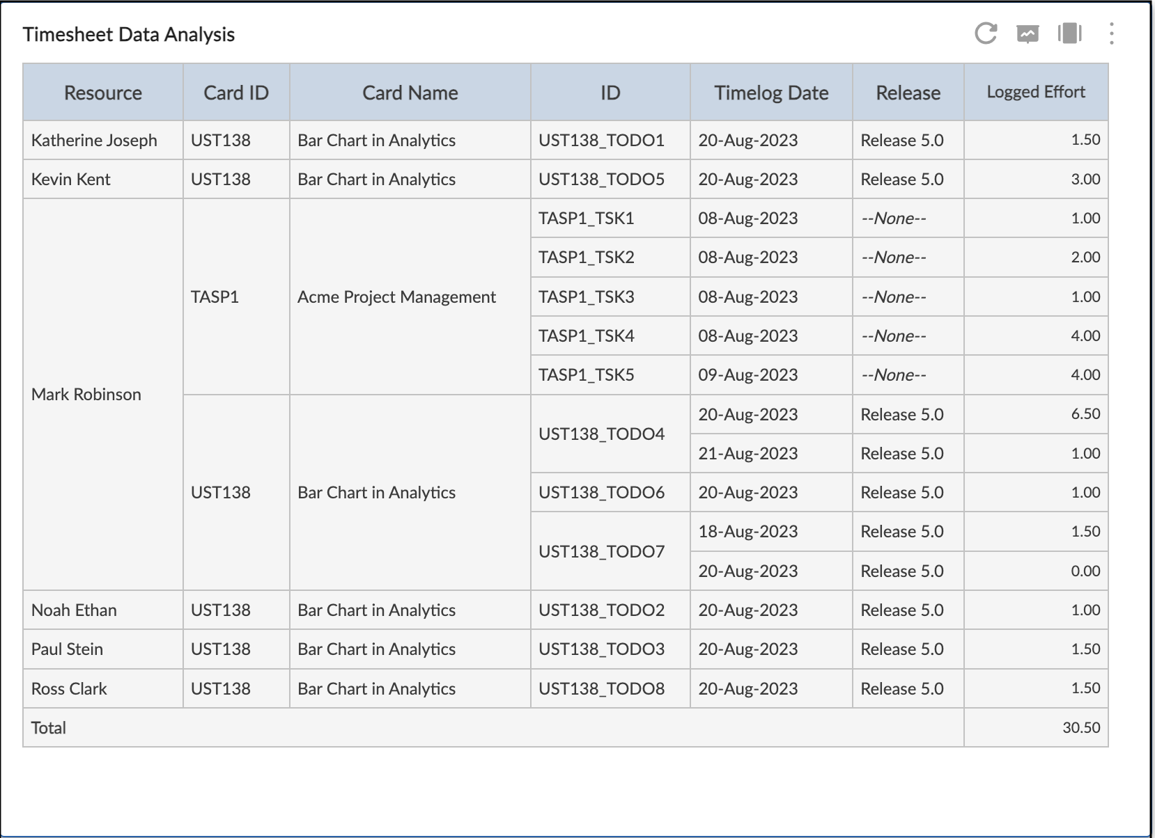
The Timesheet Data Analysis is a powerful data summarization feature that you can use to quickly summarize the timesheet data of your team in a tabular or chart format. You can refine the data based on date filter or advanced filter or both, and design the analytics based on various attributes such as Resource, Card ID, Card Name, Timelog date, Release, Sprint etc.
You can also change the table or chart format from the drop-down list. You can plot a Timesheet Data Analysis in Table, Pie chart, Bar chart, Horizontal bar chart, and Line chart. Note: By default, a Table is selected.
Moreover, you can export the table into Microsoft® Excel, Word, and PDF to view them offline. The Timesheet Analysis widget is available at the project level as well as My Analytics.
Configuring Timesheet Data Analysis
The Timesheet Data Analysis is plotted as per the data condition values set on its settings page. To interpret a Timesheet Data Analysis:
- Navigate to Analytics Builder, and select the Timesheet Analysis widget.
- Or you can skip to the Standard widgets. and from the Workitem Analytics section, click the Timesheet Data Analysis. The Settings page appears.
- Select the required criteria such as team members, filter, and date range. If you are plotting Timesheet Analysis at the My Analytics level, then select the required projects.
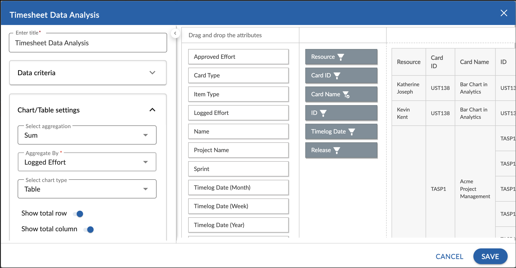
- Select the chart settings such as aggregation (Sum or Average), and chart type from the drop-down list and select whether to show or not the total of the rows and columns.
- The applicable attributes appear. Drag the attributes that you want to plot in your Timesheet Analysis to the right pane. You can also filter the value of the attributes by clicking the filter icon on the attribute and specifying the correct values.
- If there are no total rows or columns to be displayed in the table, then the respective toggle under the Chart Settings will turn off. To see the total of rows/columns, place the respective attribute in the top row or left column respectively.
- Select the required chart type from the drop-down list. You can plot a Timesheet Data Analysis in Table, Pie chart, Bar chart, Horizontal bar chart, and Line chart.
- Click the Save button.